
FBS Nacho Font Free Download
Is FBS Nacho free to download?
FBS Nacho is a commercial font sold on Creative Market, so the full version needs a paid license. Get it from the official listing: FBS Nacho font download.
Need something free? These sans serif fonts from Google Fonts are free for personal and commercial use:
Design style
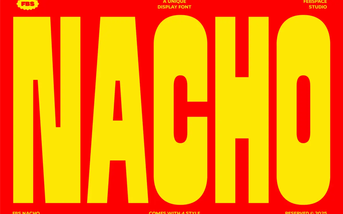
FBS Nacho is a heavyweight display sans that leans into thick, blunt strokes and a tight, almost blocky rhythm between letters. The core shape language is geometric rather than humanist — circles read as true circles, verticals and horizontals snap to grid, and there’s little variation in stroke width within a single letterform. That gives it a stamped, graphic quality rather than a typographic one in the traditional sense.
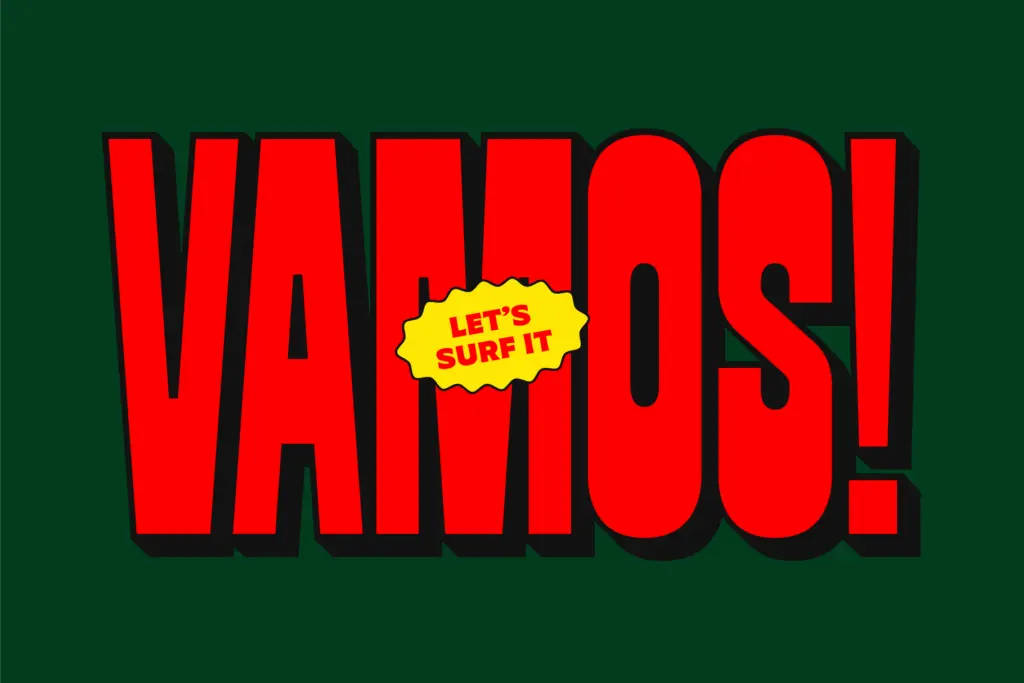
The family comes in four cuts: Regular, Soft Round, Regular Shadow and Soft Shadow. The Regular is the straight-edged version, with hard corners and square terminals that give it a stencil-adjacent, industrial feel. Soft Round takes the same skeleton and rounds off every corner, which softens the attitude considerably and pushes it toward something friendlier — more sticker or badge than warning sign. The two shadow styles add a flat, offset extrusion behind each letter, a dimensional trick that’s common in bold display work but still does its job here: it gives flat letterforms a sense of depth without resorting to gradients or textures.
None of this is subtle, and it isn’t meant to be. The letterforms are drawn for maximum ink coverage at large sizes, and the design doesn’t pretend otherwise.
Character set and features
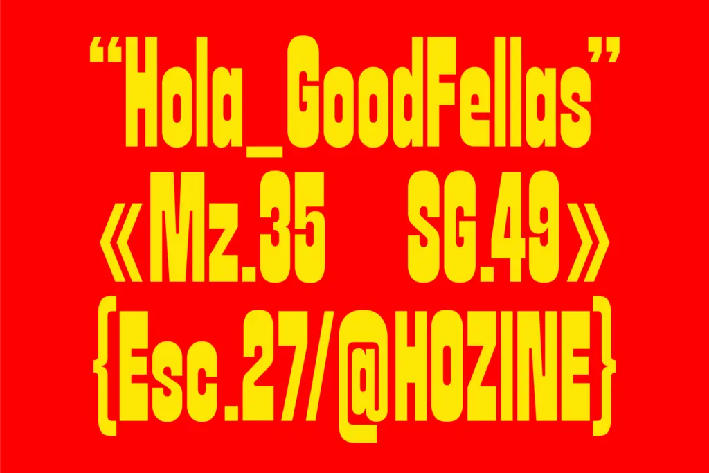
As a four-style display family, FBS Nacho’s job is to cover a handful of distinct looks rather than a wide range of weights or widths — there’s no light or thin option here, and no intermediate weights between the styles. The shadow versions are built as separate static styles rather than a stacking effect you’d layer yourself, which keeps setup simple but also means you’re locked into whatever offset and angle the designer chose.
The letterforms themselves are even-width and tightly fitted, which is typical of chunky display faces but worth noting if you’re setting anything longer than a word or two — kerning pairs matter more than usual here because the strokes are so thick that any spacing inconsistency becomes obvious fast. The rounded alternate (Soft Round) is the most versatile of the four, since it reads less aggressively and could sit in more contexts without feeling like it’s shouting.
Use cases
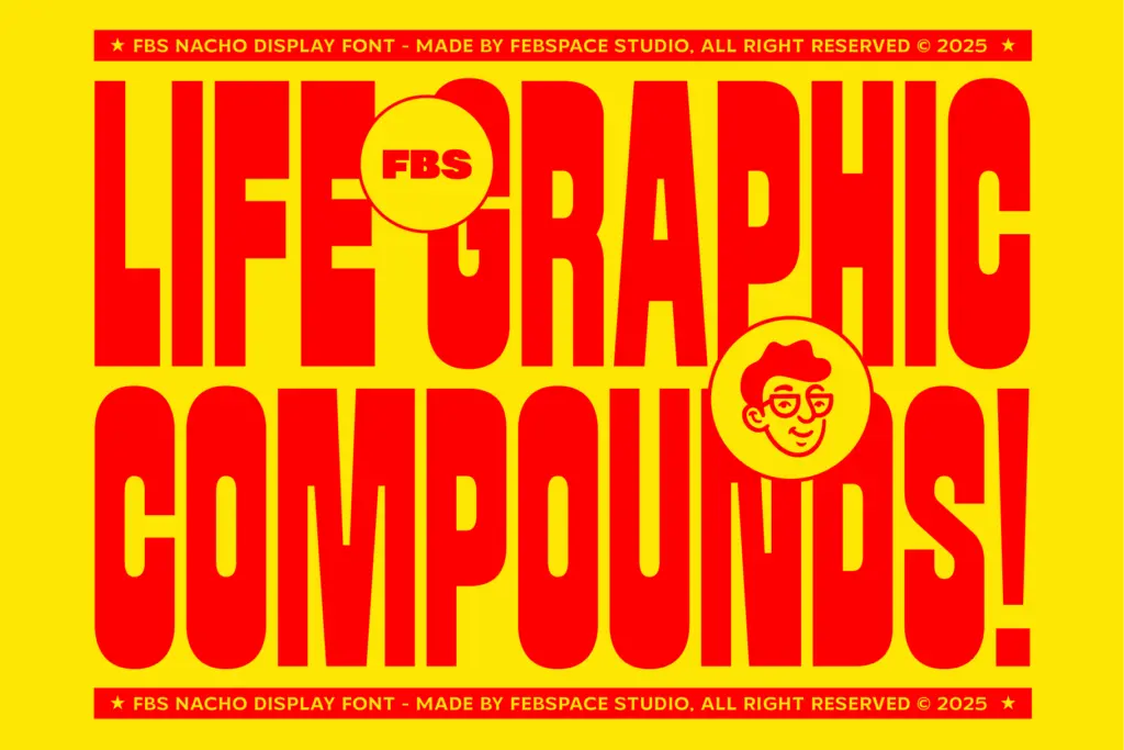
This is a font for short bursts of type at large sizes — logotypes, poster headlines, merch graphics, badges, social media graphics, packaging call-outs. It’s not built for body copy, subheads, or anything that needs to be read at length; the stroke weight and tight spacing make it fatiguing well before a sentence ends. Think one word, maybe a short phrase, set big.
The shadow styles in particular suit anything that wants a retro, screen-printed or sticker-pack feel — merch drops, event posters, snack packaging, that sort of thing. The plain Regular and Soft Round styles are more neutral and could carry a logotype or wordmark where the shadow version would be too busy. Given the narrow stylistic range, designers will likely want to pair FBS Nacho with a plainer sans or serif for any supporting text, since it has no mechanism of its own for setting that kind of secondary information.
What we liked, and what we didn’t
Strengths
- Thick, consistent stroke weight gives strong presence at poster and merch scale
- Soft Round style offers a friendlier alternative to the harder-edged default
- Shadow styles add dimensional interest without extra layering work
Trade-offs
- No weight range beyond the four fixed styles limits flexibility within a single project
- Tight spacing and heavy strokes make it unsuitable for anything beyond short headlines
FBS Nacho does one job well: short, loud display type with some retro shadow flair. It isn't built for anything beyond a few words at large size, and the four styles cover a narrow stylistic range, but within that range it's solidly drawn.

Tmfonts writes independent reviews of typefaces: what each font does well, where it falls short, what it suits, and where it is sold.