
Cowboy Standard Font Free Download
Is Cowboy Standard free to download?
Cowboy Standard is a commercial font sold on Creative Market, so the full version needs a paid license. Get it from the official listing: Cowboy Standard font download.
Need something free? These sans serif fonts from Google Fonts are free for personal and commercial use:
Design style
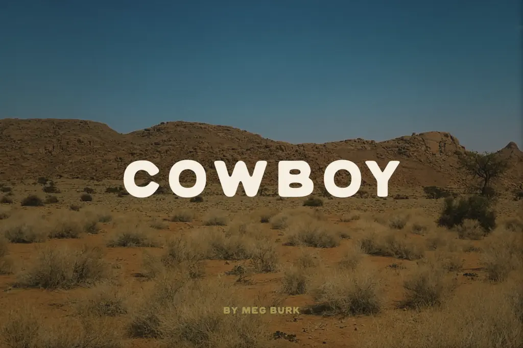
Cowboy Standard is a hand-drawn sans-serif with its roots firmly in western and southwestern visual culture. The strokes are uneven in a deliberate way: weight shifts slightly from one letter to the next, corners round off rather than meeting cleanly, and nothing sits perfectly on the baseline. It reads as drawn, not plotted, and that’s the point. The brief describes it as aged by time and human-touched, and the letterforms back that up without tipping into illegible distress-font territory.
The skeleton underneath is simple — a workmanlike grotesque — but the surface treatment is where the personality lives. Stroke ends are blunt rather than sharp, counters are open, and there’s enough visible texture in the strokes to suggest a brush or a worn marker rather than a vector tool. It’s rustic without leaning on grunge-font clichés like heavy ink splatter or forced cracks.
Character set and features
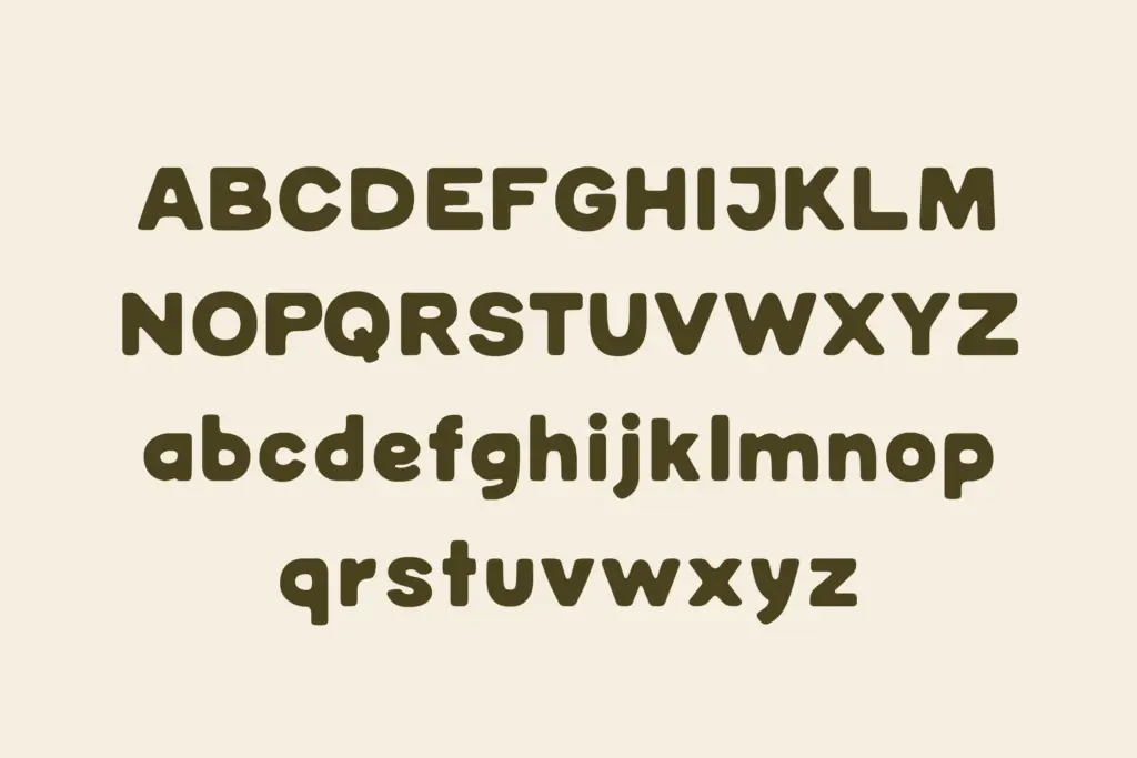
The set now includes a full lowercase alongside the uppercase, plus support for Spanish, German and French, which extends its reach past the English-only western lettering it probably started as. That said, the seller’s own guidance is worth repeating: this is best used as uppercase, with generous letter spacing between characters. The lowercase is a useful addition for body copy or tagline work, but the uppercase is where the handcrafted rhythm reads most confidently — tighten the tracking and the imperfections start to collide instead of complement each other.
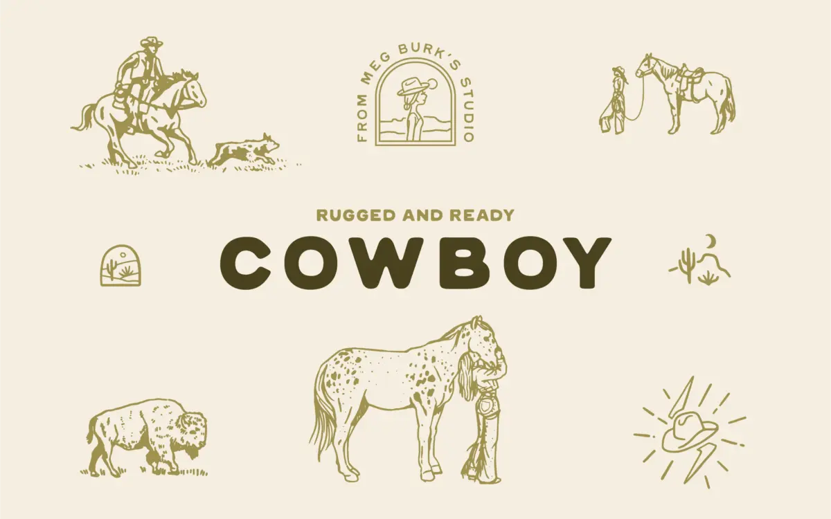
The more interesting feature is the alternate glyph set, which doubles as a small collection of western-themed vector marks — think cattle brand icons and southwestern dingbat shapes — accessed as stylistic alternates within the font itself rather than bundled as separate files. That’s a genuinely practical touch for anyone doing logo or badge work, since it keeps supplementary artwork in the same file and the same workflow as the lettering.
Use cases
This is a logo and branding font first. Short words, all caps, wide tracking — that’s its natural habitat. Think ranch and ag brands, tequila and spirits labels, outdoor and coastal-adjacent lifestyle brands, western wear, farmers’ market signage, anything trading on a handmade, sunbaked aesthetic rather than a polished one. The built-in cattle-brand-style alternates make it a reasonable one-stop option for badge or crest-style lockups without needing a separate icon set.
It’s less suited to anything that needs to read cleanly at small sizes or in long paragraphs — the hand-drawn irregularity that gives it character at display size becomes noise once you’re setting more than a line or two. Packaging copy, headline treatments on menus, hang tags, social graphics and merch all play to its strengths; body text and dense editorial layouts don’t.
What we liked, and what we didn’t
Strengths
- Built-in cattle-brand and dingbat-style alternates save separate icon sourcing
- Uneven, hand-drawn strokes give it real character without tipping into illegible grunge
- Multilingual accent support extends it past English-only western lettering
Trade-offs
- Lowercase and tight tracking undercut the handcrafted rhythm that makes the uppercase work
- Not built for body copy or dense text — the irregularity becomes noise below display size
Cowboy Standard does one job well: short, all-caps western and southwestern branding with a handmade edge. The built-in cattle-brand alternates are a genuinely useful inclusion, but the font loses its footing at small sizes or in long-form text.

Tmfonts writes independent reviews of typefaces: what each font does well, where it falls short, what it suits, and where it is sold.