
KOJAQ: a heavyweight extra-bold sans for headlines that need to shout
Design style
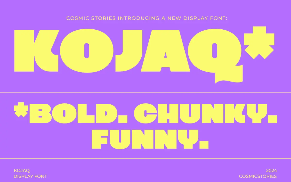
KOJAQ is an extra-bold sans built around thick, even strokes and tight counters. The weight sits at the far end of the spectrum — this is not a font that whispers at any size. Letterforms are geometric at their base but squared off at the terminals, giving the face a blocky, stamped quality rather than the softer roundness you get in some chunky grotesques. There’s no attempt at warmth here; the drawing is confident and a little blunt, which is the point.
Spacing is generous enough to keep the heavy strokes from clogging together, though at this weight the letterforms inevitably read as shapes first, words second, at a glance. That’s typical of extra-bold sans construction and not a flaw unique to KOJAQ, but it does mean the font is doing one job — impact — rather than trying to be all things.
Character set and features
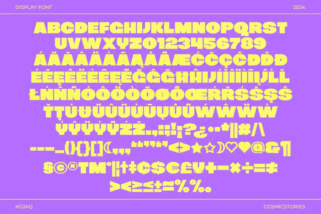
The seller notes multilingual support and special symbols, which extends the font’s reach beyond a basic Latin set, though the brief doesn’t specify which languages or how deep the symbol set goes, so test your specific character needs before committing. There’s no mention of a variable axis or multiple weights — KOJAQ appears to ship as a single extra-bold cut, which is consistent with its stated purpose but limits flexibility within a layout. If you need a lighter companion weight for body copy, you’ll be sourcing it elsewhere.
The format spread (OTF, TTF, WOFF, WOFF2) covers desktop and web use without issue. There’s nothing in the brief about ligatures, alternates, or stylistic sets, so treat this as a straightforward, single-purpose display cut rather than a feature-rich OpenType family.
Use cases
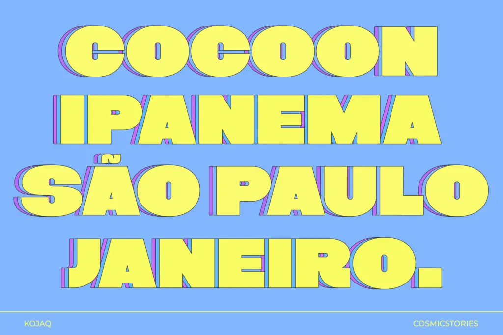
KOJAQ earns its keep in short-burst, high-visibility contexts: headlines, posters, social media graphics, packaging callouts, and logotypes that need to read instantly from a distance or a thumbnail. The thick strokes hold up well when scaled down to app icons or favicon-sized marks, which is often where chunky sans faces fall apart — worth checking directly against your use case, but the construction suggests it should survive reduction better than thinner alternatives.
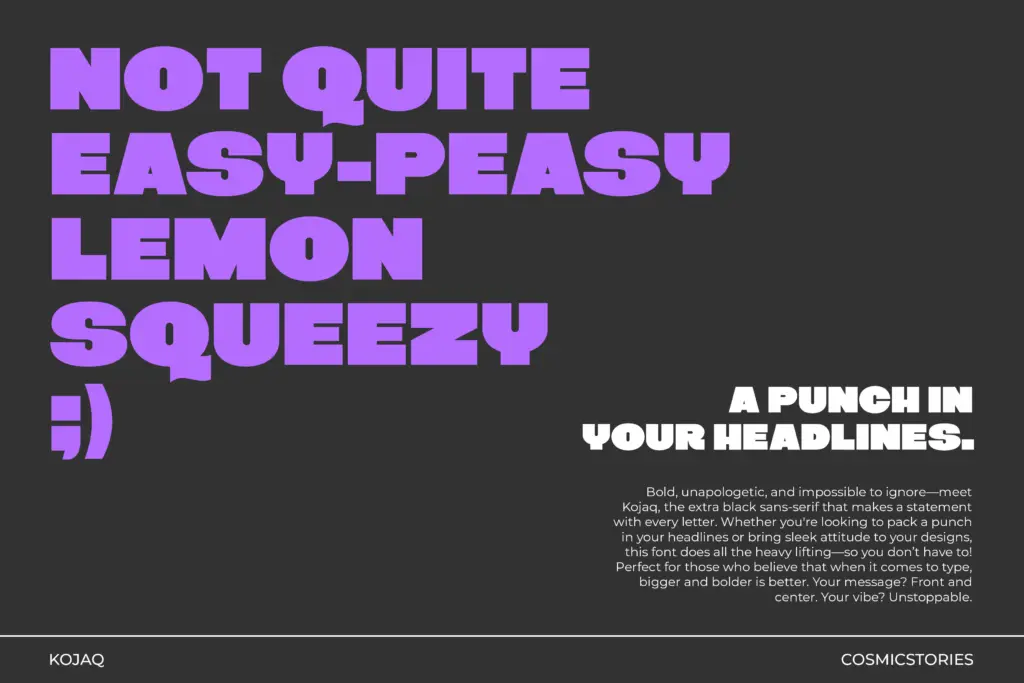
It is not a typeface for paragraphs. At body-copy sizes the heavy weight and tight counters will fight legibility, and any designer reaching for KOJAQ there is using the wrong tool. Pair it with a lighter, more neutral sans or a serif for supporting text, and let KOJAQ carry only the words that need shouting — a headline, a product name, a single call-to-action. Used sparingly and at scale, it does the one thing it’s built for competently; used everywhere, it becomes fatiguing fast.
What we liked, and what we didn’t
Strengths
- Thick, even strokes hold up well at small or scaled-down sizes like icons and thumbnails
- Blocky, stamped terminals give it a distinct personality rather than generic chunkiness
- Format spread covers both desktop and web delivery without extra conversion work
Trade-offs
- Ships as a single extra-bold weight, so you'll need to source a companion for body text or lighter contexts
- Tight counters at this weight make it unsuitable for anything beyond short headline-length text
KOJAQ is a competent, single-purpose extra-bold sans that does loud headlines and logo marks well. It doesn't try to be versatile, and it shouldn't be asked to — use it for the one or two words that need to dominate a layout and nothing more.
Verdict

Tmfonts reviews typefaces in depth — every font is tested in real branding, editorial and screen layouts before a word gets written. 555+ fonts reviewed and counting.