
Tipique Font Free Download
Is Tipique free to download?
Tipique is a commercial font sold on Creative Market, so the full version needs a paid license. Get it from the official listing: Tipique font download.
Need something free? These sans serif fonts from Google Fonts are free for personal and commercial use:
Design style
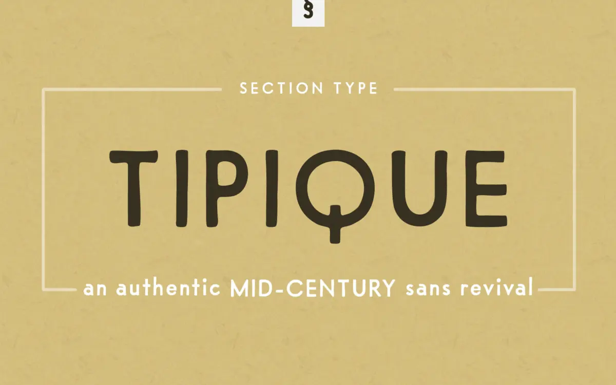
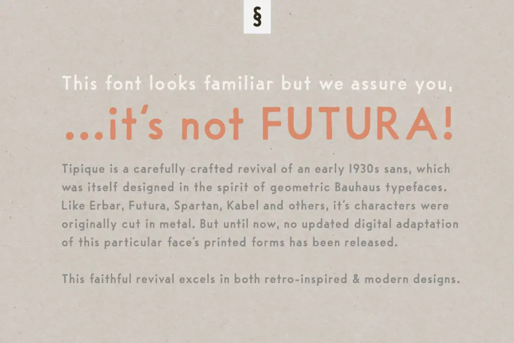
Tipique belongs to the same family tree as Futura, Erbar, Kabel and Spartan — the geometric sans faces that came out of the Bauhaus-adjacent moment in European type design. This particular cut was never digitised until now, and the revival keeps the stiffness and charm of its metal-type origins rather than smoothing it into something closer to a contemporary grotesque.
You can see the period in the circular bowls and the way the counters sit slightly tight. It’s geometric in construction but not in the cold, drafting-table sense that Futura later became known for. The x-height runs a touch low compared to modern sans faces, and the proportions feel handset rather than engineered. That’s the appeal: it reads as a sans serif with a specific decade attached to it, not a generic revival that could have come from anywhere.
Character set and features
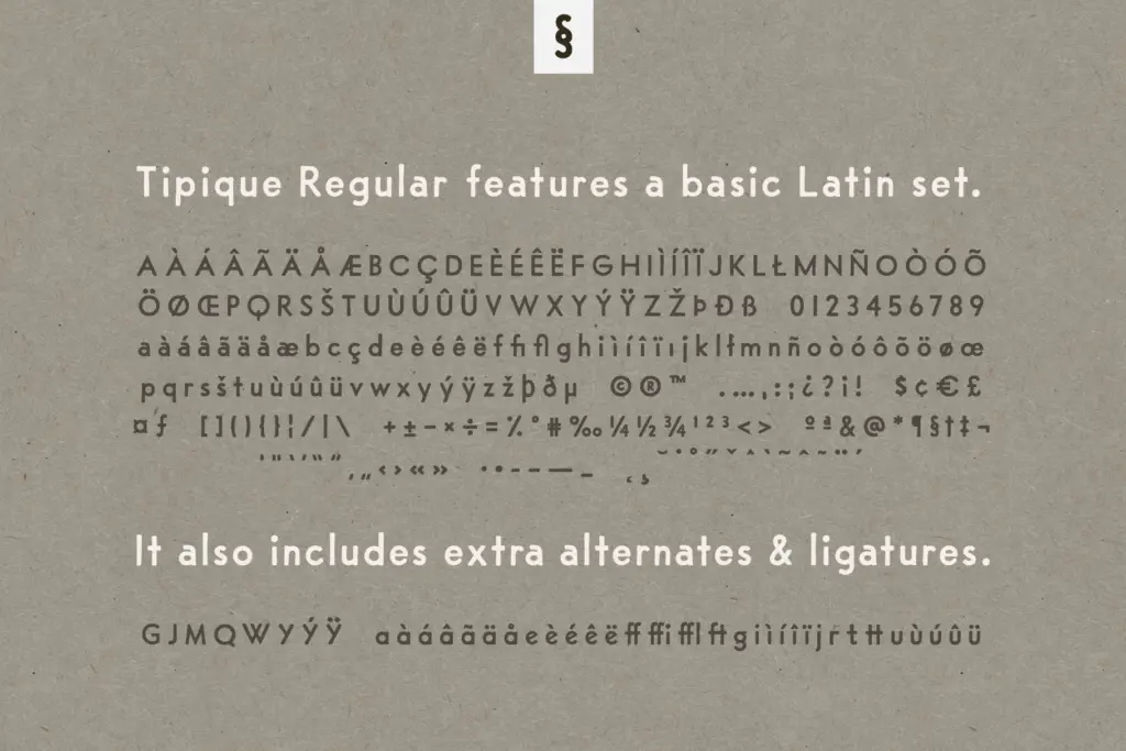
The alternates are the real working feature here. Swapping in the alternate G, J, M, Q, W, Y, a, e, g, i, j, r, t and u changes the character of a word noticeably — the alternate g in particular has a double-storey warmth that the default single-storey version doesn’t carry. Diacritic versions of these alternates are included too, which matters if you’re setting anything beyond basic English. The ff, ffi, ffl, ft and tt ligatures are a practical addition for anyone setting continuous text rather than just headlines, since those letter pairs are exactly where geometric sans faces tend to look awkward if left unligatured.
There’s only the one weight, Regular, which is worth knowing going in. There’s no bold or light to build a hierarchy from within the family itself — you’ll need to lean on size, colour or an alternate character set to create contrast, or pair it with something else entirely for body copy.
Use cases
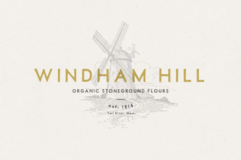
This is a display-leaning face suited to short bursts of text: logotypes, business cards, letterhead, product labels and packaging. The geometric roundness photographs well on physical goods — food packaging, menus, apothecary-style labels — where a bit of period charm does more work than strict neutrality. It also suits wedding stationery and invitations if you want something that reads as vintage without tipping into script-font sentimentality.
At small sizes or in dense paragraphs, the tightness of the counters and the low x-height start to work against it — this isn’t a body text face, and pushing it there will cost you legibility. Stick to headlines, short runs of copy, and places where the alternates get to show off. For longer editorial text, bring in a companion face built for reading, and let Tipique handle the parts of the job that are really about voice rather than information.
What we liked, and what we didn’t
Strengths
- Alternate letterforms for G, J, M, Q, W, Y and several lowercase letters give real control over tone
- Ligature set (ff, ffi, ffl, ft, tt) makes it usable in short continuous text, not just headlines
- Distinctive period character that avoids feeling like a generic geometric-sans revival
Trade-offs
- Single weight means no built-in way to build hierarchy within the family
- Low x-height and tight counters make it unreliable at small sizes or in long text blocks
Tipique is a well-researched revival with genuine period character, not just another Futura clone. It's best treated as a display and branding face rather than a body text workhorse, and the single-weight family limits how far it can go alone.

Tmfonts writes independent reviews of typefaces: what each font does well, where it falls short, what it suits, and where it is sold.