Sans Serif
3.9
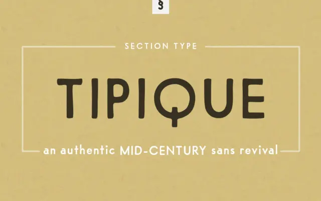
Tipique: A 1930s Geometric Sans Revived for Retro Branding Work
Design style Tipique belongs to the same family tree as Futura, Erbar, Kabel and Spartan — the geometric sans faces…
 Tmfonts

Design style Tipique belongs to the same family tree as Futura, Erbar, Kabel and Spartan — the geometric sans faces…
Tmfonts
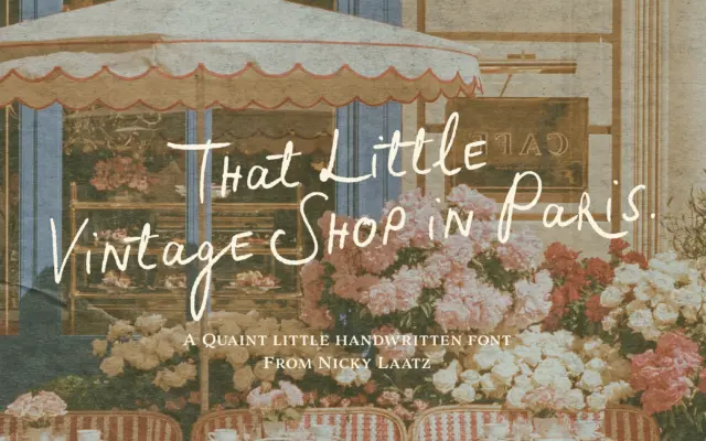
Design style Little Vintage Shop is a handwritten script built around an unhurried, slightly wobbly pen stroke. The letters carry…
Tmfonts
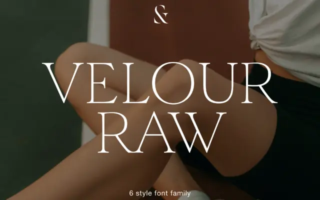
Design style Velour Raw is pitched as the calmer sibling of a display serif, and that relationship shows in how…
Tmfonts
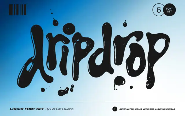
Design style Dripdrop is built from actual squirted ink, scanned and turned into type, and it reads that way in…
Tmfonts
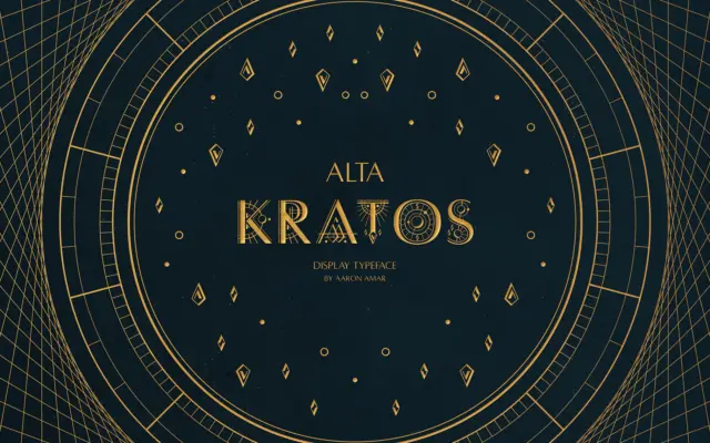
Design style Alta Kratos is an all-caps display typeface that works from the same structural idea that made Hermann Zapf’s…
Tmfonts
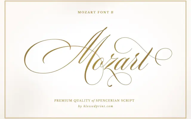
Design style Mozart Script II Basic sits in the lineage of Spencerian penmanship crossed with copperplate discipline. The lowercase carries…
Tmfonts
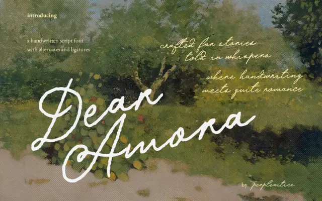
Design style Dear Amora sits in the crowded field of romantic handwritten scripts, and it doesn’t try to reinvent that…
Tmfonts
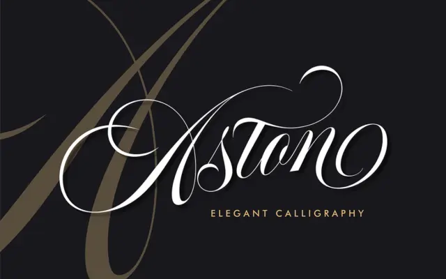
Design style Aston Script Pro sits in the copperplate-derived family of calligraphic scripts, but it doesn’t try to be a…
Tmfonts
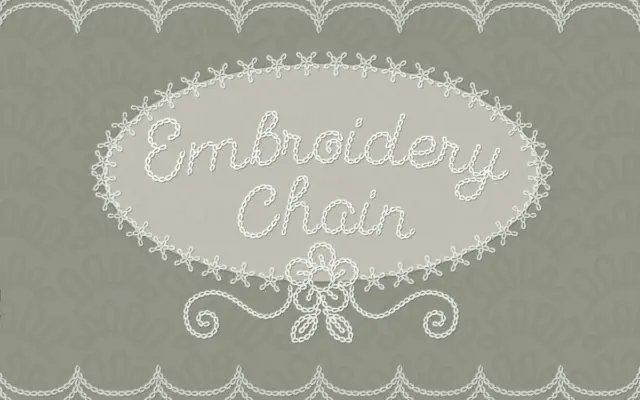
Design style This is a script built to imitate chain-stitch embroidery rather than to be used in an actual embroidery…
Tmfonts