Commuters Sans: an eight-weight workhorse sans for editorial and everyday branding
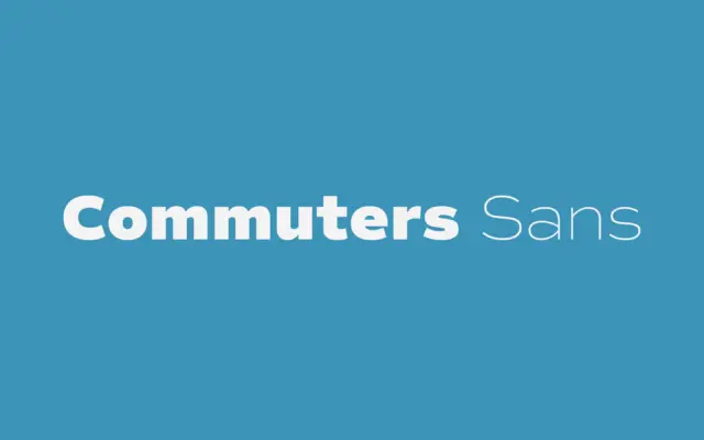
Design style Commuters Sans sits in the geometric-humanist middle ground that a lot of contemporary sans families now occupy, but…
Design style Think Sans reads, from a distance, like a plain monoline all-caps face — even strokes, geometric skeleton, nothing…
Design style Marlin sits in the well-worn tradition of Wild West display lettering: condensed slab-ish serifs, slightly flared terminals, and…
Design style Babe is a sans built around soft curvature rather than the strict verticals most grotesques rely on. The…
Design style Sardin Rounded Bold sits squarely in the bubbly, thick-stroke sans lineage that traces back to 90s cartoon lettering…
Design style Cravelo sits at the intersection of two things that don’t often meet in one letterform: condensed vintage lettering…
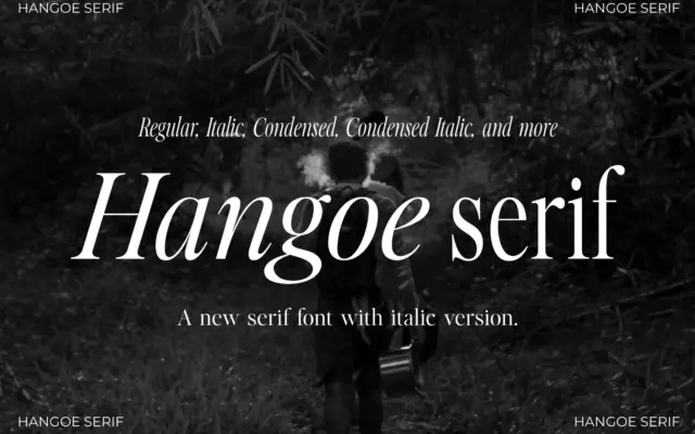
Design style Hangoe sits in old-style serif territory, but drawn with a taller, more condensed proportion than most revival faces…
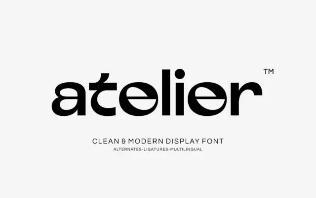
Design style Atelier sits in the crowded field of geometric display sans faces, and it earns its place by picking…
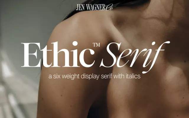
Design style Ethic Serif sits in that familiar territory of high-contrast serifs built for attention rather than paragraphs. The thick-thin…