
Hangoe Font Free Download
Is Hangoe free to download?
Hangoe is a commercial font sold on Creative Market, so the full version needs a paid license. Get it from the official listing: Hangoe font download.
Need something free? These serif fonts from Google Fonts are free for personal and commercial use:
Design style
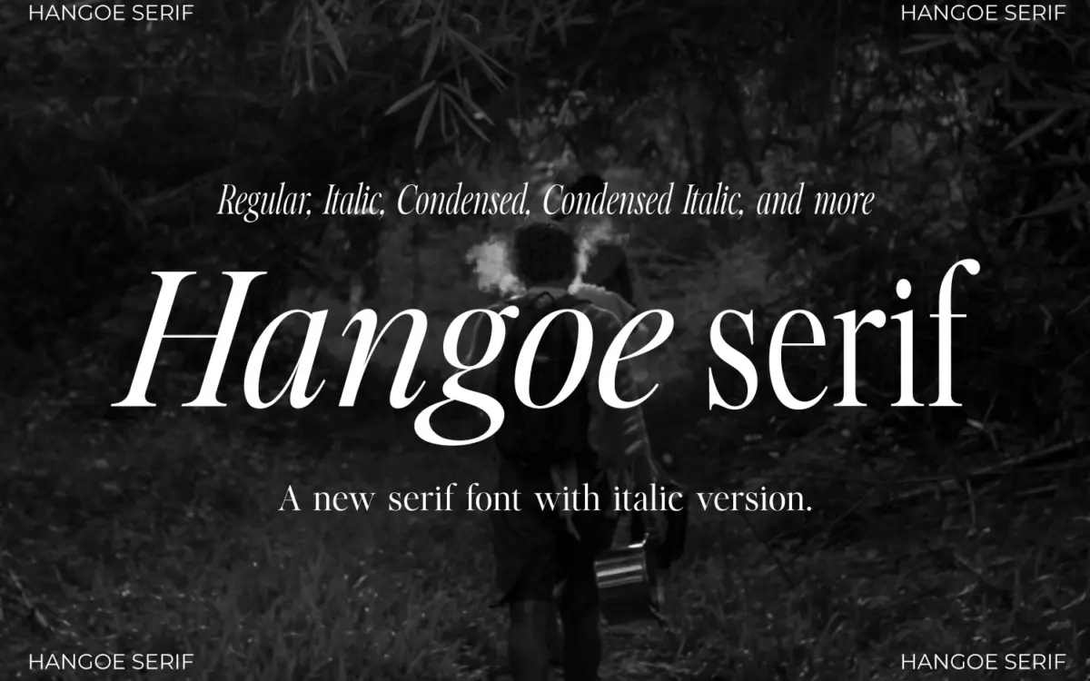
Hangoe sits in old-style serif territory, but drawn with a taller, more condensed proportion than most revival faces of this kind. The x-height is moderate, the ascenders and descenders stretch further than expected, and the overall rhythm reads narrow and upright on the page rather than wide and relaxed. That verticality gives it a slightly formal, editorial temperament — closer to a magazine masthead than a novel’s body text.
The serifs are bracketed and modest, contrast between thick and thin strokes is present but not aggressive, and the italic leans classic rather than calligraphic, with restrained swashes on a few characters. Nothing about the drawing shouts for attention. It’s a typeface built on discipline: consistent stroke weight, careful spacing, and a refusal to let any one letter become a flourish. That restraint is the point, but it also means Hangoe doesn’t have a single showstopping letterform to hang a brand identity on — its personality comes from the whole paragraph, not any one glyph.
Character set and features
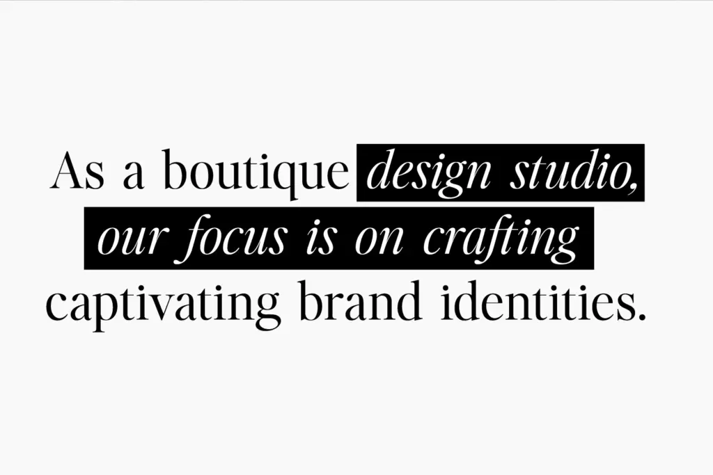
Eight styles come packaged together: Regular, Italic, Condensed, Condensed Italic, and Text equivalents of each, meaning both a display-leaning cut and a slightly more compact Text variant sit side by side. That’s a genuinely useful spread for anyone building a system that needs a headline weight and a smaller-size companion without switching families.
The character set covers uppercase, numerals, and punctuation, with ligatures and stylistic sets available through OpenType, plus kerning that’s been attended to rather than left on autopilot. Multilingual support is included, though the brief doesn’t specify which scripts or diacritics, so anyone with non-Latin or heavy accent requirements should check the glyph list before committing. Notably, there’s no clear mention of a full lowercase-driven weight range or bold cuts beyond what’s listed — this reads as a typeface built around one core weight expressed across width and posture variants, not a family with multiple optical weights for hierarchy.
Use cases
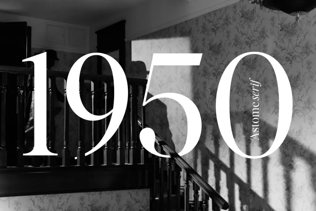
Hangoe’s tall, condensed proportions make it a strong candidate for logotypes and wordmarks where a serif needs to feel considered without taking up much horizontal space — fashion branding, boutique packaging, and editorial mastheads all suit this kind of letterform. The Condensed cuts are particularly useful for headlines in narrow columns, pull quotes, and social graphics where a caption needs to sit tight against an image.
The Text styles are the more forgiving option for anything running longer — invitation copy, blog body text, or short-form editorial paragraphs — though the elevated ascenders mean tighter leading will start to feel cramped faster than with a more conventional old-style serif. This isn’t a typeface for dense, long-form book pages at small sizes; the condensed rhythm asks for a bit more room to breathe. It’s better suited to shorter blocks of text where its formality can register: quotes, invitations, headers, and branding moments where elegance matters more than reading stamina.

What we liked, and what we didn’t
Strengths
- Condensed and Text cuts give real flexibility between headline and shorter body settings
- Restrained, consistent drawing with careful kerning and OpenType ligatures
- Tall proportions suit narrow logotypes and editorial mastheads well
Trade-offs
- Elevated ascenders and condensed rhythm make it less comfortable for dense long-form text
- No clear range of weights beyond the core styles, limiting hierarchy options within one family
Hangoe is a disciplined, tall-proportioned serif that earns its keep in branding and editorial headline work rather than long-form reading. Its eight styles give a useful spread of width and posture without ever quite building a full weight range. Buyers wanting a quiet, condensed old-style character will get real use from it; those needing dense body text should look elsewhere.

Tmfonts writes independent reviews of typefaces: what each font does well, where it falls short, what it suits, and where it is sold.