
Perfections Font Free Download
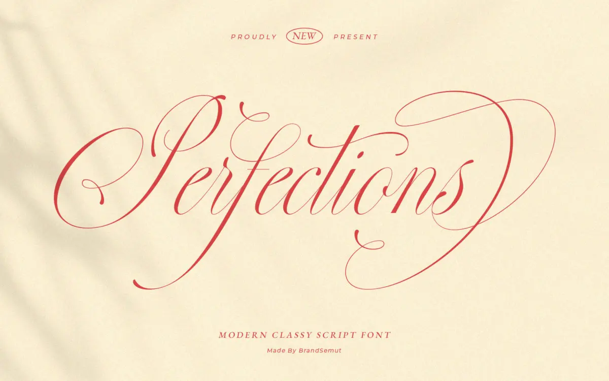
Is Perfections free to download?
Perfections is a commercial font sold on Creative Market, so the full version needs a paid license. Get it from the official listing: Perfections font download.
Need something free? These script fonts from Google Fonts are free for personal and commercial use:
Design style
Perfections sits comfortably in the crowded lane of romantic calligraphy scripts, and it knows exactly what it’s doing there. The letterforms lean into a moderate slant with connected, flowing joins, low contrast between thick and thin strokes, and rounded terminals that keep the whole thing feeling soft rather than sharp. Swashes appear on capitals and select ascenders and descenders, but they’re kept relatively restrained compared to some of the more theatrical scripts on the market — this is closer to a confident hand-lettered signature than a full calligraphic flourish piece.
The x-height is generous for a script of this type, which helps the lowercase hold its shape at smaller sizes without collapsing into a smear of loops. Letter spacing feels tuned for the connected-cursive look rather than for setting long passages, so words read as single gestures rather than as a string of individually legible characters. That’s a deliberate choice, and it’s the right one for what this typeface is trying to be, but it does mean the font is doing a display job even when it’s dressed as body-adjacent text.
Character set and features
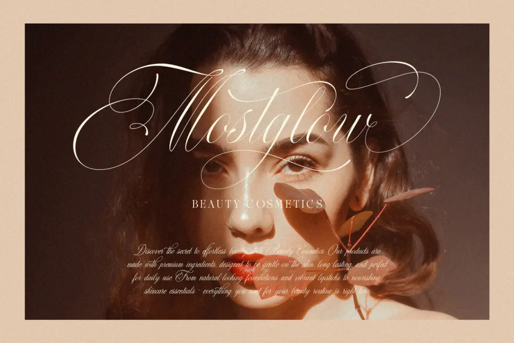
The seller markets this as a modern calligraphy script with delicate detailing, and on inspection the drawing backs that up — curves are even, joins are clean, and there’s no obvious wobble in the stroke weight as letters transition into swashes. What isn’t specified in the brief is language coverage or the depth of OpenType features (alternates, ligatures, contextual substitution), so treat any assumption about extended glyph support with caution until you’ve checked the character map yourself. If you’re setting anything beyond basic Latin text, verify accented character coverage before committing a layout to it.
Where a script like this lives or dies is in its alternates — swapped capitals, varied lowercase forms, ligatures that stop repeated letters from looking mechanical. Without confirmed feature details, the safest approach is to preview actual copy, especially any words with doubled letters or awkward letter pairs, before locking in a final design.
Use cases
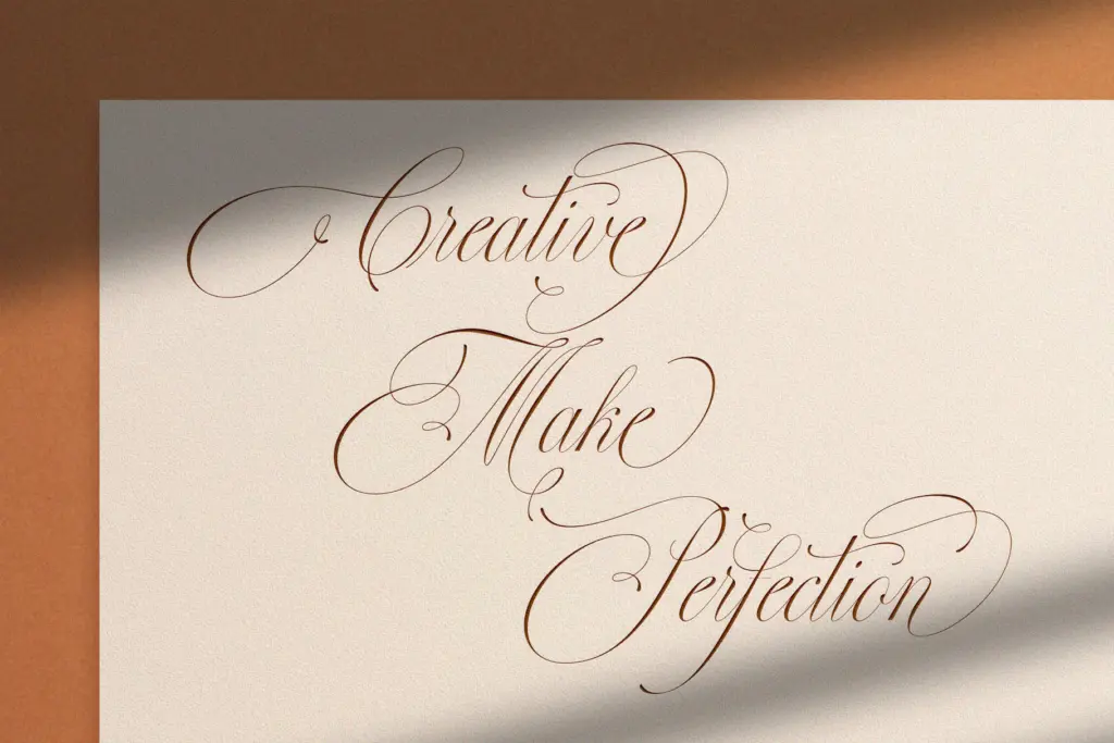
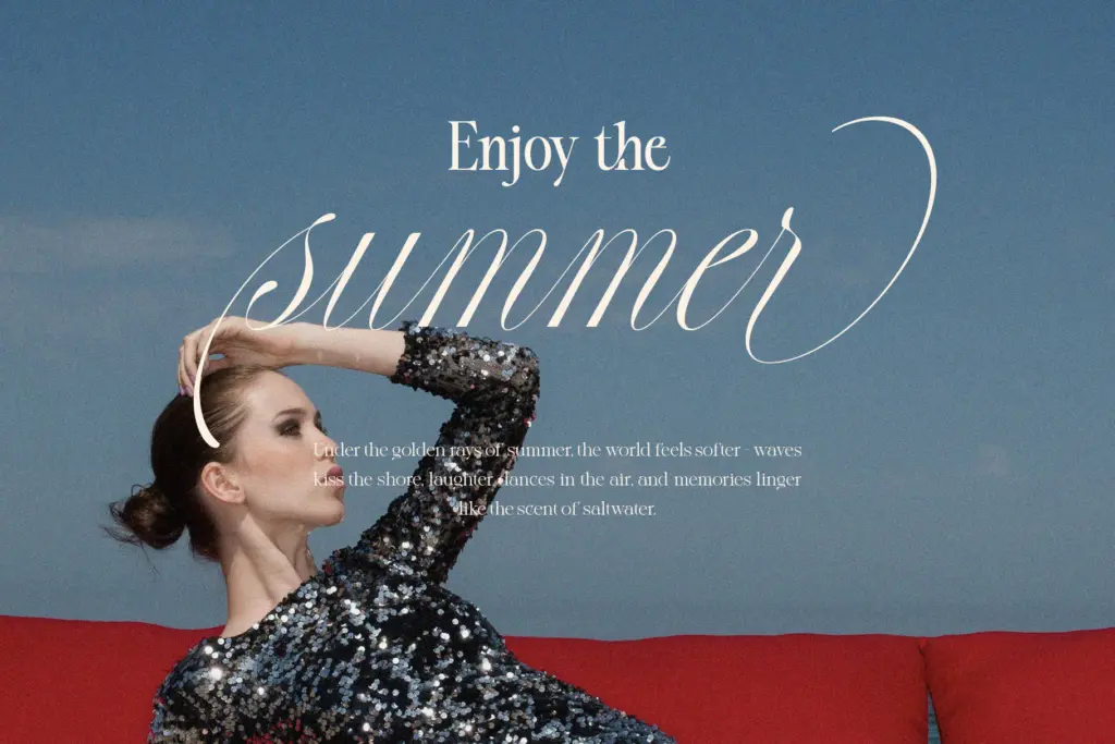
This is a font built for short, prominent lines of text: a bride and groom’s names on an invitation suite, a monogram, a logotype for a fashion or beauty brand, a single evocative word on packaging. It performs well in that register — the romantic slant and soft terminals give it a genuine sense of occasion without tipping into kitsch. It also has enough polish to work as a header treatment in editorial layouts, paired with a plain sans or serif for the actual reading matter.
Where it will struggle is anywhere that demands sustained legibility: paragraph text, dense signage read at a glance, or small print on packaging where the connected strokes start to blur together. It’s also a font that wants generous space around it — cramming it into a tight column undercuts the whole reason you’d choose it. Used as intended, for names, headlines, and short romantic phrases, it does its job cleanly.
What we liked, and what we didn’t
Strengths
- Even, controlled stroke contrast that keeps the connected script from looking sloppy
- Generous x-height helps it hold up at smaller display sizes better than many romantic scripts
- Restrained swash use makes it easier to pair with plainer typefaces than more ornate competitors
Trade-offs
- Tight, connected spacing makes it unsuitable for anything beyond short lines or headlines
- Glyph coverage and OpenType feature depth aren't confirmed, so multilingual or alternate-heavy projects need checking first
Perfections is a well-drawn romantic script that does exactly what it promises for short, prominent lines of text — names, monograms, headlines. It's not built for reading in bulk, and buyers should confirm alternates and language support before relying on it for a full identity system.

Tmfonts writes independent reviews of typefaces: what each font does well, where it falls short, what it suits, and where it is sold.