
Montage Serif Font Free Download
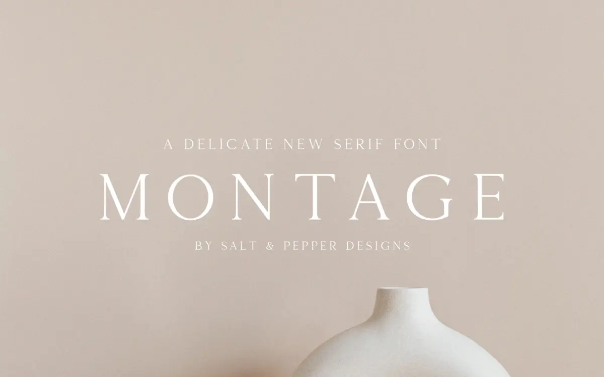
Is Montage Serif free to download?
Montage Serif is a commercial font sold on Creative Market, so the full version needs a paid license. Get it from the official listing: Montage Serif font download.
Need something free? These serif fonts from Google Fonts are free for personal and commercial use:
Design style
Montage Serif sits in the broad family of display serifs built for short bursts of text rather than paragraphs. The letterforms carry the moderate contrast and bracketed serifs typical of that category — thick-thin transitions are present but not aggressive, and the serifs themselves are stubby rather than hairline, which keeps the face from feeling fragile at smaller sizes. There’s a slight condensed quality to the lowercase, giving headlines a tighter set width than you’d get from a book serif, which is useful when you’re fitting a title into a fixed banner or card.
It reads as a face designed to look considered rather than neutral: the kind of serif a studio reaches for when a project needs to feel established without going full traditional-text-serif. It’s not doing anything structurally unusual — no ball terminals, no exaggerated swashes baked into the base characters — but the proportions are even enough that it holds a consistent tone across a headline.
Character set and features
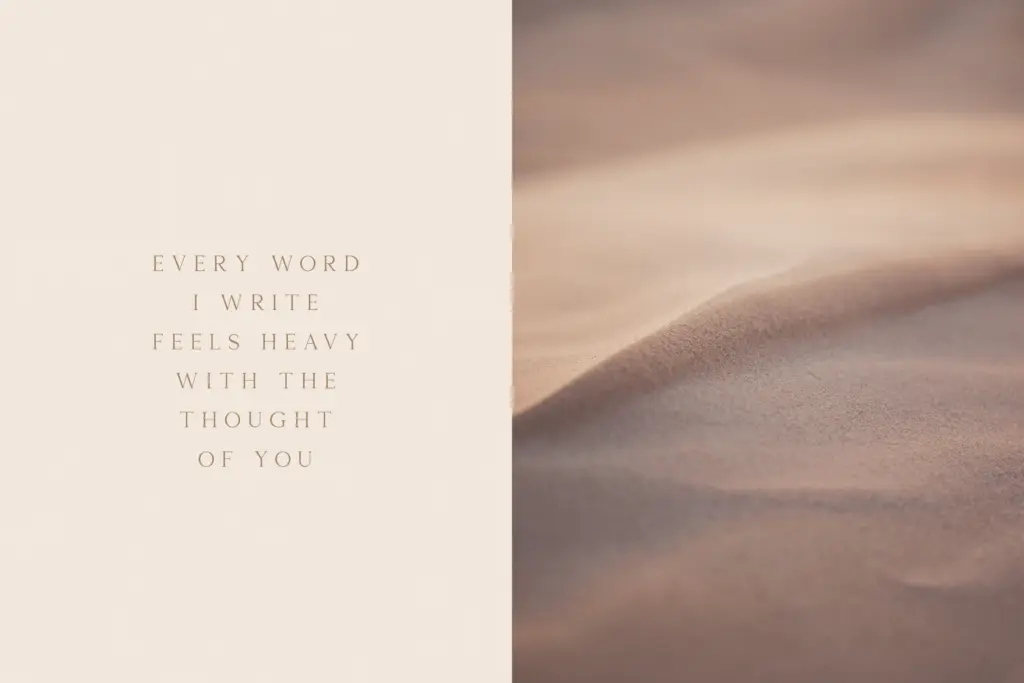
The font ships in OTF and TTF, which covers the standard bases for both design software and web or app embedding workflows. Beyond that, the seller material doesn’t specify OpenType features, alternate characters, ligatures, or language coverage, so treat this as a single-weight display face until you’ve opened it in your own software and checked the glyph panel. If you need extended Latin diacritics, small caps, or contextual alternates, verify before you commit a layout to it — nothing in the brief confirms their presence.
What is confirmed is a straightforward, single-style serif intended for commercial use. That’s a fair description of what most buyers actually need from a headline font: something legible, a bit distinctive, and easy to drop into an existing template without a manual.
Use cases
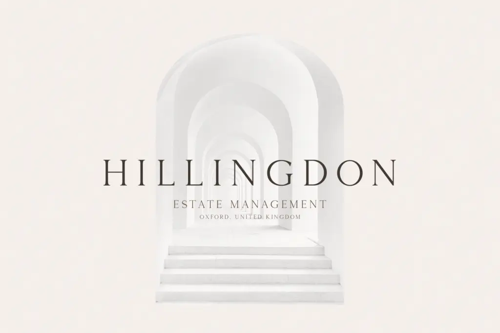
This is a heading font, not a body font. It belongs in places where type is doing a small amount of talking loudly: logotypes, packaging headers, invitation lockups, editorial pull quotes, social graphics. The moderate contrast means it survives being scaled down to a subhead size better than a high-contrast didone would, but it’s still built for impact sizes — don’t ask it to carry a paragraph of running text.
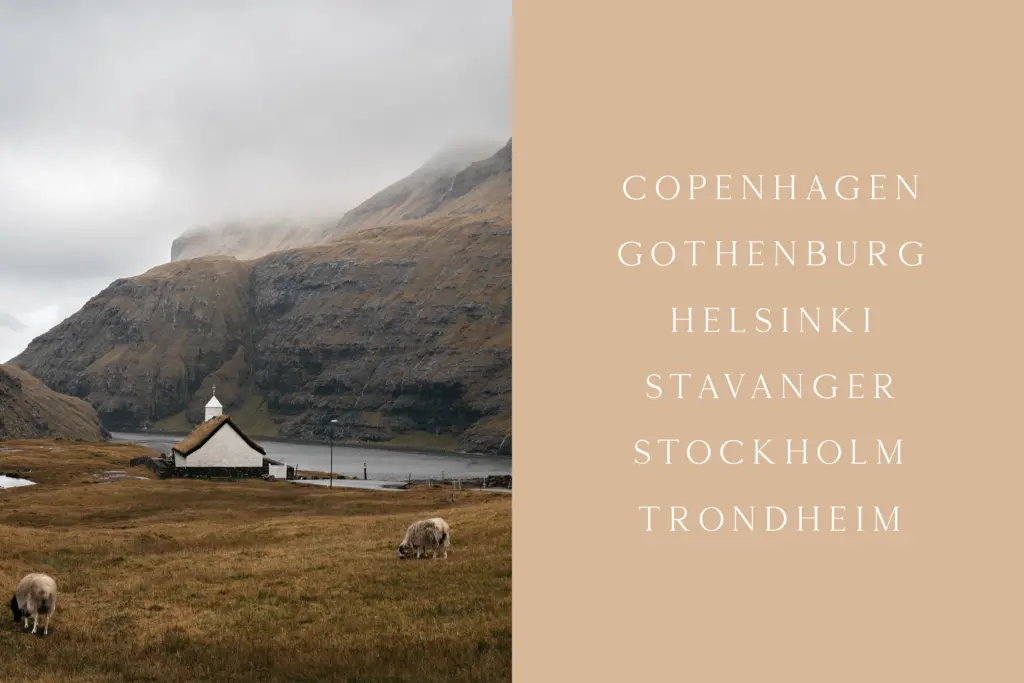
Pair it with a plain, work-a-day sans for body copy and let Montage Serif handle the title line; that’s the job it’s shaped for. It also suits branding work where a client wants
What we liked, and what we didn’t
Strengths
- Moderate contrast keeps it legible even when scaled down to subhead sizes.
- Slightly condensed lowercase gives it a distinct set width useful for tight headline spaces.
- Ships in both OTF and TTF, covering standard design and web workflows.
Trade-offs
- No confirmed OpenType features, alternates or ligatures — check the glyph panel before relying on any.
- Single style with no stated weight range limits it to headline duty only, not body text.
Montage Serif is a competent, moderate-contrast display serif suited to headlines and short branding text, but the seller documentation leaves too many practical questions unanswered — feature set, weight range and language support all need checking before you commit. It does its narrow job well enough, without offering much reason to reach for it over other headline serifs already in a working library.

Tmfonts writes independent reviews of typefaces: what each font does well, where it falls short, what it suits, and where it is sold.