
Atelier Font Free Download
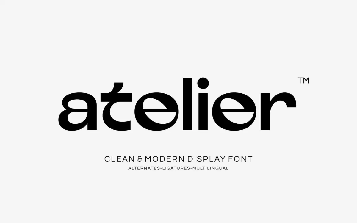
Is Atelier free to download?
Atelier is a commercial font sold on Creative Market, so the full version needs a paid license. Get it from the official listing: Atelier font download.
Need something free? These sans serif fonts from Google Fonts are free for personal and commercial use:
Design style
Atelier sits in the crowded field of geometric display sans faces, and it earns its place by picking a specific tension to work with: the friction between hard geometric bones and softened, slightly liquid curves. Circular counters and consistent stroke widths give it the expected mid-century modernist backbone, but the joins are eased rather than sharp, and a few letters carry an almost melted quality at the terminals. It reads as confident rather than showy — the kind of restraint that comes from a designer who trusted the geometry to do the work instead of piling on flourishes.
The proportions are wide and even, with generous counters that keep the letterforms from feeling cramped at large sizes. There’s a futuristic lean to a handful of characters — the kind of detail that reveals itself only when you set the font big, which is exactly where this typeface wants to live.
Character set and features
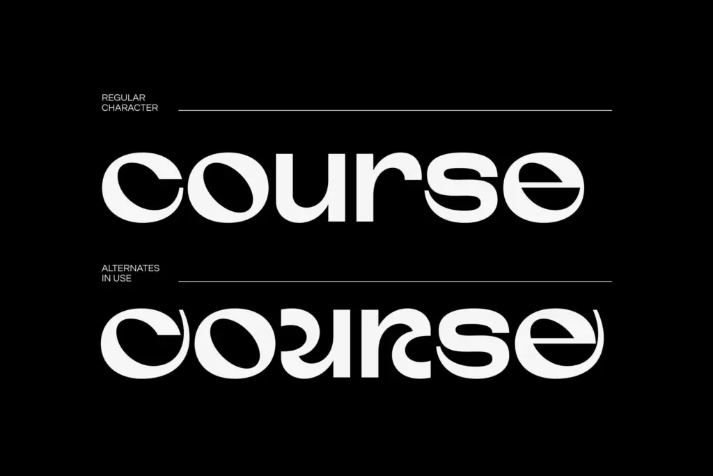
The set covers uppercase and lowercase, numerals, punctuation, and PUA-encoded glyphs, so the alternates and ligatures are reachable even in apps that don’t support OpenType features natively — a genuinely useful inclusion for anyone working in Canva or older versions of Word. Multilingual support is included, though the brief doesn’t specify which language sets, so anyone with technical diacritic requirements should check coverage before committing.
The alternates give the lowercase some welcome variation — enough to break up repetition in a logotype without turning the font into a display gimmick. Ligatures are present but understated, doing tidy work on common pairs rather than showing off. There’s no indication of a full weight range in the brief, so this reads as a single-weight display face rather than a family with text-weight siblings, which matters for anyone hoping to use it for body copy.
Use cases
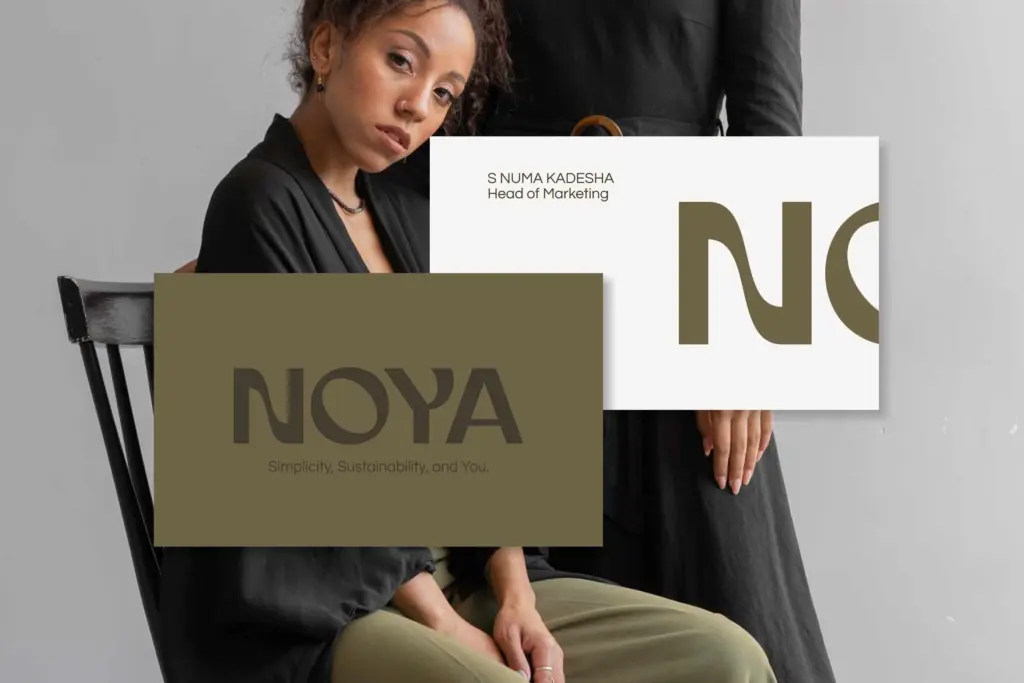
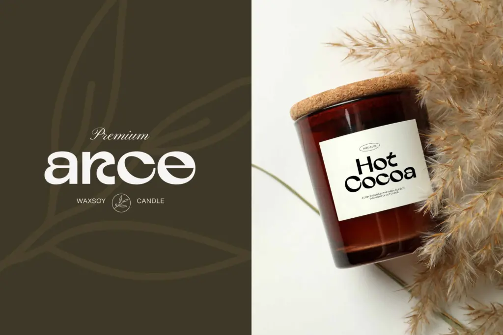
This is a headline font, not a paragraph font, and it knows it. Set large — in a logotype, a magazine masthead, a poster headline, or packaging copy — the geometric structure and eased curves both read clearly, and the wide counters keep it from feeling stiff. It has an obvious affinity for the beauty, fashion, and lifestyle branding space the seller name-checks: the fluid geometric feel suits a premium, slightly editorial tone without tipping into anything too ornate or retro.
Where it will struggle is at small sizes or in dense settings. Tight tracking or long lines will erode the softened terminals that give the letterforms their character, and without a text-weight companion, designers will need to pair it with something else for body copy — Atelier isn’t built to be that workhorse itself. It also isn’t a neutral, get-out-of-the-way sans; the personality in the curves means it will fight for attention in layouts that already have a lot going on. Used with restraint, on covers, headers, and short-form branding moments, it does exactly the job it was drawn for.
What we liked, and what we didn’t
Strengths
- Eased, slightly liquid terminals give the geometric structure genuine character
- PUA encoding makes alternates and ligatures usable even in apps without OpenType support
- Wide counters and even proportions hold up well at large display sizes
Trade-offs
- No indication of a text-weight companion, so it isn't suited to body copy on its own
- Softened details lose definition at small sizes or tight tracking
Atelier is a confident geometric display sans with a distinctive softened edge, built for logos, headlines, and premium branding work rather than body text. It looks best set large, where its eased curves and wide counters can breathe. Anyone needing a text-weight companion or dense-paragraph legibility will need to look elsewhere.

Tmfonts writes independent reviews of typefaces: what each font does well, where it falls short, what it suits, and where it is sold.