
Spencer Font Free Download
Is Spencer free to download?
Spencer is a commercial font sold on Creative Market, so the full version needs a paid license. Get it from the official listing: Spencer font download.
Need something free? These serif fonts from Google Fonts are free for personal and commercial use:
Design style
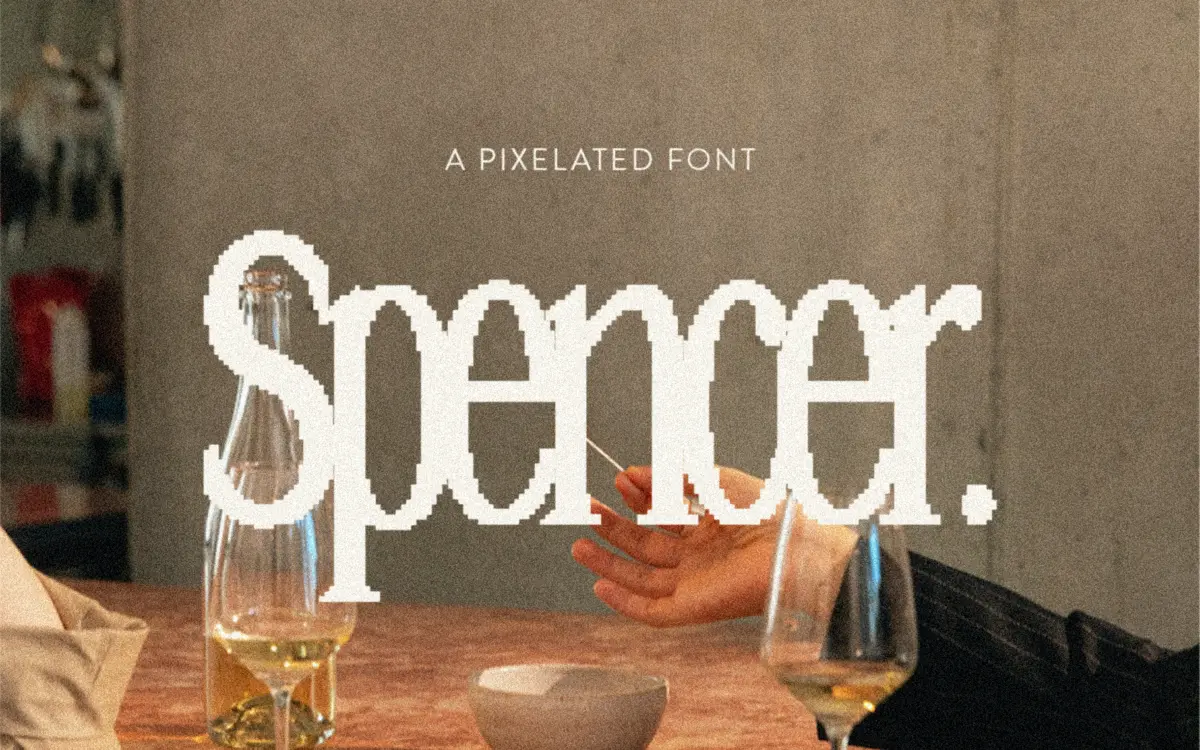
Spencer takes the idea of a serif and runs it through a low-resolution filter. The letterforms are built from stepped, blocky segments that suggest a bitmap font, but the underlying skeleton is a tall, narrow serif rather than a sans grid. Serifs are reduced to small squared-off nubs, and the stroke contrast that would normally come from thick-to-thin transitions is instead implied through the staircase edges of the pixels. It’s a deliberate, slightly gimmicky effect, and it works because the proportions underneath are disciplined: the condensed width and consistent x-height keep the pixelation from reading as noise.
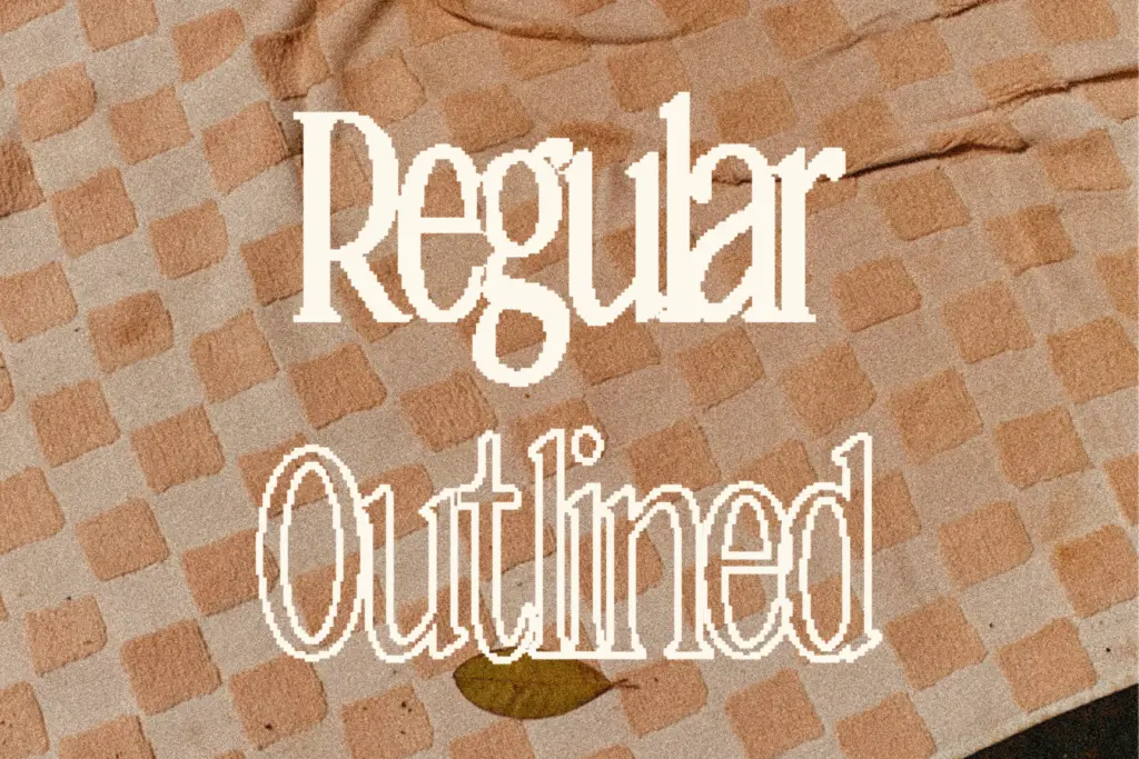
The regular style has filled counters, while the outlined companion strips the letters down to their stepped contours only, which changes the personality quite a bit — regular reads dense and heavy, outline reads more like a technical diagram of the same word. Both share the same underlying pixel grid, so they line up cleanly when stacked or layered against each other.

Character set and features
Spencer comes as two separate styles, Regular and Outlined, each supplied in the standard web and desktop formats. There’s no weight range and no italic, so what you see in the two cuts is the full stylistic scope of the family. That’s fine given what the font is trying to do — a pixel serif doesn’t really need a light weight — but it does mean you’re locked into one texture per style, with no way to soften or intensify the effect through weight alone.
Because the letterforms are built on a fixed grid, the pixel steps are consistent across the alphabet, which helps rhythm at a glance, but it also means some letters (round ones especially) look chunkier than others since curves have to be approximated in right angles. That’s an inherent trade-off of the genre rather than a flaw specific to this drawing, and Spencer handles it with reasonable consistency — no single letter jumps out as noticeably clumsier than its neighbours.
Use cases
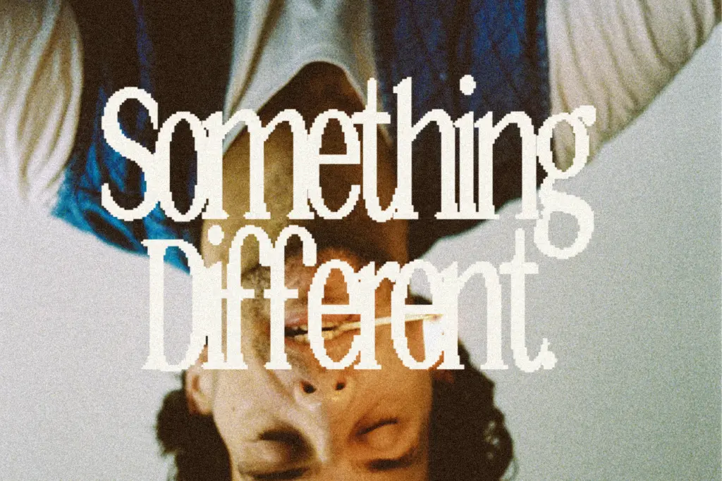
This is a display font, full stop, and it knows it. At large sizes — headlines, cover typography, social graphics, short logotypes — the pixel treatment reads clearly as a stylistic choice rather than a rendering error. Set it small and the effect collapses into mush, since the pixel steps compete with the letter shapes for attention at a scale where neither can be resolved. Keep it to a handful of words per composition.
The tall, narrow proportions make it useful for vertical spaces: book spines, Instagram story headers, magazine mastheads, packaging that needs a short word to carry visual weight without taking up much horizontal room. The outlined version is worth having specifically for layering — outline over a photo, regular for the solid version underneath, or the two combined for a shadow effect. Pair it with a plain, quiet body text elsewhere in the layout, since Spencer supplies all the personality a piece of design needs on its own and doesn’t want competition from another characterful face nearby.
What we liked, and what we didn’t
Strengths
- The stepped pixel treatment stays consistent across the alphabet rather than favouring some letters over others.
- Regular and outlined styles share the same grid, so they layer and stack cleanly together.
- Tall, narrow proportions suit vertical spaces like spines and story headers where horizontal room is tight.
Trade-offs
- No weight range or italic means the stylistic scope is limited to two fixed textures.
- Legibility collapses quickly below display sizes, so it's unusable for anything resembling body text.
Spencer is a narrow, tall pixel serif that does one job well: loud, short-word display type with a retro-digital edge. It has no range beyond that job, and it falls apart at small sizes, but for headlines, logos, and social graphics it delivers a distinct, consistent texture.

Tmfonts writes independent reviews of typefaces: what each font does well, where it falls short, what it suits, and where it is sold.