Sans Serif
3.7
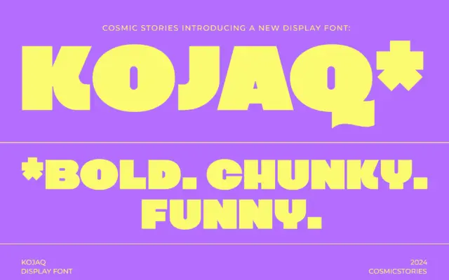
KOJAQ: a heavyweight extra-bold sans for headlines that need to shout
Design style KOJAQ is an extra-bold sans built around thick, even strokes and tight counters. The weight sits at the…
 Tmfonts

Design style KOJAQ is an extra-bold sans built around thick, even strokes and tight counters. The weight sits at the…
Tmfonts
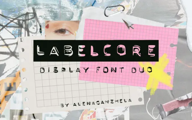
Design style LABELCORE takes its cue from the embossed plastic tape of handheld label makers — the kind of lettering…
Tmfonts
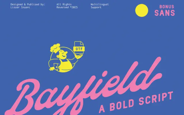
Design style Bayfield is a two-piece family: a thick, bouncy script and a plain, no-fuss sans serif built to sit…
Tmfonts
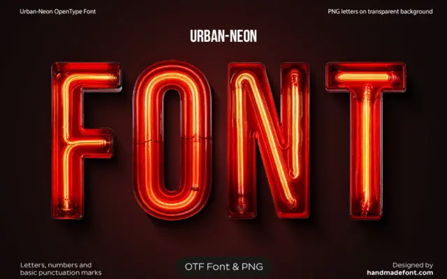
Design style Urban Neon Font is a novelty display typeface built to mimic bent-tube signage rather than to behave like…
Tmfonts
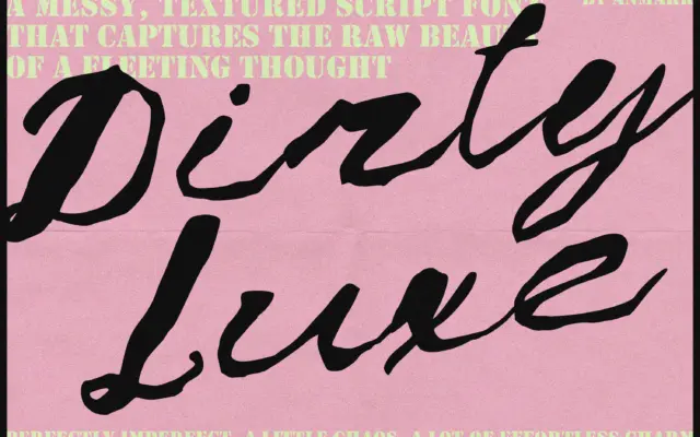
Design style Dirty Luxe sits in the current wave of deliberately rough scripts, where the pitch is imperfection rather than…
Tmfonts
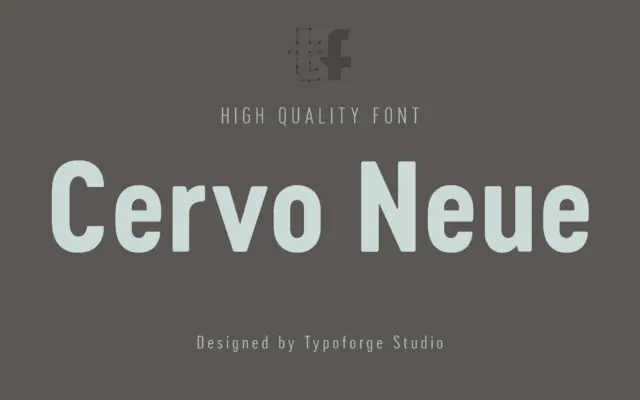
Design style Cervo Neue draws from an unlikely source: a Polish lifestyle monthly published between 1960 and 1973. That lineage…
Tmfonts
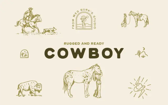
Design style Cowboy Standard is a hand-drawn sans-serif with its roots firmly in western and southwestern visual culture. The strokes…
Tmfonts
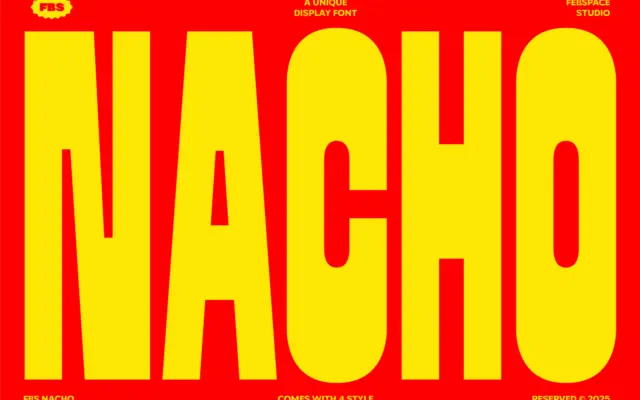
Design style FBS Nacho is a heavyweight display sans that leans into thick, blunt strokes and a tight, almost blocky…
Tmfonts
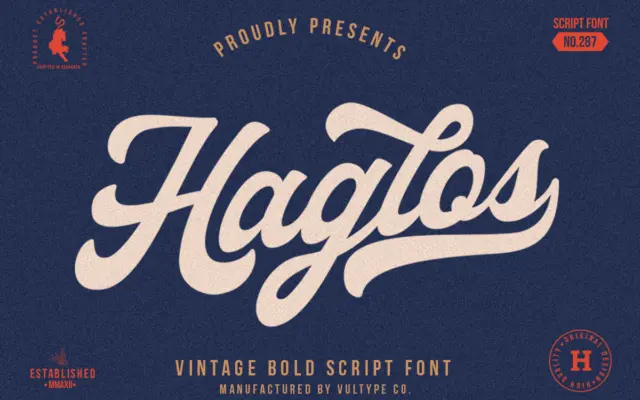
Design style Haglos Bold Script sits in the thick-brush, American-vintage lane that’s been well worked over the last decade, but…
Tmfonts