Slab Serif
3.7
Upstate: A Collegiate Slab Serif for Team Names and Varsity Logos
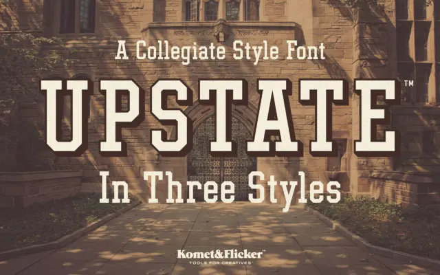
Design style Upstate is built on the same bones as old varsity block lettering: thick, squared-off slabs, angular joins, and…
 Tmfonts

Design style Upstate is built on the same bones as old varsity block lettering: thick, squared-off slabs, angular joins, and…
Tmfonts
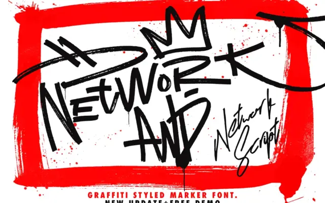
Design style Network sits somewhere between a graffiti tag and a felt-marker signature. The strokes have the slightly ragged, pressure-varied…
Tmfonts
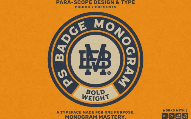
Design style PS Badge Monogram Bold belongs to a small, useful genre: typefaces built not to set words but to…
Tmfonts
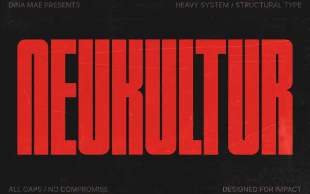
Design style NEUKULTUR is a bold, compressed, all-caps display face built for situations where horizontal space is scarce and the…
Tmfonts
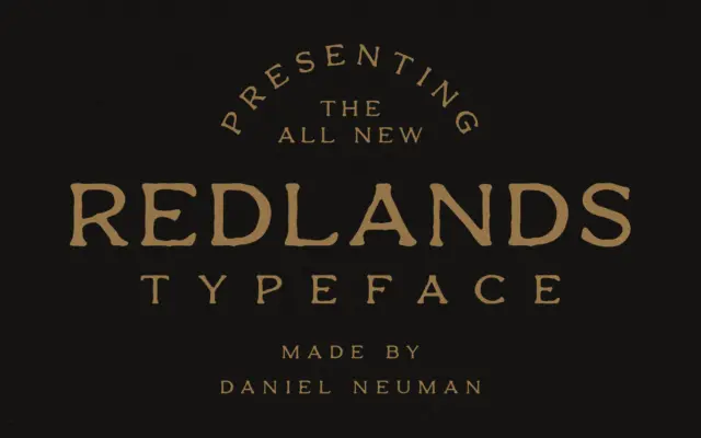
Design style Redlands sits squarely in the western/vintage-outdoor lane, but it does it through a duo rather than a single…
Tmfonts
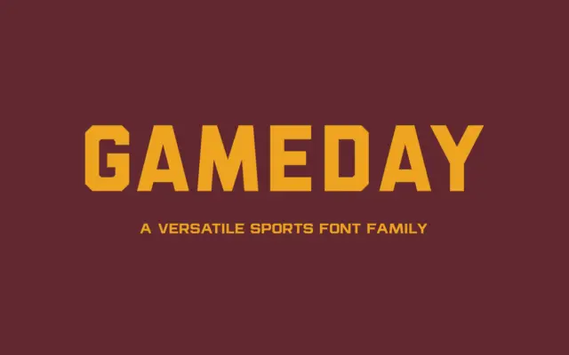
Design style Gameday sits squarely in the athletic-lettering tradition — the kind of sans you see stitched onto jerseys, stencilled…
Tmfonts
Design style Sardin Rounded Bold sits squarely in the bubbly, thick-stroke sans lineage that traces back to 90s cartoon lettering…
Tmfonts
Design style Pieno is a bold, hand-drawn display face that leans into a mid-century, slightly childish energy without going full…
Tmfonts
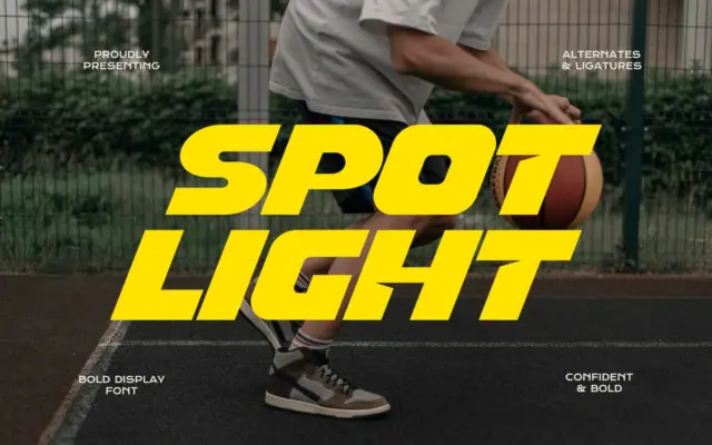
Design style Spot Light is a wide, heavily bolded sans with a forward slant baked into the letterforms rather than…
Tmfonts