
Network: a marker-brush script for graffiti-flavoured branding
Design style
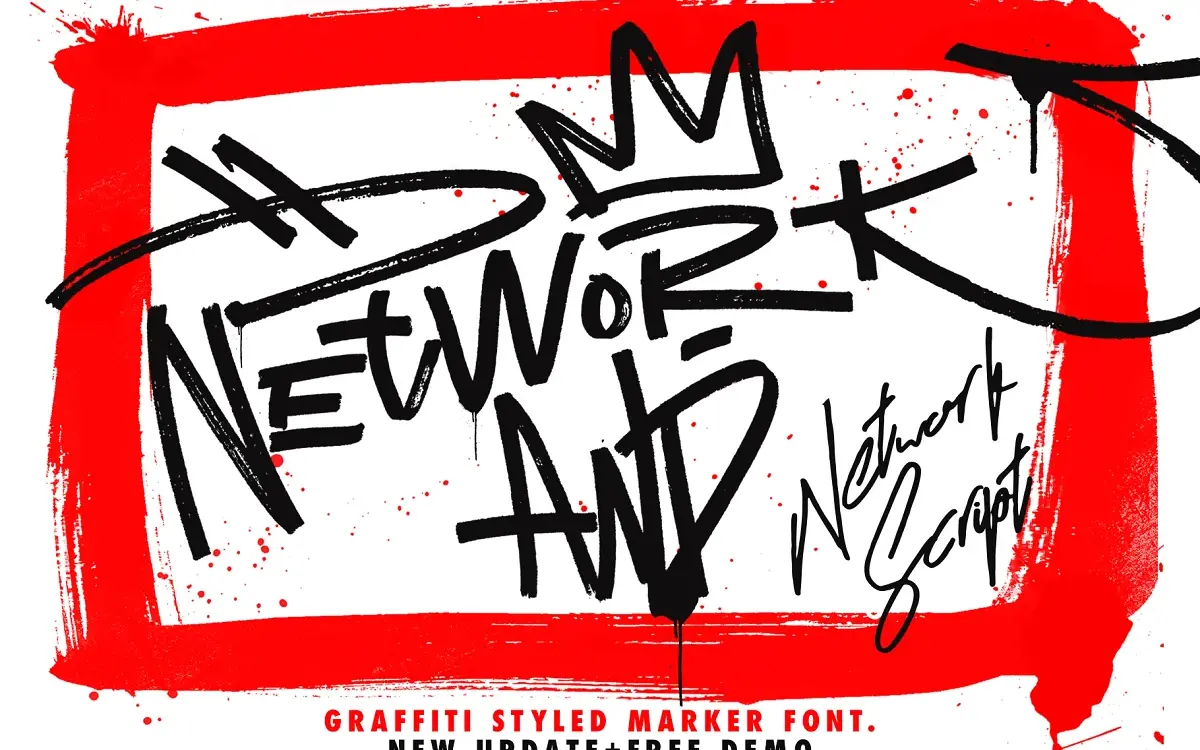
Network sits somewhere between a graffiti tag and a felt-marker signature. The strokes have the slightly ragged, pressure-varied edge of a broad marker dragged fast across paper, rather than the clean vector taper you get in most script fonts. Letters lean forward, connect loosely, and carry the kind of overshoot and ink-trap irregularity that reads as handmade rather than plotted. It’s an unapologetically urban, street-lettering aesthetic — closer to what you’d see sprayed on a wall or scrawled across a skate deck than anything intended for a formal invitation suite.
The package includes several related files rather than a single weight: a base font, plus alternate and swash versions labelled Alt, Balt and Calt. That structure suggests the designer built this as a small system of variant letterforms rather than one static face, which is the right call for a script this loose — swapping in alternates lets you break up repeated letters and avoid the flat, stamped-out look that plagues single-style handwriting fonts.
Character set and features
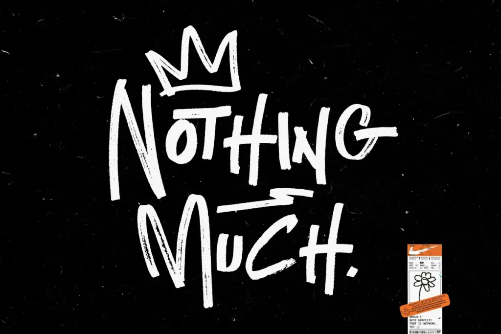
The core alphabet covers uppercase and lowercase in the expected marker-script manner, with the alternates existing specifically to vary repeated characters and add swash flourishes to word starts and endings. The six included spray textures are a genuine extra — they let you apply a grungy, aerosol-can surface to the letterforms rather than leaving them as flat vector shapes, which matters a lot for a font this rooted in graffiti reference. Without that texture option, a marker script this loose can look oddly sterile once it’s set in a clean digital layout; with it, the letters at least gesture toward their physical inspiration.
Because the designer positions this as a signature-style font family rather than a single cut, expect some inconsistency in how the alternates knit together — that’s the nature of hand-lettered scripts assembled from several source files rather than one unified drawing pass. Don’t expect deep multilingual coverage or an extensive ligature system; this reads as a display script built for short bursts of text, not long-form typesetting.

Use cases
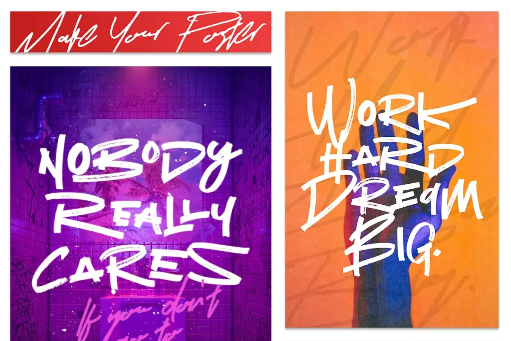
Network is built for exactly the kind of work its name and tags suggest: streetwear and t-shirt graphics, sale banners, shop and web banner headlines, logo marks that want a scrappy, self-made signature feel. It’s a strong pick for brands trying to signal authenticity or a DIY, skate-and-spray heritage — a single word set large, with the spray texture applied, does a lot of the visual work a brief like that usually asks for. It also has an obvious use in badge-style logotypes where a signature or tag mark is the whole point.
It’s a poor fit for anything requiring sustained readability at small sizes or in body copy — the connected, marker-blob strokes get muddy fast below display sizes. It’s also not a font for restrained, minimal branding; the graffiti reference is loud and specific, and it will fight against any layout trying to feel quiet or classic. Used at large sizes, for short words, with the texture options in play, it does its one job convincingly.
What we liked, and what we didn’t
Strengths
- Alternate letter sets let you vary repeated characters instead of a flat, repetitive look
- Six spray textures give the letterforms a genuine aerosol surface rather than a flat vector outline
- Strong, specific fit for streetwear, graffiti-referencing and signature-style logo work
Trade-offs
- Loses legibility fast below display sizes, so it's unsuitable for body text or dense layouts
- The graffiti aesthetic is narrow and won't suit brands aiming for a quiet or classic feel
Network delivers a convincing marker-and-spray graffiti script with enough alternates and texture options to avoid looking stamped-out. It's a niche display tool built for logos, streetwear graphics and banners, not for text-heavy work or restrained branding.
Verdict

Tmfonts reviews typefaces in depth — every font is tested in real branding, editorial and screen layouts before a word gets written. 555+ fonts reviewed and counting.