
NT Fabulous: a high-contrast serif for fashion and editorial branding
Design style
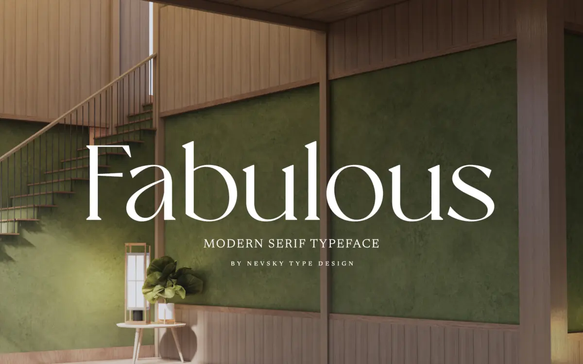
NT Fabulous belongs to the current wave of high-contrast serifs built for luxury and fashion branding, where thin hairline strokes meet thick stems and the whole thing reads as expensive at a glance. The contrast is aggressive rather than restrained: verticals swell to a heavy stress while horizontals and connecting curves thin out almost to nothing. That pushes it firmly into display territory. Terminals are sharp, bracketing is minimal, and the overall skeleton leans on a classic Didone structure without copying one directly. It has a cool, editorial temperament rather than a warm, bookish one.
The rhythm across a word is deliberately uneven — some letters feel narrow and clipped, others open and generous — which gives headlines a bit of syncopation instead of a flat, mechanical march. That’s a stylistic choice that works in short bursts and gets fatiguing over longer stretches.
Character set and features
The seller states that NT Fabulous supports over 200 Latin-based languages, so multilingual reach on European markets should be well covered, though exact diacritic handling is worth checking against your specific language before committing to a large-scale rollout. Beyond the base alphabet, the kind of extras a fashion-brand typeface tends to include — small caps, ligatures, alternate characters — aren’t detailed in the brief, so treat the character set as competent and Latin-focused rather than exhaustively featured until proven otherwise in the specimen.
What is clear from the letterforms themselves is that this is a single-purpose contrast serif, not a flexible workhorse family with multiple optical sizes. There’s no indication of a text-weight companion cut for small sizes, and the thin hairlines are the first thing to suffer if you try to push this down to body copy.
Use cases
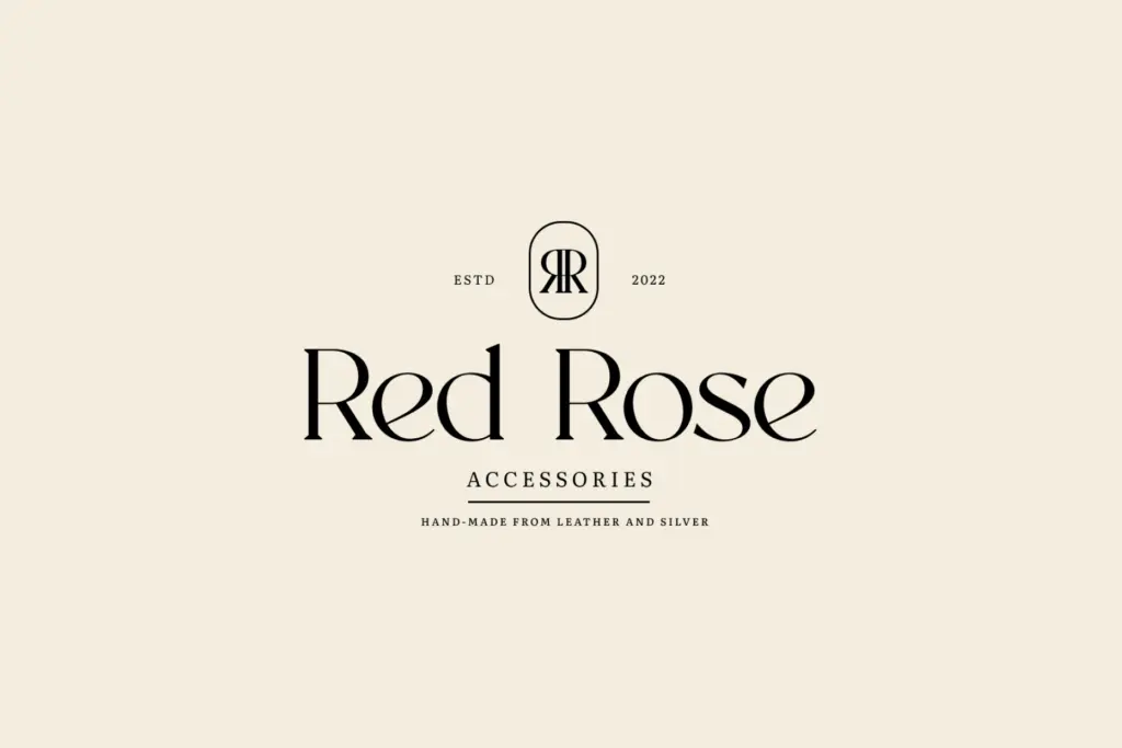
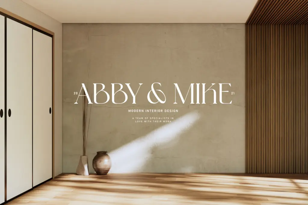
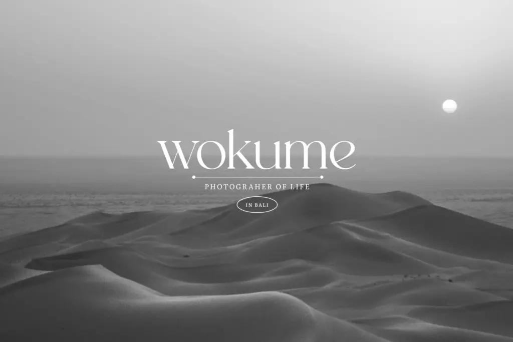
This is a logotype and headline font first. It suits fashion branding, beauty packaging, magazine mastheads, and the kind of invitation or cover design where a few large, elegant words carry the whole composition. Wordmarks for boutiques, perfume lines, and editorial mastheads are the obvious home for it — anywhere the brand wants to signal taste through typography rather than through illustration or colour.
It is less useful as a paragraph face. The contrast that makes it striking at 80pt becomes a liability at 10pt, where hairlines can drop out on lower-resolution screens or lower-quality print stock. Pair it with a plain sans or a low-contrast serif for supporting text and reserve NT Fabulous for the words that need to do the selling — a product name, a headline, a monogram. Used that way, in generous sizes with enough negative space around it, it does its job convincingly.
What we liked, and what we didn’t
Strengths
- Sharp, confident contrast gives wordmarks an immediate luxury feel
- Uneven letter rhythm adds character to short headlines
- Broad Latin-based language support noted by the foundry
Trade-offs
- Hairline strokes lose definition at small sizes or on lower-quality print
- No apparent text-weight companion for longer copy
NT Fabulous is a competent high-contrast display serif that does one job well: giving fashion and luxury brands a striking wordmark. It's not built for text, and buyers should pair it rather than build a whole layout system around it.
Verdict

Tmfonts reviews typefaces in depth — every font is tested in real branding, editorial and screen layouts before a word gets written. 555+ fonts reviewed and counting.