
Hello Bride: a calligraphic script built for wedding stationery
Design style
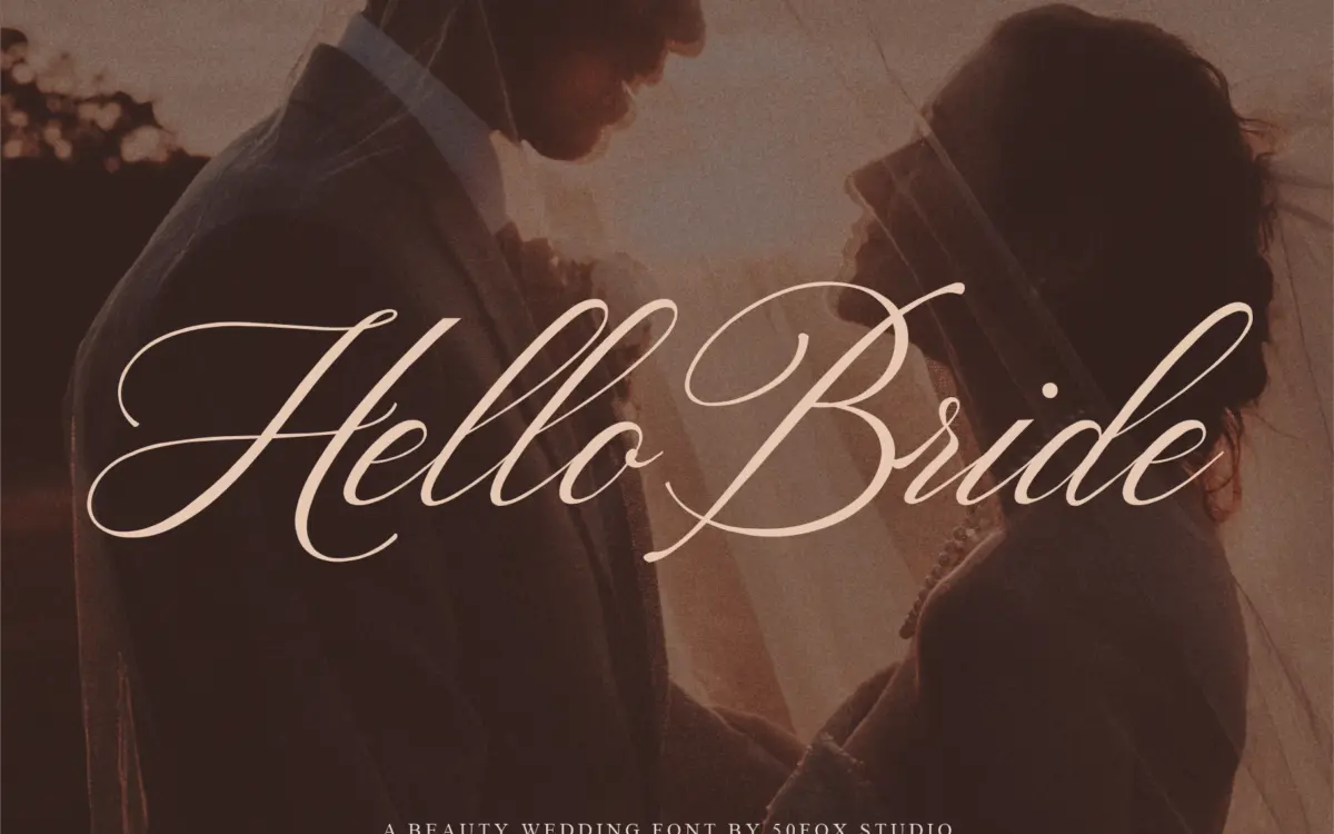
Hello Bride sits squarely in the modern calligraphy camp that dominates wedding stationery right now: a slanted, connected script with a brush-pen feel, tapering strokes and a fairly high degree of flourish. The letters lean toward the traditional side of that trend rather than the loose, sketchy end — strokes are confident and consistent rather than deliberately wobbly, which gives the face a more composed, formal air than some of its competitors in the same category.
The joins between letters are the strongest part of the design. Rather than relying on a single connecting stroke repeated mechanically, the lowercase shows some variation in how letters meet, which keeps long words from reading as a rigid chain. Ascenders and descenders extend generously, and a handful of capitals carry extra swash weight that’s clearly meant for the first letter of a name or a monogram rather than for running text. It reads as handwritten without pretending to be casual — the kind of script you’d expect on a save-the-date rather than a birthday card.
Character set and features
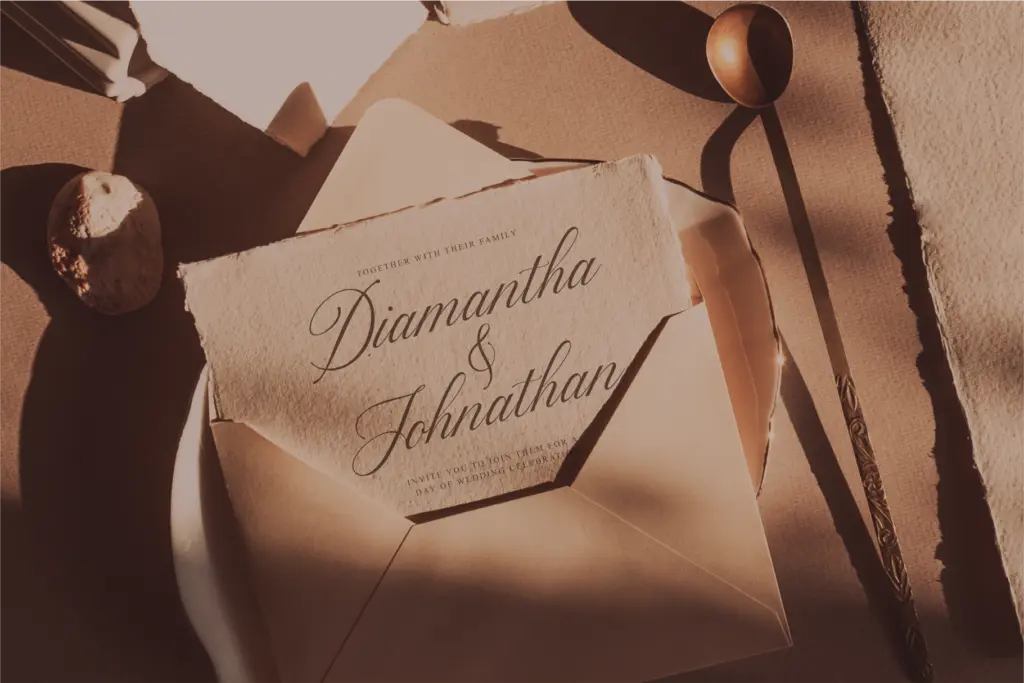
The seller notes a large set of ligatures and alternate characters, and that’s really the operative feature here — scripts like this live or die on how well they handle repeated letter combinations without looking mechanical. Alternates give you a way to swap out a double letter or an awkward pairing for something that sits better in context, and the ligature set suggests the designer anticipated the usual trouble spots in English wedding vocabulary — names,
Verdict

Tmfonts reviews typefaces in depth — every font is tested in real branding, editorial and screen layouts before a word gets written. 555+ fonts reviewed and counting.