
Augustine: a rustic monospaced script for weathered, hand-lettered branding
Design style
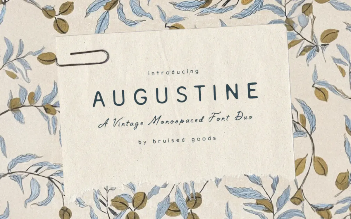
Augustine sits at an odd but interesting crossing point: a handwritten script built on a monospaced skeleton. Every character occupies the same horizontal width, which is unusual for anything claiming to look hand-lettered, and it gives the face a ticking, typewriter-like rhythm underneath its loose, inked strokes. The letters wobble and lean the way real handwriting does, with inconsistent baselines and thick-to-thin transitions that read as pen pressure rather than programmed contrast.
The name-check to Saint Augustine, Florida comes through in the finish more than the letterforms themselves — there’s a sun-bleached, salt-air quality to the strokes, slightly broken at the terminals as if drawn with a worn nib. It isn’t polished modern calligraphy. It’s closer to a postcard scrawled in a beach town, or a chalkboard menu that’s been rewritten a hundred times. That rough, imperfect character is the whole appeal, and also the thing that limits it.
Character set and features
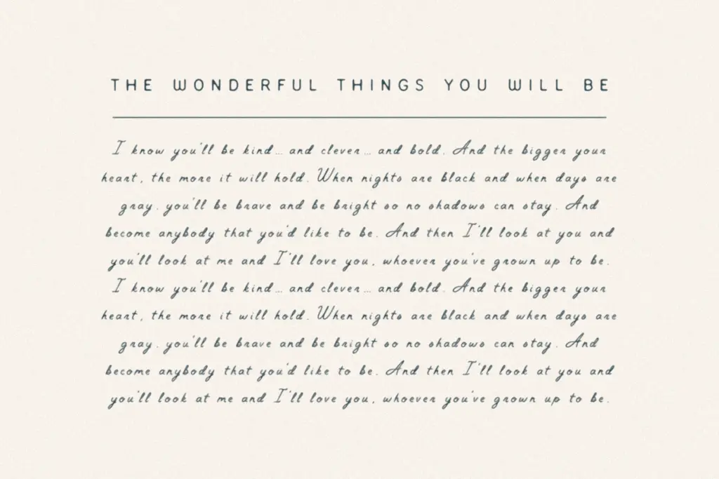
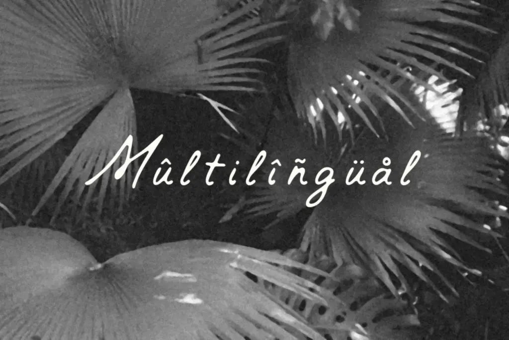
The set runs to 360 glyphs — uppercase and lowercase, numerals, punctuation, and a reasonable spread of symbols — with language support covering Danish, English, French, German, Irish, Italian, Portuguese, Spanish, Swedish, and Swiss German. That’s enough diacritic coverage to handle most Western European copy without falling over on accented characters, which matters more than people expect once a script font gets dropped into real client work.
Because it’s monospaced, kerning is fixed rather than hand-tuned per pair, so tight, calligraphic ligatures of the kind you see in more traditional script faces aren’t part of the package here. What you get instead is even, predictable spacing — useful for lining text up in a grid or a table, less useful if you want letters to flow into each other with the intimacy that scripts usually promise. It reads more as a hand-drawn alternative to a typewriter face than a hand-drawn alternative to copperplate.
Use cases
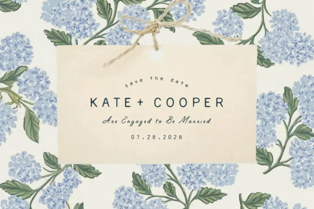
Short lines are where Augustine works best: a logotype, a one-word product name, a header on an invitation, a line of copy on packaging. The monospacing gives it an odd charm in these contexts — think a rustic apparel tag or a small-batch label, where the fixed-width rhythm reads as intentional rather than robotic. Wedding stationery briefs asking for something
What we liked, and what we didn’t
Strengths
- The monospaced structure gives it a distinctive, ticking rhythm rarely seen in script fonts
- Weathered, uneven strokes read as genuinely hand-drawn rather than templated
- Solid diacritic coverage across ten Western European languages
Trade-offs
- Fixed-width spacing fights against the natural flow expected of a script once set in longer lines
- Lack of hand-tuned kerning pairs means it can't offer the tight ligature work found in more traditional calligraphic faces
Augustine is a handwritten face with a genuinely odd twist — monospacing under a rustic, hand-inked script. It has real character in short bursts but the fixed-width rhythm undercuts the natural feel of handwriting once you set more than a line or two.
Verdict

Tmfonts reviews typefaces in depth — every font is tested in real branding, editorial and screen layouts before a word gets written. 555+ fonts reviewed and counting.