
Salome Nomadic: a sun-worn handwritten serif for boho branding
Design style
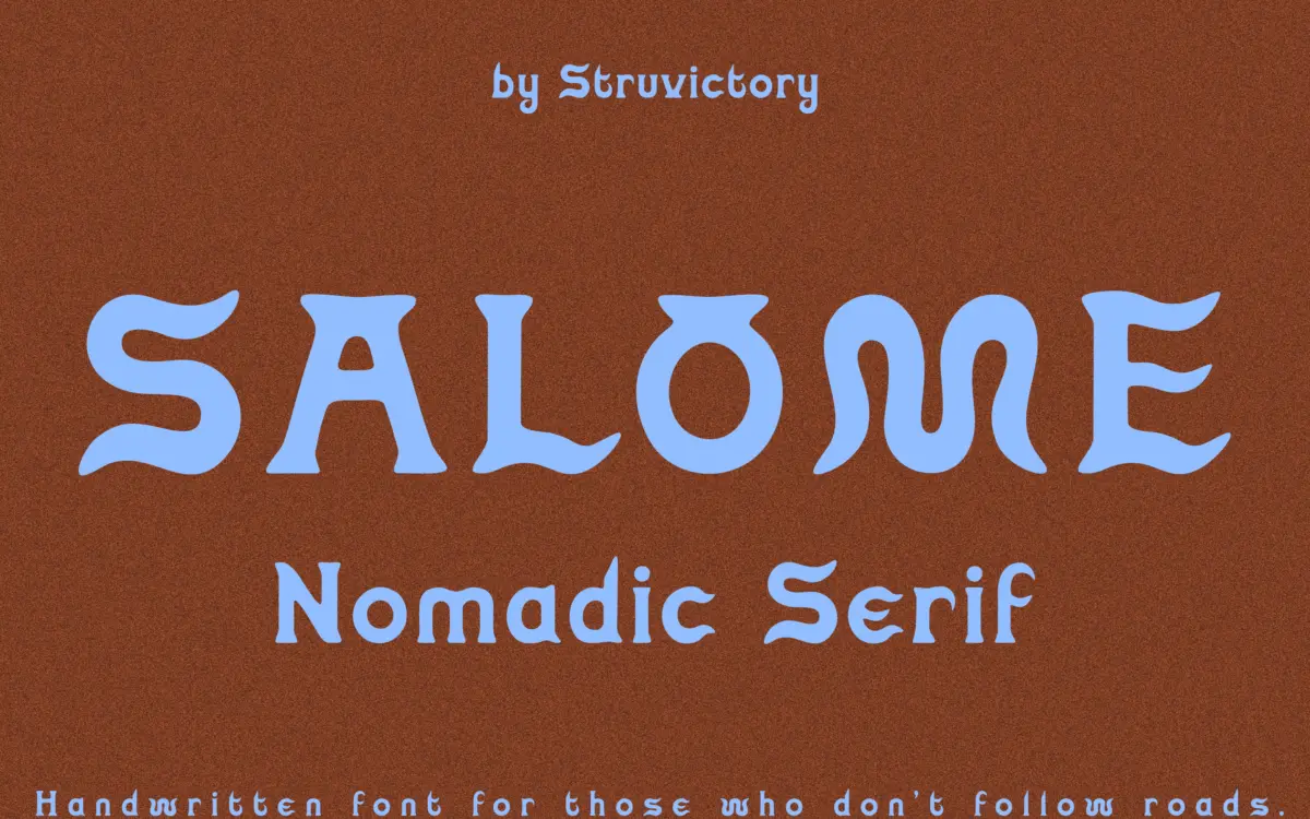
Salome Nomadic sits somewhere between a handwritten script and a serif, which is an odd combination on paper but reads clearly once you see it. The letters are tall and narrow, drawn with a dry, slightly broken line that suggests a brush running low on ink rather than a smooth pen. Curves lean and wobble just enough to feel made by hand, not generated. Serifs appear as small flicks rather than formal strokes, more gestural than structural.
The overall mood is dusty and unpolished on purpose. It doesn’t chase the tidy femininity of most handwritten scripts on the market; instead it goes for something drier and more weathered, which is presumably where the ‘nomadic’ framing comes from. It won’t suit every brief that wants a script, but it has a clear point of view rather than being another generic loopy alternative.
Character set and features
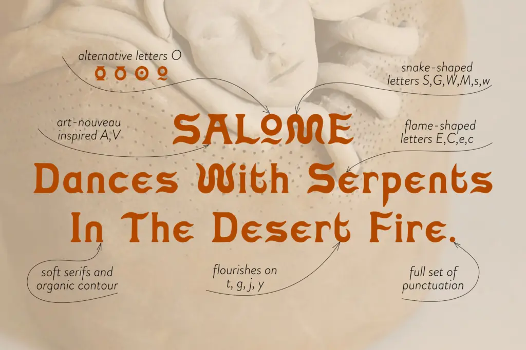
The face includes stylistic alternates for the letter O, which is a welcome inclusion given how often that single letterform gets repeated in a logotype or a short headline — swapping alternates lets you avoid three identical O shapes sitting next to each other. Latin language support covers the common European diacritics, so it should hold up for most Western European branding jobs without falling over on accented characters.
Because this is a display face built for word marks rather than paragraphs, don’t expect a large range of ligatures or contextual alternates beyond that single letter swap. The x-height is tall relative to the ascenders and descenders, which gives individual words a distinctive silhouette but also means tight leading in multi-line settings can start to look cramped. Kerning at very small sizes needs a careful eye — the imperfections that make it charming at 60px become mushy at 10px.
Use cases
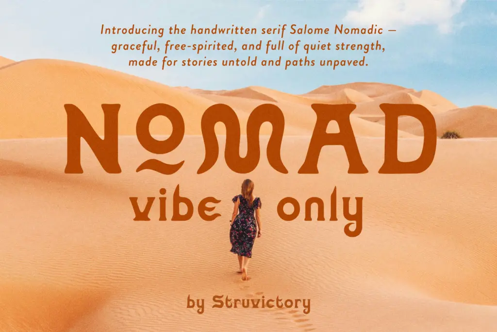
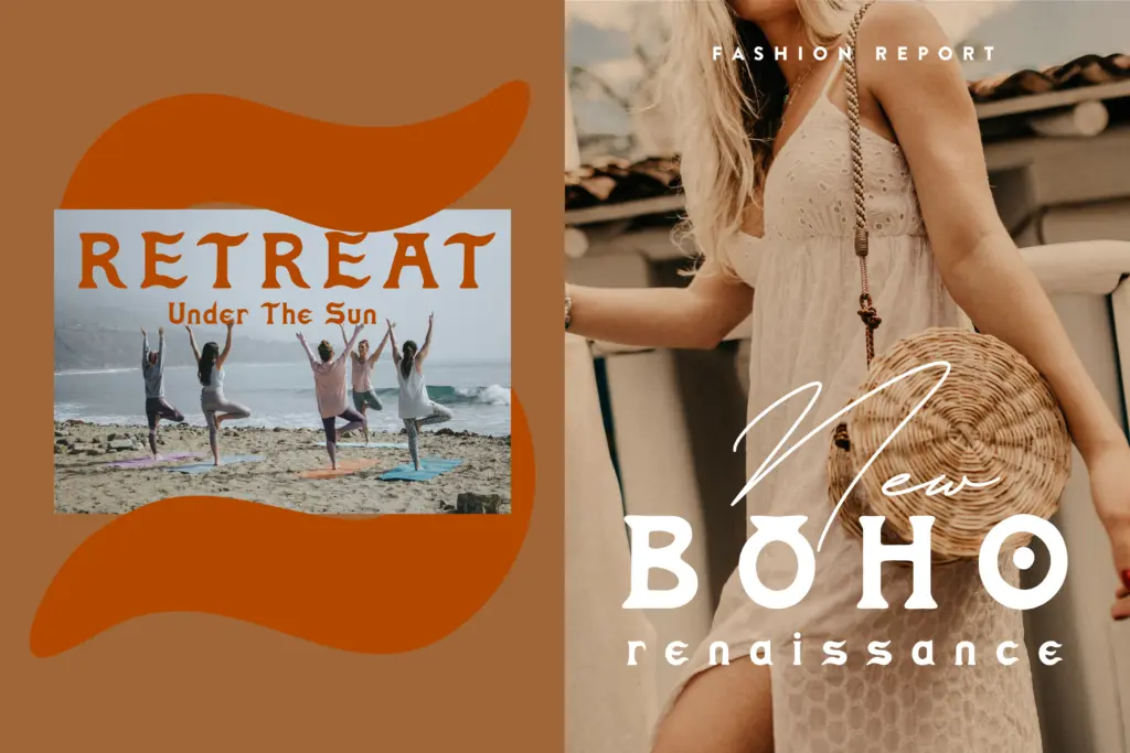
This is a logo and headline font first, and it’s honest about that. It works well set large: a brand name on a packaging label, a wordmark on a tent flap or a market stall sign, a title on an editorial spread about desert travel or ceramics. The dry, sun-bleached texture suits earthy, tactile categories — pottery studios, glamping outfits, herbalists, candle makers, anything trading on a handmade, unhurried feel.
It is not a body text font and shouldn’t be asked to set anything longer than a line or two. Push it into paragraph settings and the irregularity that reads as personality at large sizes turns into visual noise. Treat it as a signature element — a name, a tagline, a short editorial hed — and pair it with a plain, quiet sans or serif for the supporting text, letting Salome Nomadic do the talking at the top of the page.
What we liked, and what we didn’t
Strengths
- Distinctive dry, sun-worn texture that avoids generic script clichés
- Tall, narrow letterforms give short word marks a strong silhouette
- Stylistic O alternates help break up repetition in short logotypes
Trade-offs
- Falls apart at small sizes where the irregular strokes read as noise
- Not built for anything beyond short headline or logo use
Salome Nomadic has a distinct, dusty handwritten character that suits earthy, boho branding well at large sizes. It's a one-job font — logos, wordmarks, short headlines — and shows its limits quickly outside that role.
Verdict

Tmfonts reviews typefaces in depth — every font is tested in real branding, editorial and screen layouts before a word gets written. 555+ fonts reviewed and counting.