
Armany: A Fluid Sans Serif Display Face for Clean, Modern Branding
Design style
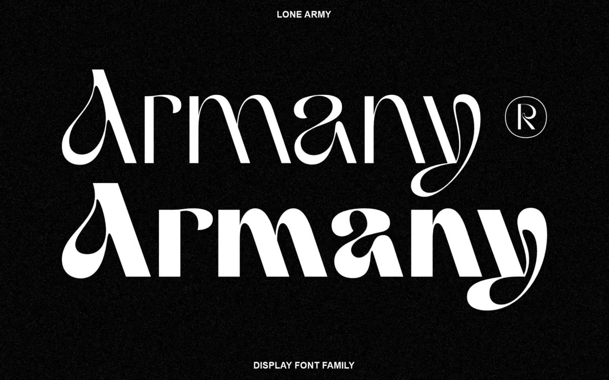
Armany positions itself as a modern sans serif display family with what its maker calls a fluid touch, and that phrase does describe the feel of the letterforms. Rather than the rigid, geometric skeletons common in grotesque display faces, Armany’s curves have a looser, almost hand-guided quality. Terminals are softened rather than cut square, and the transitions between strokes avoid the mechanical uniformity you get from a strict grid-based build. It reads as a sans serif with a script-adjacent sensibility, without actually being a script.
The overall structure stays disciplined. Letters sit on a consistent baseline, x-heights are even, and the family doesn’t wander into decorative excess. That restraint is what keeps it usable as a display face rather than a novelty one. It’s a typeface built for a specific mood — clean, contemporary, slightly organic — rather than one trying to cover every stylistic base.
Character set and features
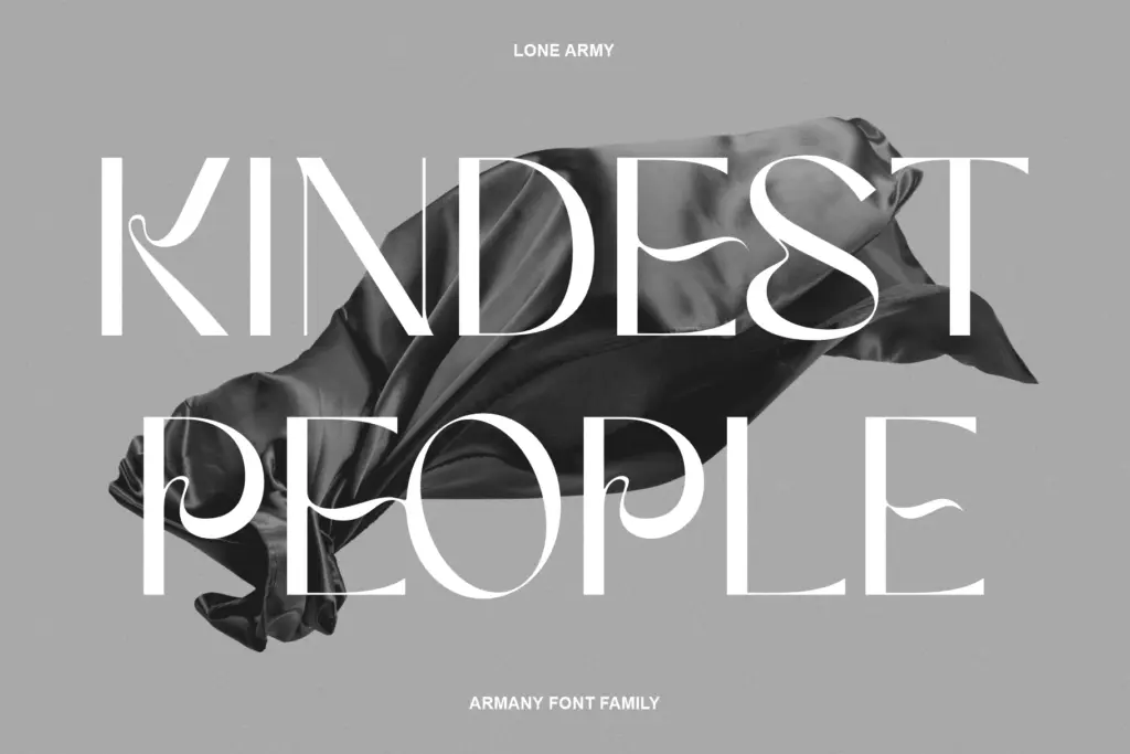
As a display font family, Armany is built to carry headlines and short-form text rather than paragraphs. The character shapes are clearly the focus of the design, with attention paid to how each letter reads on its own rather than how a dense block of them behaves. Users should expect a standard Latin character set covering uppercase, lowercase, numerals and basic punctuation, sized for the kind of short, punchy applications display fonts are typically drawn for.
What’s not specified in the family’s materials — multilingual character coverage, alternate glyphs, ligatures, or OpenType features — shouldn’t be assumed. If your project depends on extended language support or contextual alternates, test the actual character map before committing rather than relying on the product description. What is clear is that the fluid quality of the letterforms is consistent across the set, which matters more for a display face than feature depth; a headline font lives or dies on how its individual letters look together, not on how many stylistic sets it ships with.
Use cases
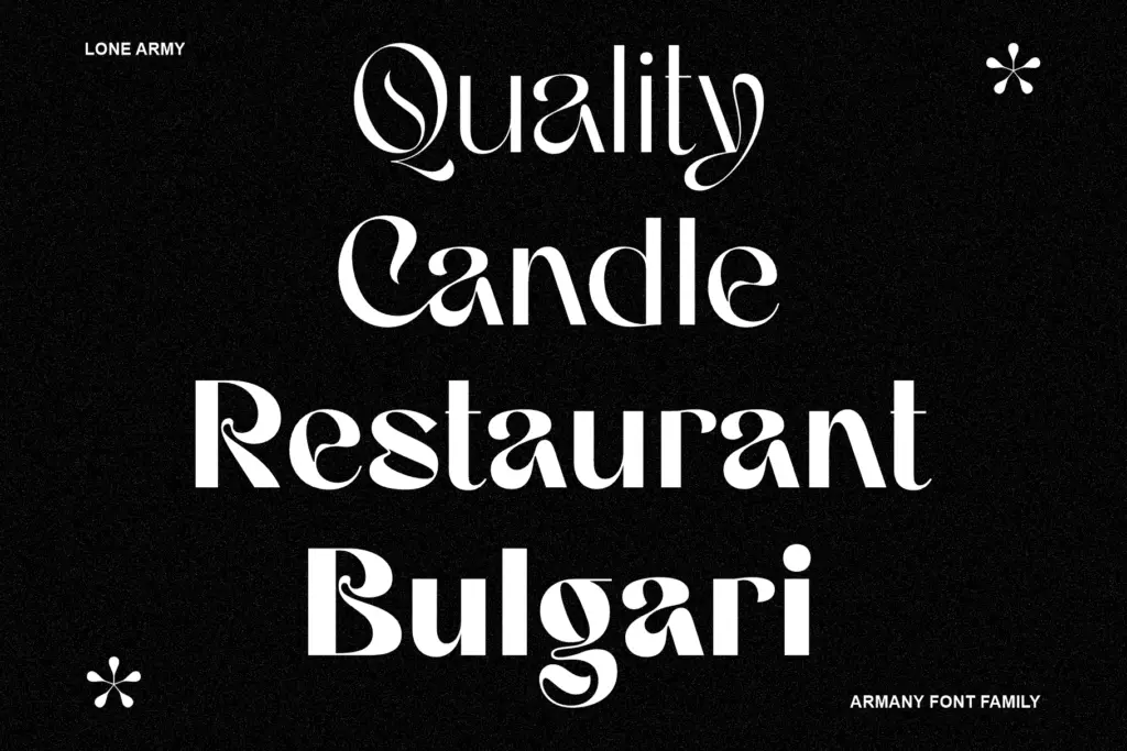
Armany’s natural home is anywhere a brand wants a sans serif that reads as approachable rather than corporate. Logotypes, headline type on websites, packaging call-outs, and short editorial pull quotes are all places where that fluid touch can register without being undermined by heavy body-copy use. It has the kind of personality that works well at large sizes — posters, banners, hero sections — where the softened terminals and looser rhythm are actually visible.
It’s not the right pick for dense text. Display families like this one are drawn with generous spacing and personality-forward shapes that get muddy and slow to read once you shrink them down to paragraph sizes. Pair it with a plainer, more neutral text face for body copy and let Armany handle the headline work it was built for. For branding projects — a wordmark, a set of section headers, an invitation’s main line — it’s a reasonable, fairly low-risk choice, provided the rest of the visual system doesn’t lean on the same softness and end up feeling undifferentiated.
What we liked, and what we didn’t
Strengths
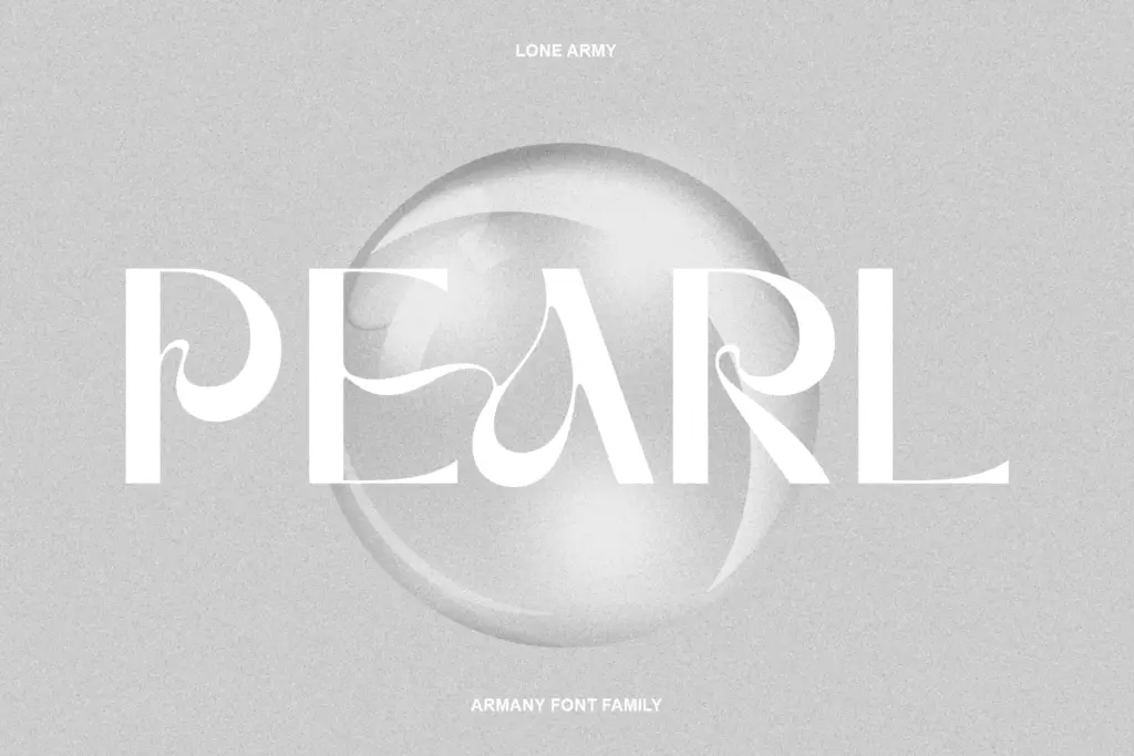
- Softened terminals and fluid curves give it more personality than a standard grotesque display face
- Consistent baseline and even x-height keep it disciplined enough for branding use
- Works well at large sizes such as headlines, posters and logotypes
Trade-offs
- Feature set and language support aren't clearly documented, so extended use cases need testing first
- Not built for body text or dense paragraphs, limiting it to short-form applications
Armany is a competent display sans with a softened, fluid character that suits headlines and branding rather than body text. It doesn't reinvent the genre, but the letterforms hold together at large sizes and avoid feeling generic. Worth considering for wordmarks and short-form display use, less so for anything text-heavy.
Verdict

Tmfonts reviews typefaces in depth — every font is tested in real branding, editorial and screen layouts before a word gets written. 555+ fonts reviewed and counting.