
Dreamies Retro Script: a bold hand-lettered script for vintage-leaning branding
Design style
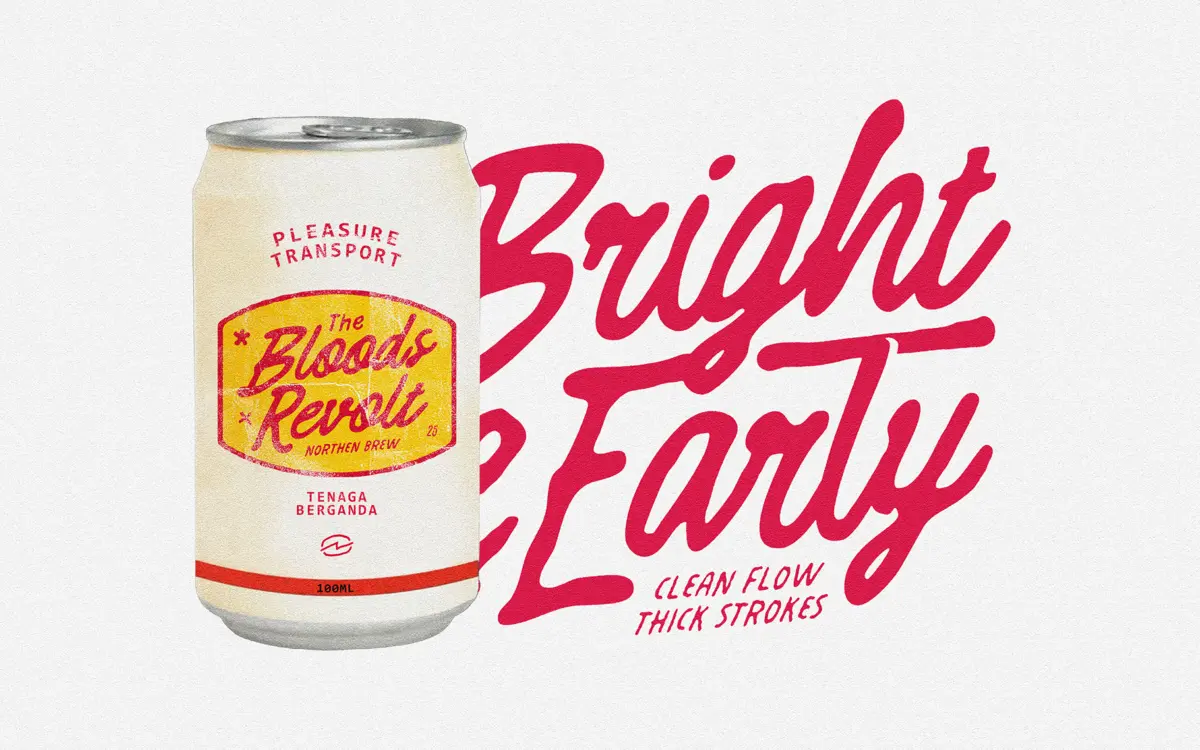
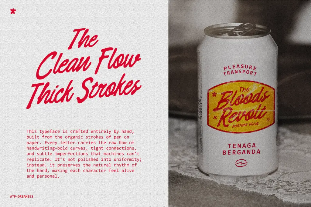
Dreamies Retro Script reads as a genuine hand-lettered script rather than a smoothed-out digital simulation of one. The strokes are thick and confident, built from a broad-nibbed or brush-like tool, and the connections between letters are tight, almost cramped, which gives the face its rushed, signature-like energy. You can see the pen lifting and re-landing in places, and the baseline drifts slightly letter to letter, which is exactly the kind of imperfection that separates a script drawn by hand from one built purely on a grid.
The vintage character comes through in the way the curves bulge and taper unevenly rather than following a mechanical contrast curve. It sits closer to mid-century soda-fountain lettering or hand-painted signage than to formal copperplate or contemporary calligraphy. There’s a warmth to it, but also a bit of grit — this isn’t a delicate script, it’s a stocky one, and that stockiness is the whole personality.
Character set and features
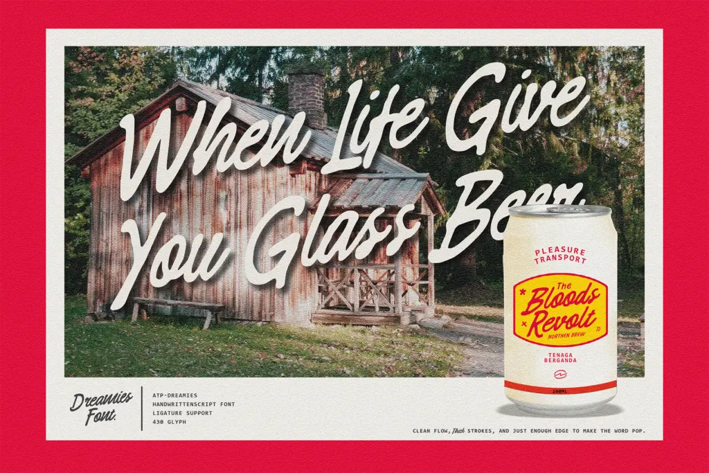
As a script built on connected, flowing strokes, letter fit is doing most of the work here, and for the most part the joins hold together at the intended display sizes. Where a script like this typically runs into trouble is in long words or unusual letter pairs, where the tight connections can start to clot rather than flow — worth testing your actual copy before committing to a layout, particularly with repeated ascenders or descenders sitting close together. There’s no indication in the source material of extended language support or a large glyph set of alternates, so treat this as a Latin-focused, single-weight display script rather than a full working family with swash variants and ligature banks. That’s not a flaw so much as a scope: it does one voice, and it does it with conviction.
Use cases
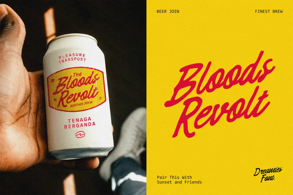
This is a font for short bursts of text where personality matters more than neutrality — a logotype, a badge, a poster headline, a product label that wants to feel handmade rather than corporate. The bold strokes hold up well at large sizes and in reversed-out treatments (light script on a dark ground), which suits packaging and signage work. It’s less suited to anything that needs to run at small sizes or in long lines — a paragraph set in this face will fight itself, with the tight joins turning into visual noise rather than readable rhythm.
Pair it with a plain, quiet sans or slab for supporting text and let the script carry the voice on its own. Western, roadside, and retro-Americana branding are the obvious lanes, but it also works for anything chasing a nostalgic, handcrafted feel — coffee packaging, small-batch goods, event lettering for a themed party or vintage-styled invitation. Don’t reach for it if you need something restrained or corporate; it wants attention and it’s built to give it, not to disappear into the background.
What we liked, and what we didn’t
Strengths
- Genuinely hand-drawn feel with irregular baseline and stroke weight, not a mechanical script simulation
- Thick, confident strokes hold up well at large display sizes and in reversed-out treatments
- Strong fit for vintage, western, and Americana branding where personality is the point
Trade-offs
- Tight letter connections can clot in longer words, so test actual copy before finalising layouts
- Limited to a single display voice with no indication of extended alternates or language support
Dreamies Retro Script delivers a convincingly hand-drawn, mid-century signage feel with real personality in its bold, tight-jointed strokes. It's a strong pick for short display work like logos and badges, but its cramped connections and single-weight scope limit it outside that lane.
Verdict

Tmfonts reviews typefaces in depth — every font is tested in real branding, editorial and screen layouts before a word gets written. 555+ fonts reviewed and counting.