
DRIPHAUS: A Blocky, Chalkboard-Rough Display Font for Coffee Branding
Design style
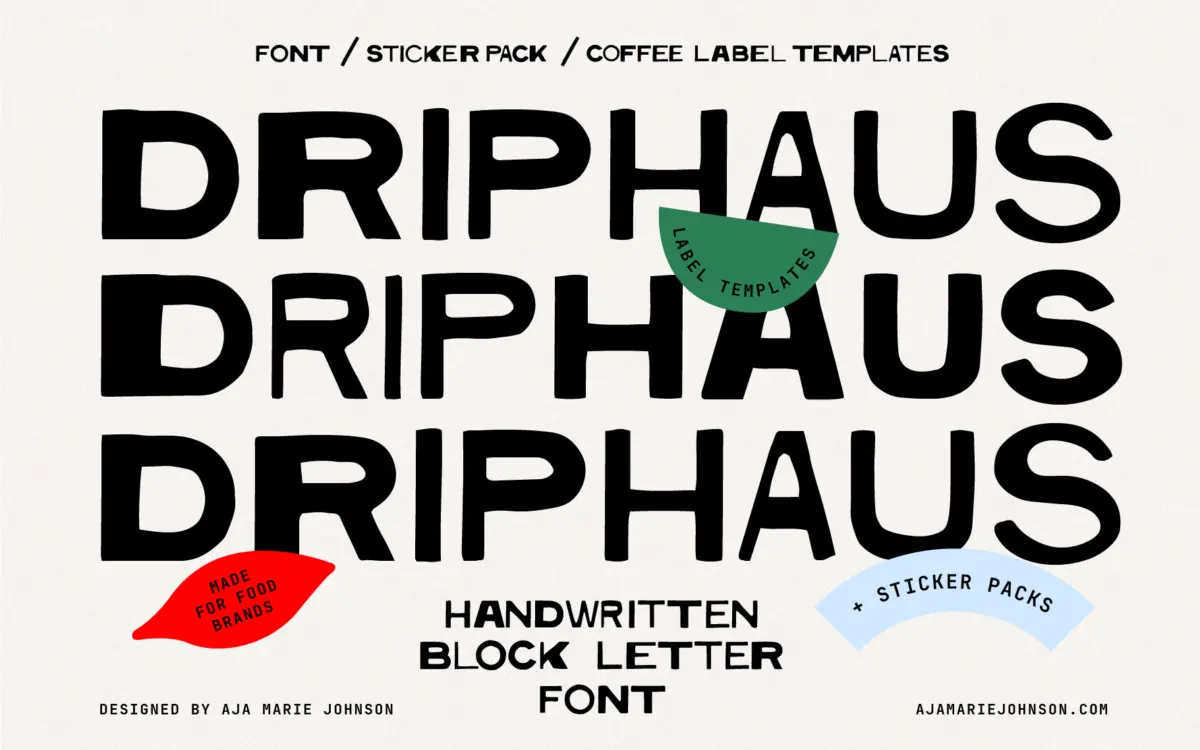
DRIPHAUS is an all-caps display face built from thick, blocky strokes that look like they were painted with a stiff brush rather than drawn with a pen tool. The letterforms are chunky and slightly uneven — corners don’t quite square off, stroke widths wobble a touch from letter to letter, and a few counters (the O, the A) sit a little lopsided. That imperfection is the whole point. It reads like something stenciled onto a chalkboard menu or stamped on a burlap sack, and it earns that comparison honestly rather than faking it with a generic distressed texture filter.
There’s a second style included alongside the main face, which gives you a bit of range without leaving the same handmade-block family. Don’t expect fine detail or nuance here — this is a font built for impact at large sizes, not for careful reading. The irregularities that make it charming at three inches tall will just look messy if you shrink it down too far.
Character set and features
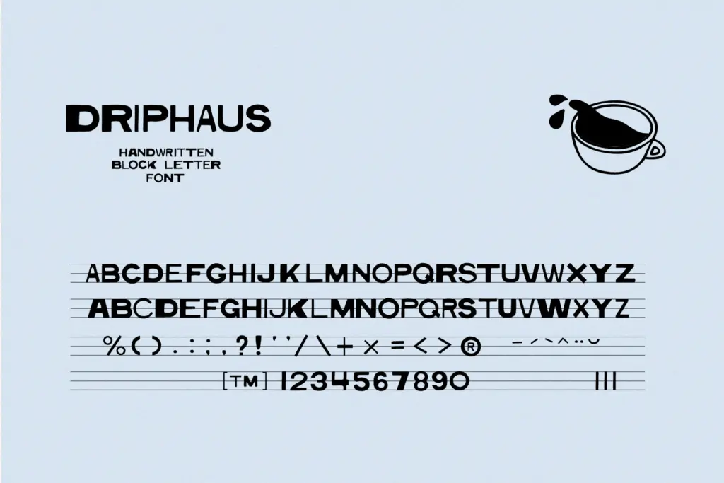
The letterforms are uppercase only, which fits the display-lettering brief but means you’ll need to plan layouts around that limitation rather than expecting a lowercase companion. JetBrains Mono is bundled in as a secondary font for labels — a sensible, no-nonsense monospace that handles small print, ingredient lists, or addresses without competing with DRIPHAUS for attention.
Beyond the typeface files, the kit comes loaded with production-ready assets: a sticker pack, seven-plus logo templates, and label layouts, all delivered as editable Illustrator and AI/EPS files. This is clearly built for people who want to go from typeface to finished packaging mockup in one sitting, not just license a font and start from a blank page. The catch is that you’ll need real Illustrator skills to make the most of it — these aren’t drag-and-drop templates for someone unfamiliar with vector editing, and the files won’t do much for you outside Illustrator.
Use cases
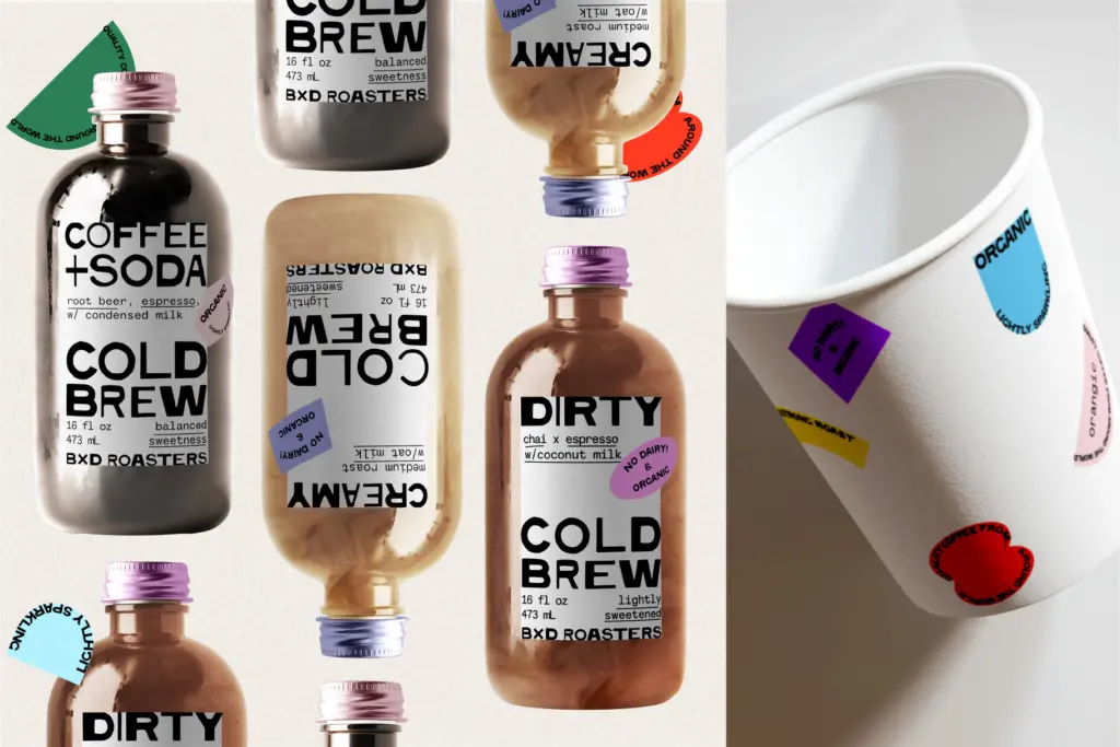
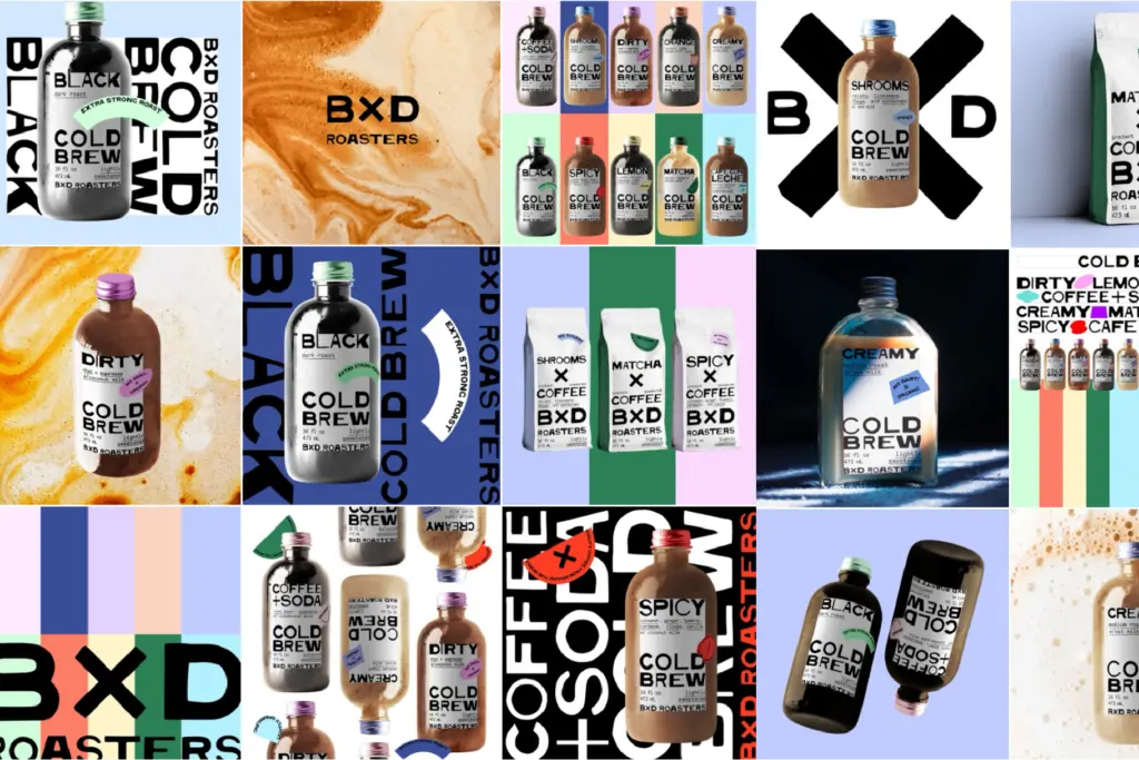
This is squarely a coffee-and-food-branding font, and it’s honest about that rather than pretending to be a general-purpose workhorse. Coffee bag labels, cold brew bottles, café signage, farmers-market packaging, sticker sheets for a small-batch food brand — this is where DRIPHAUS does its job well. The rough-hewn blockiness reads as handmade and artisanal without tipping into cutesy or twee, which is a real trap for this genre of lettering.
It’s less useful anywhere that calls for restraint or refinement — corporate branding, editorial text, anything that needs to feel polished rather than scrappy. And because it’s all caps and fairly heavy, it doesn’t do quiet: every word set in DRIPHAUS shouts a little, so pair it carefully with calmer secondary type (the included JetBrains Mono is a reasonable bet) and don’t ask it to carry paragraphs of copy. Used for a logotype, a bag stamp, or a poster headline, it’s confident and specific. Used for anything that needs to disappear into the background, it’s the wrong tool.
What we liked, and what we didn’t
Strengths
- The intentional roughness feels hand-painted rather than filtered, which is rare in this genre.
- The bundled label templates and sticker pack give you a head start on actual packaging design, not just type samples.
- JetBrains Mono as a secondary font is a smart, practical pairing for small print on labels.
Trade-offs
- All-caps only, so there's no lowercase option for more conversational layouts.
- Best suited to a narrow lane of coffee and artisanal food branding — it won't flex into corporate or editorial work.
DRIPHAUS is a confident, purpose-built display font for coffee and food branding that knows exactly what job it's for and doesn't try to be anything else. The bundled templates add real production value if you know your way around Illustrator, but the font itself is narrow in scope — all caps, heavy, and best kept to headlines and packaging rather than body copy.
Verdict

Tmfonts reviews typefaces in depth — every font is tested in real branding, editorial and screen layouts before a word gets written. 555+ fonts reviewed and counting.