
Cabana Service: a hand-drawn resort font pack for warm, casual branding
Design style
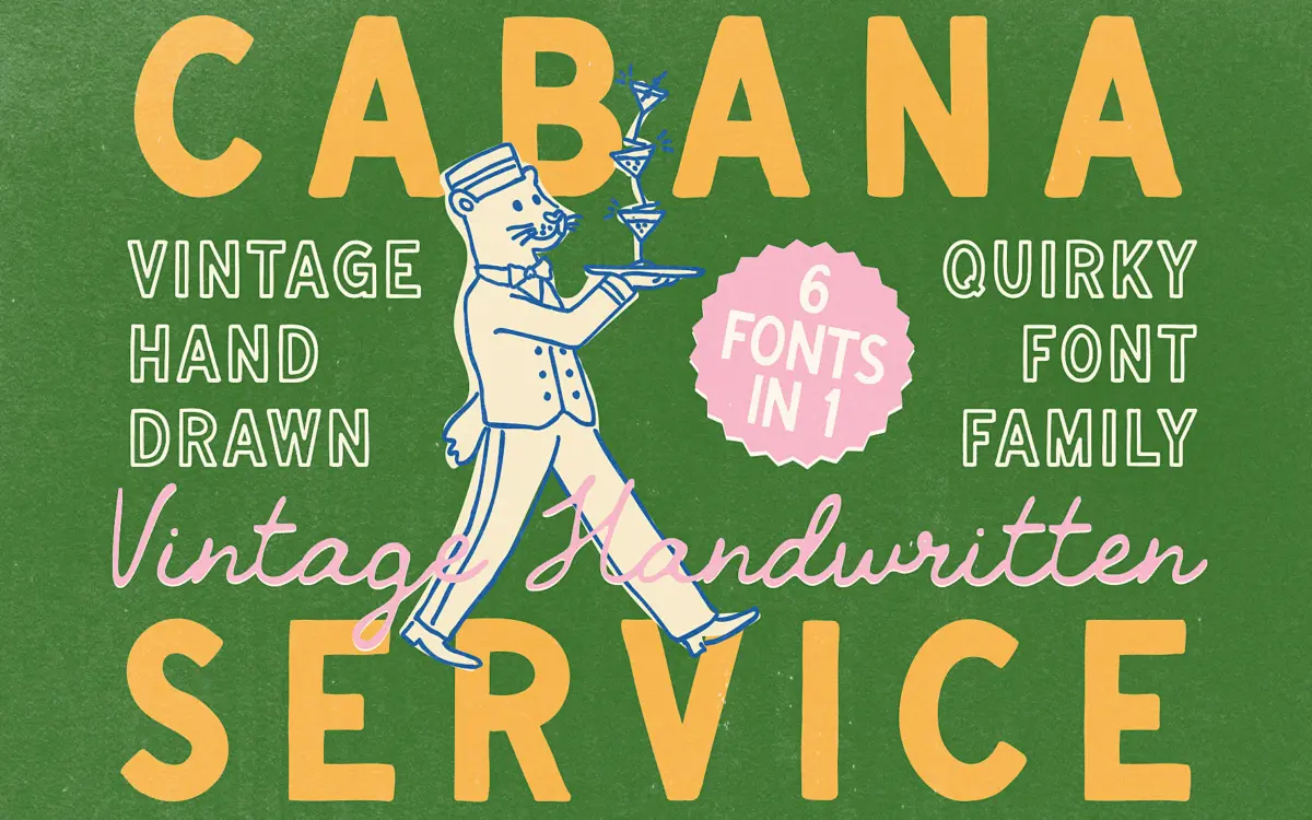
Cabana Service is built around the loose, slightly wobbly line you get from a felt-tip pen held without much pressure. The strokes taper unevenly, corners round off at different rates, and no two instances of the same letter sit exactly on the same baseline. That’s the point — it’s chasing the feel of a hand-painted hotel sign left to fade in the sun, not a polished script. The vintage reference is mild rather than heavy-handed: no distressed textures, no faux ink bleed, just an unhurried, imperfect hand.
The family covers six variants — Regular, Bold, Outline Regular, Outline Bold, Script, and Script Slanted — which gives it more range than most single-weight hand-lettered packs. The sans-style cuts (Regular and Bold) read as a casual print hand rather than a script, with open counters and blunt terminals. The outline versions strip the fill and leave just the wobble of the line, which works well as a secondary mark next to a solid logotype. The script styles lean more traditional, with connecting strokes and a gentler slant, and sit closer to what buyers usually mean by
What we liked, and what we didn’t
Strengths
- Six coordinated styles give more range than a typical single-weight hand-lettered set.
- The outline variants work well as a secondary mark alongside the solid cuts.
- The imperfect line has a specific, believable vintage-resort feel rather than a generic distressed look.
Trade-offs
- The wobble and uneven baselines make it unsuitable for anything smaller than a headline or short line of text.
- The style is narrow enough in mood that it can feel repetitive if used for every element in a design rather than as an accent.
Cabana Service is a solid pick for anyone chasing a laid-back, hand-drawn resort look without paying for a bespoke lettering job. It won't hold up as body text or in tight spaces, and its charm is specific enough that it will start to feel repetitive if overused across a single project. Use it where its warmth is the whole point — headlines, logos, packaging — and it earns its keep.
Verdict

Tmfonts reviews typefaces in depth — every font is tested in real branding, editorial and screen layouts before a word gets written. 555+ fonts reviewed and counting.