
Mangrove Font Duo: a playful sans and script pairing for branding work
Design style
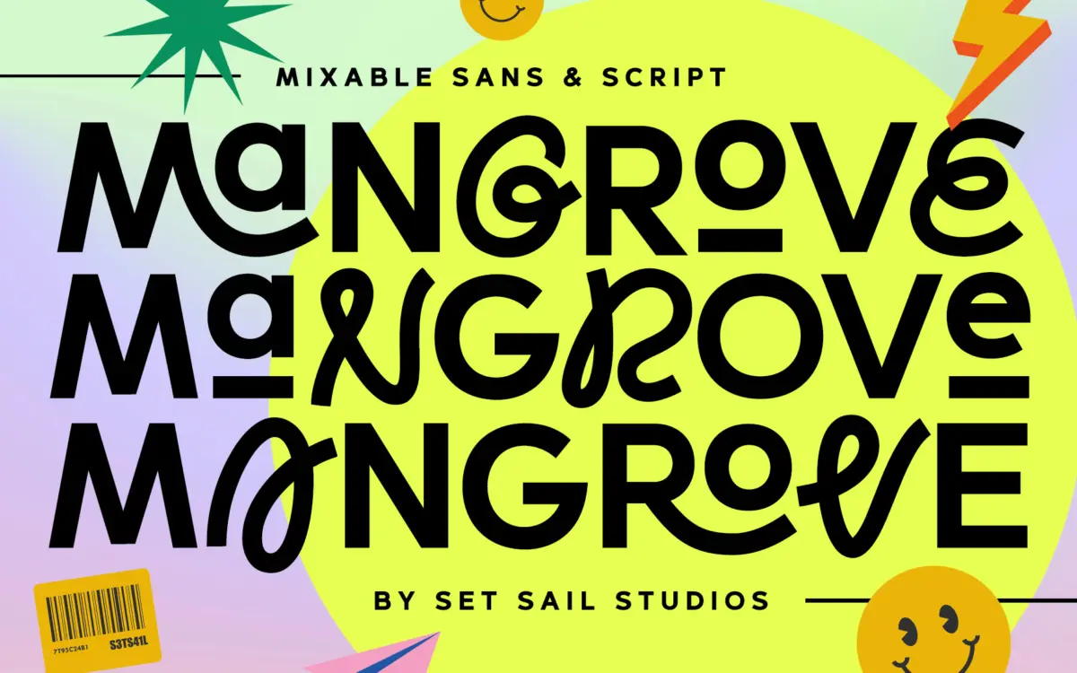
Mangrove is built as a two-part system: a rounded sans and a companion script, each offered in three weights. The sans carries soft, slightly bulbous terminals and a loose, informal rhythm that reads as friendly rather than corporate. It isn’t trying to be a neutral workhorse — the curves are a touch exaggerated, the counters generous, and there’s a bounce to the baseline feel even though the letters sit correctly on it. The script half leans casual rather than formal copperplate; strokes are even in weight with gentle swashes rather than dramatic loops, which keeps it from tipping into wedding-invitation territory unless that’s what you want.
Put side by side, the two do share DNA — similar x-height proportions and a comparable stroke warmth — so the pairing feels considered rather than accidental. That said, this is a decorative, character-driven design, not a face built for long-form reading. It has a point of view, and that point of view is cheerful, slightly retro, and aimed squarely at branding and packaging work rather than editorial text.
Character set and features
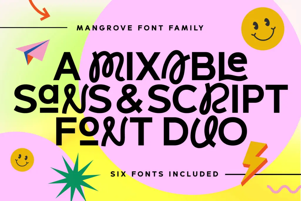
Each of the six fonts (three sans weights, three script weights) supports both cases, and the sans includes small caps and ligatures, which is where a lot of the personality lives — swooping sans ligatures and small-cap sets that behave more like display flourishes than typographic housekeeping. The idea of dropping a script letter into the middle of a sans word is a genuine feature of how the glyphs were drawn, not just a marketing suggestion, and it works reasonably well for logotypes and short lockups.
Language support is broad, covering most major Western and Central European languages plus a handful of others, so diacritics are accounted for if your project needs them. There’s no mention of numerals or extended symbol sets doing anything unusual, and the weight range, while giving six fonts to work with, is really three tonal steps rather than a fine gradient — don’t expect the subtlety of a text-optimised weight ladder.
Use cases
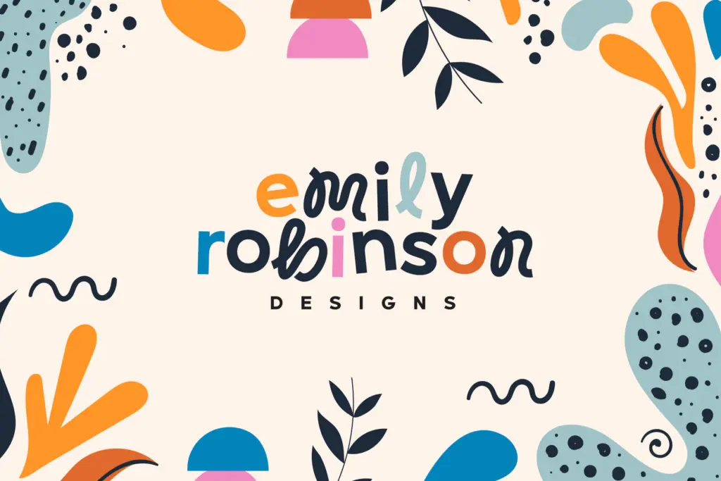
This is a branding toolkit first. Logotypes, packaging, product labels, social graphics, and short headline treatments are where the sans and script combination earns its keep — particularly anything wanting a handmade, slightly nostalgic warmth without going full hand-lettered script. The small caps and ligatures make short brand names and taglines feel custom-built rather than typed.
It’s less suited to body copy or anything requiring sustained reading; the sans’s rounded, characterful shapes lose some of their charm at small sizes and start to feel busy in a paragraph. Treat the script weights as accent typography — a word or two, not a sentence. For a designer building a food, lifestyle, or craft-adjacent brand identity who wants two coordinated voices instead of hunting for a pairing elsewhere, Mangrove offers a workable, self-contained system. For anything needing typographic neutrality or long-form clarity, look elsewhere.

What we liked, and what we didn’t
Strengths
- Sans and script weights share proportions closely enough that the pairing feels deliberate rather than forced.
- Ligatures and small caps in the sans add genuine logotype-ready flourishes, not just decoration.
- Broad diacritic support across many European languages for international branding work.
Trade-offs
- The rounded, bouncy sans loses clarity and charm at small sizes or in continuous text.
- Three weights per style is a fairly coarse range if you need finer tonal control.
Mangrove is a competent, characterful branding duo rather than a do-everything system. The sans and script share enough DNA to pair convincingly, and the ligatures and small caps give short lockups real personality, but it's not built for reading at length.
Verdict

Tmfonts reviews typefaces in depth — every font is tested in real branding, editorial and screen layouts before a word gets written. 555+ fonts reviewed and counting.