
Studio Nomad: a monoline gel-ink script with a textured experimental side
Design style
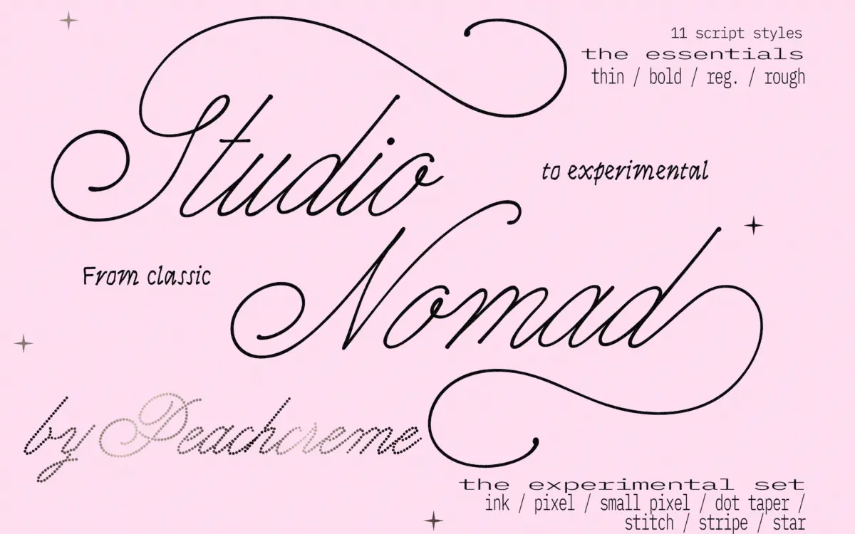
Studio Nomad sets out to do something narrower than most script releases: strip the thick-to-thin contrast out of calligraphy and replace it with the feel of gel ink on paper. That’s a specific, useful target, and the Essentials styles hit it. Strokes stay close to a single weight throughout, joins are smooth, and the letters lean into a casual, unforced rhythm rather than the formal swing of copperplate or Spencerian scripts. There’s none of the heavy contrast that makes a lot of calligraphic scripts feel bridal or old-fashioned by default — this reads more like a confident handwritten note than an invitation suite.
The Experimental Set is a different proposition entirely. Instead of continuous strokes, these styles (built around names like Star, Pixel, Stitch) construct letterforms from repeated micro-units — dots, star shapes, stitched marks — arranged along the skeleton of the script. It’s a texture treatment layered onto a script structure, closer to a pattern-fill effect than a handwriting style. Whether this counts as one design language or two adjacent ones is a fair question; the Essentials and Experimental sets don’t really behave like variants of the same font so much as a clean script and a set of decorative overlays that happen to share a skeleton.
Character set and features
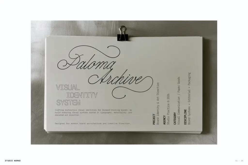
The monoline letters carry the family’s real strength: even spacing, consistent stroke weight, and joins that don’t wobble at small sizes. Swash and alternate characters are included, which matters for a script — a monoline face without decorative capitals or terminal flourishes can feel flat, and Studio Nomad avoids that by giving you options at the start and end of words.
The experimental styles ask more of the letters. Because each glyph is built from small repeated units rather than a single flowing line, character overlaps and kerning need closer attention than usual — this is a family where you should proof full words, not just individual letters, before committing to a layout. Legibility in these styles depends heavily on size and context; they read as texture and mood at display sizes, and lose clarity fast once you shrink them for body copy or long headlines.
Use cases
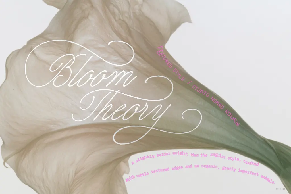
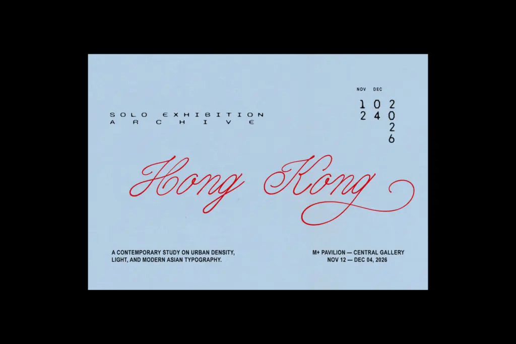
The Essentials styles are the workhorse half of this family. They suit logotypes, packaging, and editorial headers where a script needs to feel current rather than formal — a beauty brand wordmark, a magazine pull-quote, a product label that wants warmth without lace-and-calligraphy baggage. Because the stroke weight stays even, these styles also hold up reasonably well at smaller display sizes, which is not something you can say for most high-contrast scripts.
The Experimental styles are a different tool: they belong in mood-driven, texture-forward design — Y2K-leaning branding, gig posters, packaging accents, anything where the pattern itself is doing communicative work rather than the word being read quickly. Use them sparingly, at larger sizes, and expect to spend time adjusting spacing rather than dropping text in and moving on. Pairing the two sets within one project — a clean Essentials wordmark with an Experimental accent — is where the family’s split personality actually pays off.
What we liked, and what we didn’t
Strengths
- Even, monoline stroke weight holds up better at small display sizes than most calligraphic scripts
- Swash and alternate characters give the plain script real personality without changing its structure
- Experimental styles offer a genuinely different textured option for mood-driven branding work
Trade-offs
- Experimental styles require careful spacing and proofing because of how the micro-unit letterforms overlap
- The two halves of the family feel more like separate products than variations on one design
Studio Nomad's Essentials styles deliver a clean, even-weighted script that avoids the usual calligraphic clichés. The Experimental set is a more niche, texture-driven add-on that needs careful sizing and spacing to work. Together they cover more ground than a single script typically would, but they don't feel like one cohesive family so much as two related tools.
Verdict

Tmfonts reviews typefaces in depth — every font is tested in real branding, editorial and screen layouts before a word gets written. 555+ fonts reviewed and counting.