Sans Serif
4.0
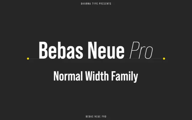
Bebas Neue Pro: the original condensed headline face, now with lowercase
Design style Bebas Neue started life as a free single-weight capitals-only face, and it became one of the most overused…
 Tmfonts

Design style Bebas Neue started life as a free single-weight capitals-only face, and it became one of the most overused…
Tmfonts
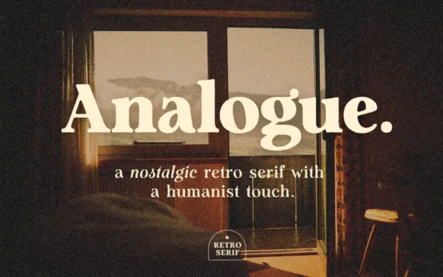
Design style Analogue sits in that familiar territory where retro signage lettering meets a humanist serif skeleton. The strokes carry…
Tmfonts
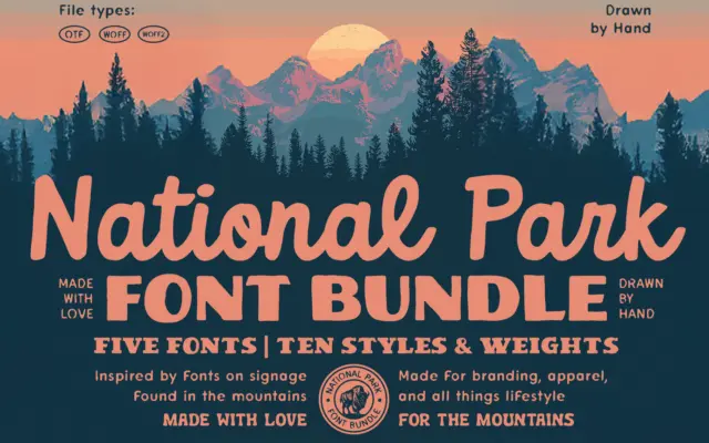
Design style This is a bundle built around a single mood rather than a single construction principle: the worn, hand-cut…
Tmfonts
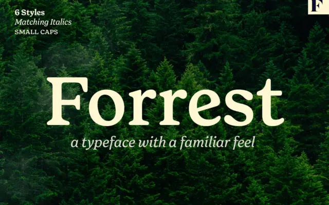
Design style Forrest is a serif built on nostalgia rather than novelty. The letterforms read as a reworking of old…
Tmfonts
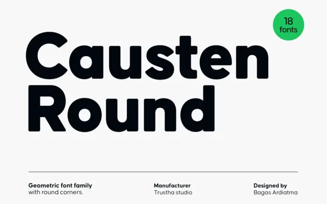
Design style Causten Round takes a geometric skeleton — circular counters, even stroke widths, a constructed look — and files…
Tmfonts
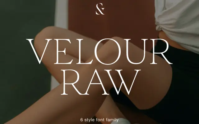
Design style Velour Raw is pitched as the calmer sibling of a display serif, and that relationship shows in how…
Tmfonts
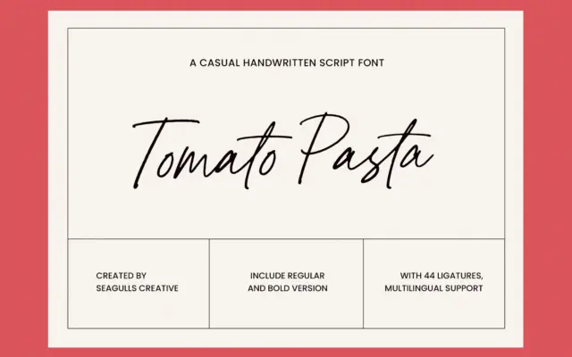
Design style Tomato Pasta is a loose, marker-style handwritten script, the kind meant to look like it was dashed off…
Tmfonts
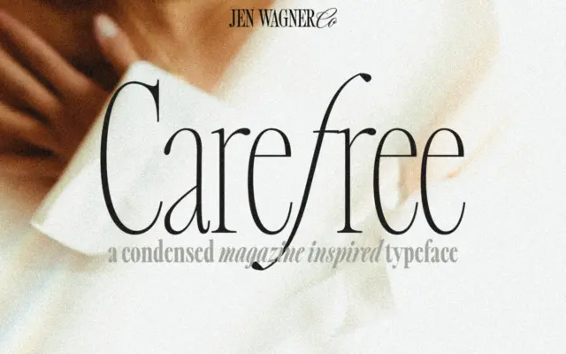
Design style Carefree is a condensed serif built around sharp, angled italics, with the family expanded out to eight weights…
Tmfonts
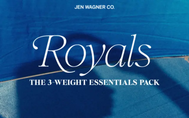
Design style Royals Serif belongs to the current wave of boutique serifs built for branding kits rather than long-form reading.…
Tmfonts