
Velour Raw Font Free Download
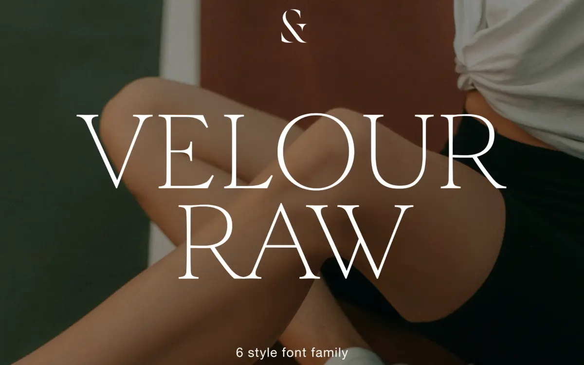
Is Velour Raw free to download?
Velour Raw is a commercial font sold on Creative Market, so the full version needs a paid license. Get it from the official listing: Velour Raw font download.
Need something free? These serif fonts from Google Fonts are free for personal and commercial use:
Design style
Velour Raw is pitched as the calmer sibling of a display serif, and that relationship shows in how it’s built. Where a display cut would push stroke contrast for drama, Velour Raw dials it down to something closer to even. The result reads as a transitional serif with its edges sanded off: no flared serifs, no theatrical thicks-and-thins, just a steady stroke that doesn’t call attention to itself. It’s a sensible move. Display serifs rarely survive the jump to paragraph sizes, and the designer seems to have known that and built a separate, quieter instrument rather than just shrinking the original.
The six weights, from Thin to Bold, keep that restraint consistent. The Thin doesn’t go so pale that it disappears, and the Bold doesn’t tip into slab territory. There’s a slight warmth to the curves — not quite humanist, not quite rational — that keeps the family from reading as generic. It won’t win attention on a poster wall, but that’s not what it’s for.
Character set and features
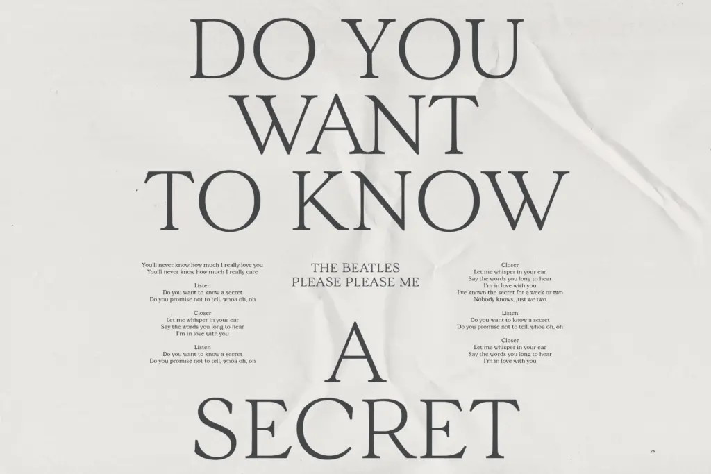
Language support spans Western, Central and South Eastern European character sets, which is the detail that matters most for a text face: if you’re setting long-form copy, you need diacritics that don’t look bolted on, and a family this size suggests the designer put real effort into that rather than treating it as an afterthought. The brief doesn’t detail specific OpenType features, so judge any ligatures, alternates or small caps on a case-by-case basis rather than assuming a full feature set — but the core letterforms are solid enough to carry text without those extras doing the heavy lifting.
Six weights is a reasonable range for building hierarchy within a single family — captions in Thin, running text in Regular or Light, pull quotes or subheads in Bold — without having to reach for a second typeface to do the contrast work. That’s the real argument for buying a family instead of a single cut.
Use cases
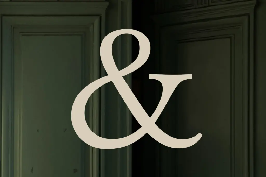
This is a working text face first. Editorial layouts, long-form web copy, annual reports, book interiors — anywhere you need a serif that can sit at 10 to 12 point for paragraphs without the strokes thinning out or the counters closing up. The even contrast that makes it unremarkable at display sizes is exactly what keeps it legible at small ones.
It can still carry a headline if the rest of the page is quiet, but it won’t do the attention-grabbing work that the original Velour was presumably built for. Pair it with its own heavier weights for a masthead rather than looking elsewhere, and keep the layout otherwise plain — this isn’t a face that wants ornament around it. For branding work, it reads as trustworthy and a little understated rather than distinctive, which suits some sectors better than others.

What we liked, and what we didn’t
Strengths
- Even stroke contrast holds up well at small text sizes
- Six weights give enough range to build hierarchy within one family
- Extended European language support suits long-form, multilingual text work
Trade-offs
- Lacks the visual drama needed to carry headline or poster work on its own
- Feature set beyond the basic character set isn't clearly specified
Velour Raw does exactly what it says: it takes the drama out of a display serif and leaves something you can actually set paragraphs in. It won't turn heads on its own, but that restraint is the point for editorial and long-form work.

Tmfonts writes independent reviews of typefaces: what each font does well, where it falls short, what it suits, and where it is sold.