
Machico Font Free Download
Is Machico free to download?
Machico is a commercial font sold on Creative Market, so the full version needs a paid license. Get it from the official listing: Machico font download.
Need something free? These handwritten fonts from Google Fonts are free for personal and commercial use:
Design style
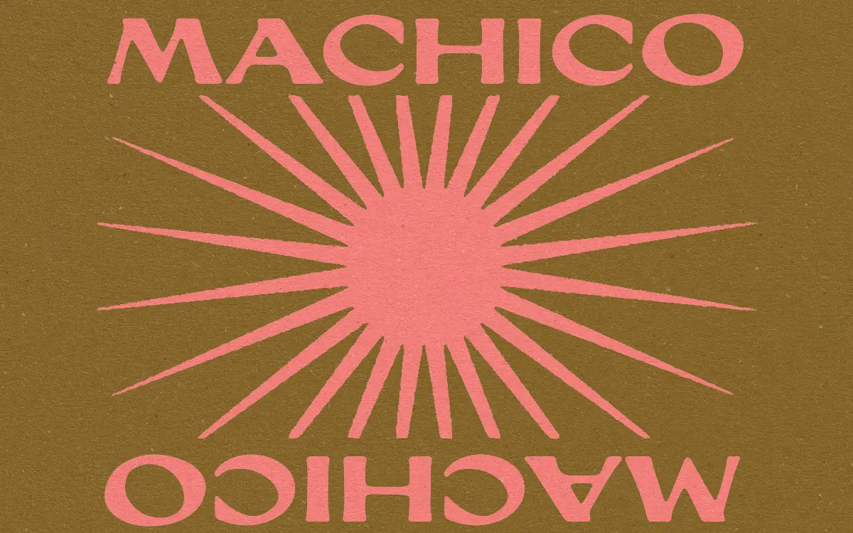
Machico works from a simple premise: a squared-off serif, the kind you’d find stamped on an old civic register, run through a few decades of bad storage. The letterforms are built on a boxy, almost slab-like skeleton, but every edge has been softened or chewed at, so nothing sits perfectly square. The seller describes it as a worn printing press effect, and that reads through clearly — strokes thin out unevenly, corners round off at different rates, and the registration feels slightly off, as if the ink bled a touch before it dried.
This isn’t a script or a loose hand-lettered face in the usual sense; it’s closer to a distressed vintage serif with a hand-drawn conscience. The letters keep a consistent structure, but the texture does the talking. It leans into a document aesthetic rather than a decorative one — think town hall ledgers, old shop signage, stencilled crates, rather than invitation calligraphy.
Character set and features
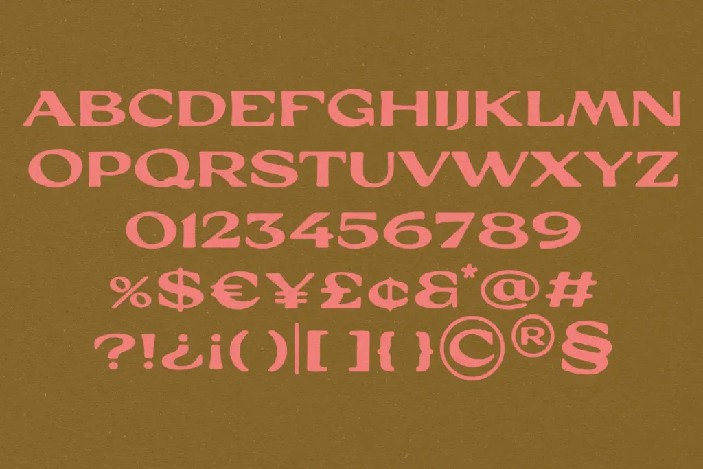
The core alphabet holds its squared serif logic through both cases, with the weathering applied evenly enough that no single letter looks like an outlier. The small serifs are short and blunt rather than bracketed, which keeps the face from tipping into anything too formal — it reads as stamped rather than engraved. Numerals follow the same boxy proportions as the letters, so dates and figures sit comfortably alongside text rather than looking like a mismatched addition.
Because the distressing is baked into the outlines rather than applied as a separate texture layer, the roughness is consistent across weights of use — there’s no need to layer a grunge overlay on top, which is often where these effects fall apart. That said, the brief gives no indication of alternate characters, ligatures, or multilingual support, so treat this as a straightforward single-style alphabet rather than a feature-rich OpenType family. If you need accented characters for other languages, test before committing.
Use cases
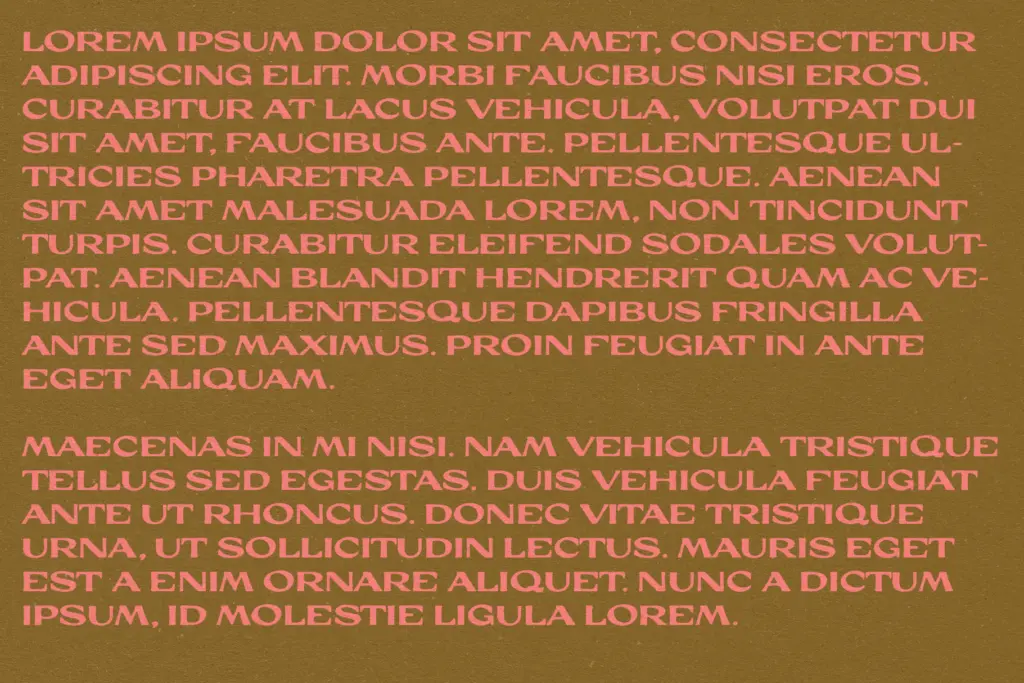
Machico is suited to short-form work where texture matters more than reading speed: logotypes, product labels, packaging for natural or earthy goods, signage that wants a found-object quality. The desert and southwestern associations the seller leans on make sense — the warm, sun-bleached irregularity suits leather goods, pottery, small-batch food labels, anything trying to look handled rather than mass-produced.
It’s less at home in long-form text. The worn edges and uneven weight that give it character at display size will start to fight legibility once you drop it below headline sizes or stack it into paragraphs — the texture becomes noise rather than mood. Use it for names, short taglines, stamps, and badge-style lockups, and pair it with a plain, quiet sans or serif for any supporting copy. It’s a flavour font: strong in small doses, used sparingly it does real work, pushed too far it just looks tired.
What we liked, and what we didn’t
Strengths
- The distressing is built into the letterforms themselves, so it stays consistent without needing an overlay effect
- The squared serif skeleton gives it a stamped, official-document feel rather than generic grunge
- Numerals match the letter proportions, which makes it work cleanly for product dates and codes
Trade-offs
- No indication of ligatures, alternates or expanded language support, so it reads as a basic single-style alphabet
- The wear that gives it character at display size undermines legibility if pushed into body text
Machico delivers a convincing worn-document texture with a squared serif structure that reads as stamped rather than decorative. It's a strong fit for short branding moments with an earthy or vintage lean, but it's a single-trick face with no stated extended features, and it isn't built for anything beyond headline-length use.

Tmfonts writes independent reviews of typefaces: what each font does well, where it falls short, what it suits, and where it is sold.