
Iguana Font Free Download
Is Iguana free to download?
Iguana is a commercial font sold on Creative Market, so the full version needs a paid license. Get it from the official listing: Iguana font download.
Need something free? These sans serif fonts from Google Fonts are free for personal and commercial use:
Design style
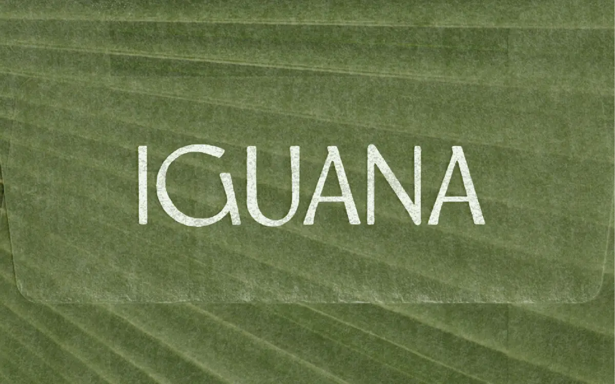
Iguana is a humanist sans built around open counters and gentle, sweeping curves rather than mechanical geometry. The forms feel hand-adjusted — slightly irregular stroke widths, soft terminals that round off instead of snapping square. There’s a loose rhythm to it that reads as relaxed without tipping into casual script territory. Apertures are generous, which gives the lowercase an airy quality at larger sizes, and the overall texture has a bit of grain to it, the kind of subtle imperfection that keeps a sans from feeling sterile. It sits closer to the humanist end of the spectrum than to grotesque or neo-grotesque families, closer in spirit to lettering than to a system typeface.
The character comes through most clearly in isolated words and short phrases. Letters like ‘g’ and ‘a’ carry some personality in their curves, and the overall width feels a touch wider than average, which supports the calm, unhurried mood the design is going for. It’s a typeface with a point of view, even if that point of view is deliberately understated.
Character set and features
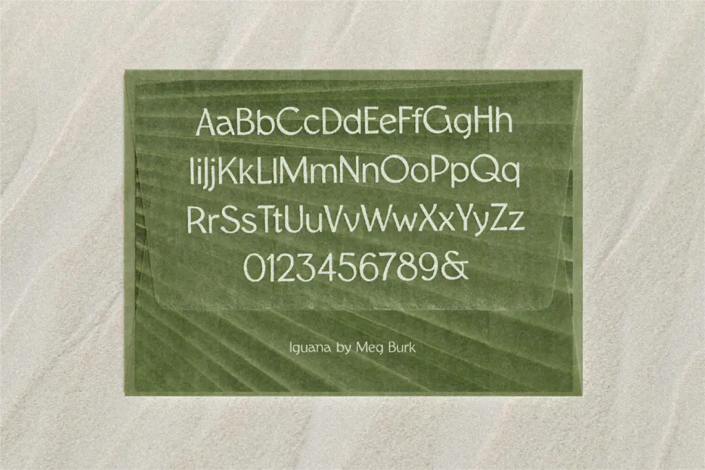
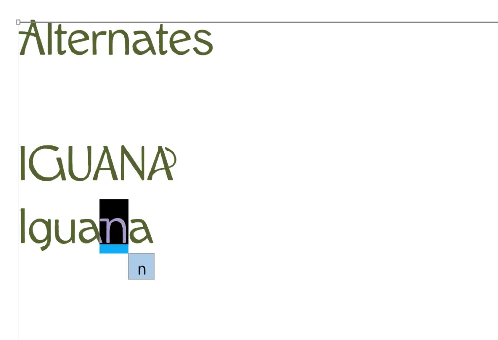
The set covers English uppercase and lowercase, which is the current scope — Spanish support is planned but not yet shipped, so anyone needing accented characters beyond basic English should hold off or test the character map first. There’s no mention of extended ligatures, alternates, or OpenType features in the brief, so treat Iguana as a straightforward single-style sans rather than a font with a deep feature set to explore. That’s not a knock; plenty of display sans faces do their job with no ligature set at all, but it does mean you’re buying the letterforms themselves, not a toolkit of swash variants or contextual substitutions.
Spacing feels considered for the kind of short-line setting it’s aimed at — headlines, product names, single words on packaging — rather than dense paragraphs. The texture and the slightly loose curves that look good at display sizes will need testing before committing to anything smaller than subheads; airy counters can get fuzzy once a sans this loose drops into body text territory.
Use cases
This is a typeface for brand-forward, lifestyle-adjacent work: hospitality signage, café and matcha packaging, fashion lookbooks, logotypes that want to feel warm rather than corporate. The humanist curves and natural reference points (the designer cites shell and reptile-skin textures as inspiration) suit anything trying to evoke a relaxed, coastal, or boho sensibility without resorting to handwriting or script. It would pair comfortably with a plain, quiet sans or serif for body copy, since Iguana’s job here is clearly display and short-paragraph work, not long-form reading.
Where it won’t help: dense editorial layouts, data-heavy interfaces, or any brand that needs a neutral, invisible workhorse. It’s also a young release with a single language currently supported, so international branding work will need to wait or work around that gap. For English-only, display-led, warm-weather branding, though, it does a specific job well.
What we liked, and what we didn’t
Strengths
- Soft, naturalistic curves give it a distinct warm character without resorting to script forms.
- Generous apertures and open counters keep display settings feeling airy rather than cramped.
- Well matched to a specific niche — hospitality, food and fashion branding — rather than trying to do everything.
Trade-offs
- Character set is currently English-only, limiting it for multilingual branding work.
- No mention of ligatures, alternates, or other OpenType features, so there's little to explore beyond the base letterforms.
Iguana is a likeable, warm humanist sans with real character in its curves, best suited to headlines and short brand copy rather than long text. Its current limitation to English-only glyphs and lack of a developed feature set keep it from being a complete workhorse, but for coastal, lifestyle-driven branding it has a clear and well-handled identity.

Tmfonts writes independent reviews of typefaces: what each font does well, where it falls short, what it suits, and where it is sold.