
Reserve Font Free Download
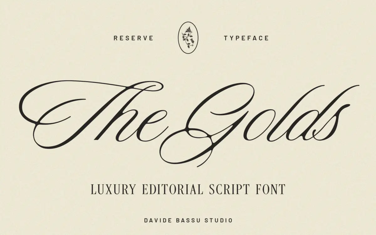
Is Reserve free to download?
Reserve is a commercial font sold on Creative Market, so the full version needs a paid license. Get it from the official listing: Reserve font download.
Need something free? These script fonts from Google Fonts are free for personal and commercial use:
Design style
Reserve sits in the calmer end of the script spectrum. Rather than chasing the loose, brush-pen energy that dominates a lot of script releases right now, it works from a more structured base — moderate stroke contrast, connected lowercase, and a slant that stays consistent rather than wandering letter to letter. The result reads as composed rather than performative. There’s flourish in the capitals, but it’s rationed, not piled on.
The softness the brief describes comes through mostly in the joins: curves into stems are rounded rather than sharp, so words don’t feel clipped even when the spacing is tight. It’s a script that looks drawn by hand but corrected by a steady editor afterward. That restraint is the point of the design, and it’s also the thing to be aware of — if you want maximum expressiveness or an obviously calligraphic feel, this isn’t that font.
Character set and features
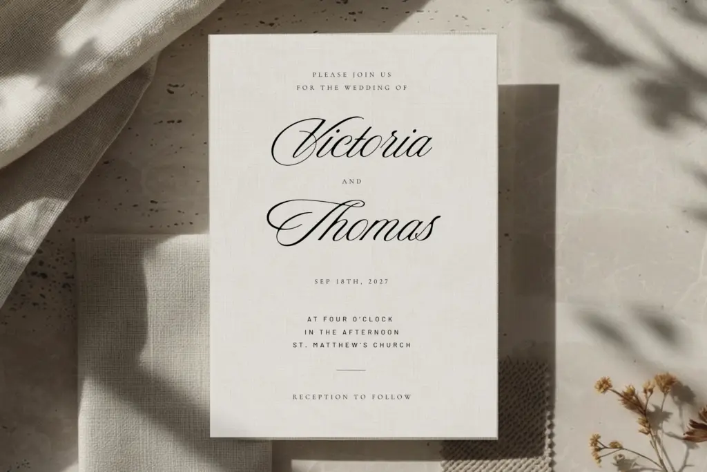
As a script built for names, titles and short phrases, Reserve is doing a specific job rather than trying to be a general-purpose text face, and the letterforms are shaped accordingly. The connecting strokes are built to flow from one letter into the next, which means it wants to be set as whole words rather than picked apart letter by letter — kerning pairs matter more here than in a sans or slab, so it’s worth testing your actual words, not just a sample sentence.
Swash capitals give it some of its editorial lift, useful for a monogram or an opening initial on a card, but they’re sized to be used sparingly — set every capital in full swash and the structure the design is built on starts to work against itself. Subtlety is baked into the glyph set, which means the font rewards a light hand more than a heavy one.
Use cases
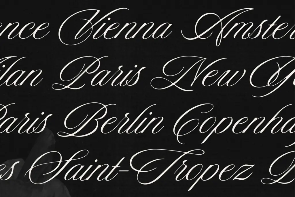
This is a logotype and headline script, not a paragraph script. At the sizes it’s meant for — a couple’s names on an invitation, a brand name on packaging, a title card for social — the joins hold together and the contrast reads clearly. Push it down to body copy or long phrases and the connected strokes start to blur into each other, which is true of most scripts this tightly joined but worth flagging anyway.
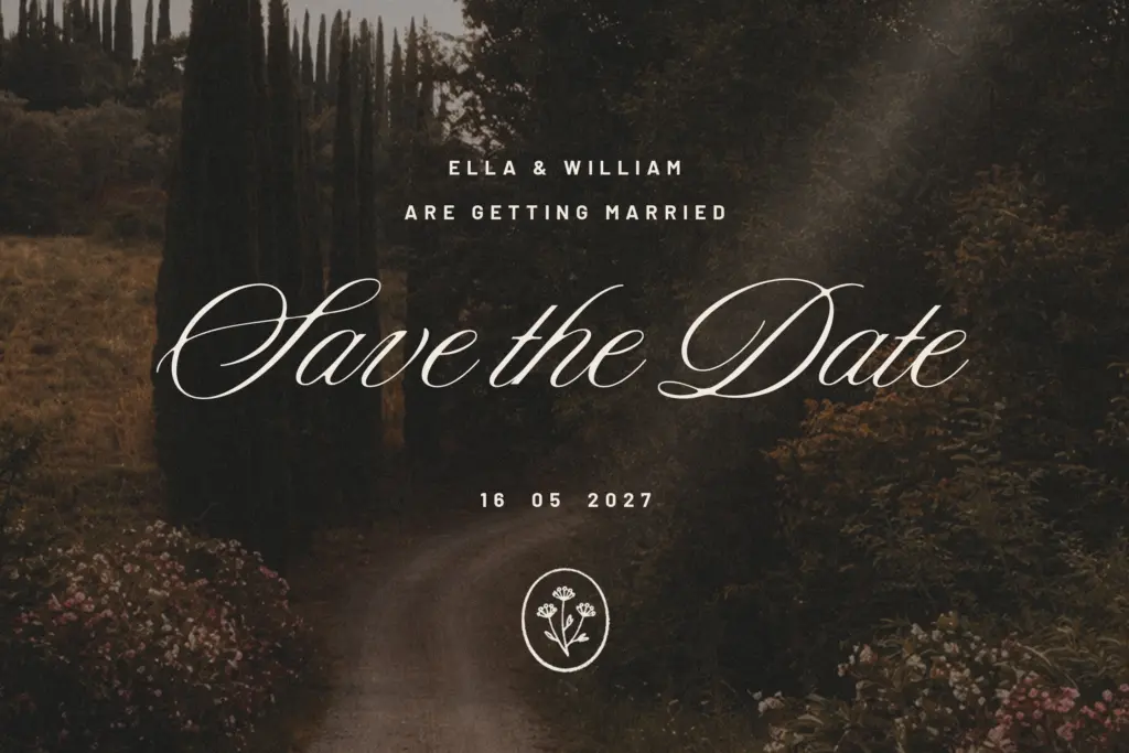
Its natural home is wedding stationery: save-the-dates, invitation suites, place cards, monograms. It also suits boutique and beauty branding where a single word or short tagline needs to feel considered rather than loud — a product label, a logo lockup, a header on a fashion lookbook. Pair it with a plain, quiet sans or serif for supporting text, since Reserve is already carrying the personality in the layout and doesn’t need a second ornamental voice competing with it.
What we liked, and what we didn’t
Strengths
- Consistent slant and controlled joins give it a composed, editorial feel rather than a performative one.
- Swash capitals add lift to monograms and openers without overwhelming the rest of the set.
- Well suited to the specific job of setting names and short phrases on invitations and packaging.
Trade-offs
- Connected strokes blur together at body-text sizes or in longer phrases.
- The restrained style limits it if you're after a more expressive, loose calligraphic look.
Reserve is a well-mannered script that trades maximalist flourish for editorial calm, which makes it genuinely useful for wedding and boutique branding work. It's built for short setting — names, titles, logotypes — and starts to strain once you ask it to do paragraphs or heavy swash work. A solid, dependable choice rather than a showstopper.

Tmfonts writes independent reviews of typefaces: what each font does well, where it falls short, what it suits, and where it is sold.