
Loviena Rose Font Free Download
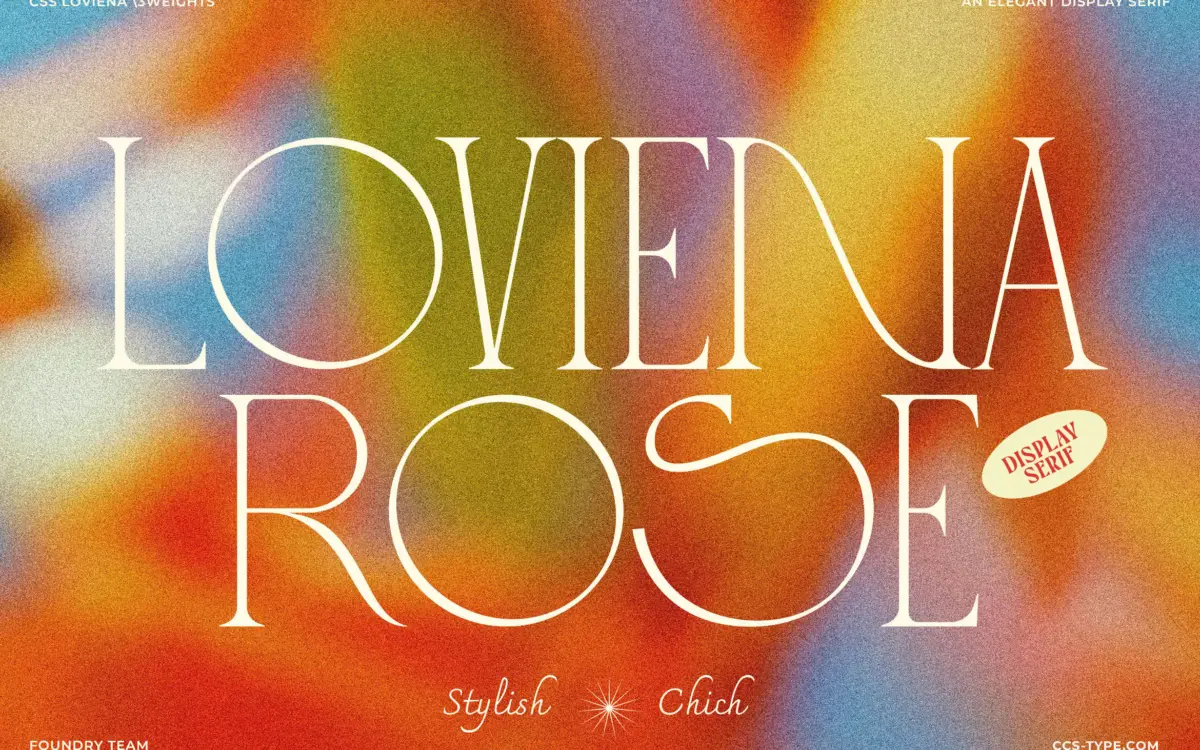
Is Loviena Rose free to download?
Loviena Rose is a commercial font sold on Creative Market, so the full version needs a paid license. Get it from the official listing: Loviena Rose font download.
Need something free? These serif fonts from Google Fonts are free for personal and commercial use:
Design style
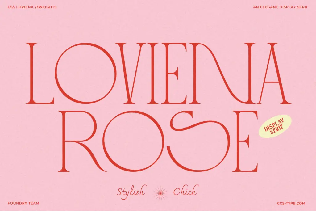
Loviena Rose is an all-caps display serif built around a high-contrast structure: thin, almost hairline strokes paired with thicker verticals that give each letter a kind of pinched elegance. The serifs are small and pointed rather than bracketed, which keeps the overall texture light on the page. There’s a retro editorial quality to the forms, something that leans toward old magazine mastheads rather than strict classical serif tradition, and the curves on letters like the S and C have a slight looseness that reads as handcrafted rather than geometric.
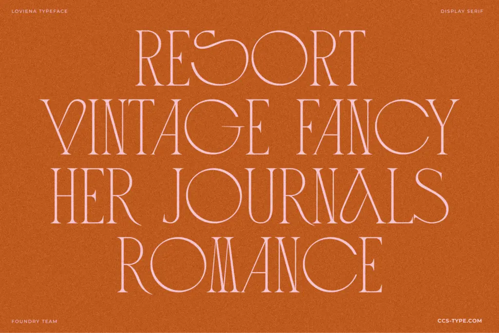
Because it’s caps-only, the typeface lives or dies on spacing and rhythm between letters, and that’s handled reasonably well here — the default tracking gives each form room to breathe without looking gappy. The character comes mostly from the alternates and ligatures layered on top of the base letterforms, which is where the designer has clearly spent the most effort. On its own, the base set is attractive but fairly restrained; it’s the swapped-in alternates that push it toward something more playful.
Character set and features
The family ships in three weights — Regular, Semibold and Bold — which gives some flexibility for hierarchy within an all-caps system, though obviously nothing in the way of a lowercase to fall back on for body text. Stylistic alternates and ligatures are the headline feature, and they’re worth digging into through the glyphs panel rather than relying on defaults: several of the alternate forms swap in curved flourishes or connected letter pairs that shift the tone from clean editorial to something closer to a boutique logotype. Multilingual support is included, which extends its reach beyond English-only branding work.
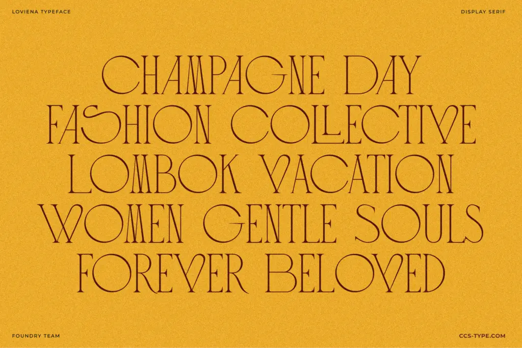
The ligatures are the part that will divide opinion. Used sparingly, on a single word in a logotype or a short headline, they add a nice bit of personality without undermining legibility. Overused across a full line of running caps, they start to compete with each other and the result can look cluttered — this is a typeface that rewards restraint and careful glyph substitution rather than wholesale application of every alternate on offer.
Use cases
This is squarely a headline and branding typeface, not a text face — there’s no lowercase, and the design simply isn’t meant to carry paragraphs. It suits logotypes for fashion, beauty and lifestyle brands, wedding stationery where a touch of romance is welcome, and editorial headlines in magazines with a retro or feminine lean. It would also work well on packaging labels or social graphics where a single word or short phrase needs to carry visual weight.
It’s less suited to anything requiring long lines of set type, multi-line headlines where the contrast and alternates start to fight each other, or contexts needing a true workhorse display face across many registers. Within that narrower lane, though, it does a specific job well.
What we liked, and what we didn’t
Strengths
- Small pointed serifs and high contrast give it a distinct retro-editorial character
- Three weights allow some hierarchy within an all-caps-only system
- Alternates and ligatures add genuine personality to single words and logotypes
Trade-offs
- No lowercase means it can't function as a text or body typeface
- Heavy use of ligatures across full lines can look cluttered rather than refined
Loviena Rose is a well-drawn all-caps display serif with a distinct romantic, editorial character, best used in small doses for logotypes and headlines. The alternates and ligatures add personality but need a careful hand to avoid clutter, and the lack of a lowercase limits it to short-form work. A solid, narrowly focused choice rather than an all-purpose typeface.

Tmfonts writes independent reviews of typefaces: what each font does well, where it falls short, what it suits, and where it is sold.