
Le Buffet Font Free Download
Is Le Buffet free to download?
Le Buffet is a commercial font sold on Creative Market, so the full version needs a paid license. Get it from the official listing: Le Buffet font download.
Need something free? These handwritten fonts from Google Fonts are free for personal and commercial use:
Design style
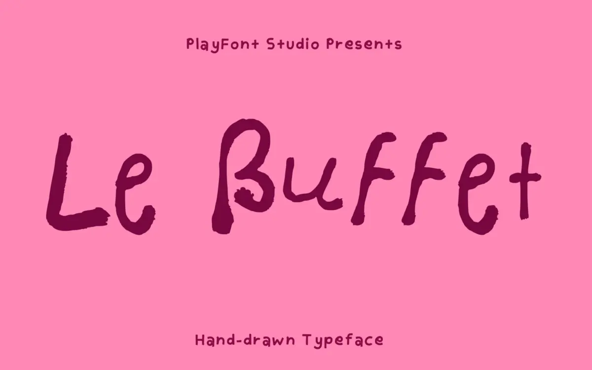
Le Buffet is a single-weight hand-drawn display face built on the idea of a scrawled artist’s signature rather than a careful script. Strokes vary in thickness within single letters, baselines wobble slightly, and the whole thing reads as if someone wrote it fast with a wide felt-tip. It’s closer to lettering than to calligraphy — there’s no formal joining logic, no consistent entry or exit stroke, just a loose, confident scribble that leans into imperfection as the point.
That looseness is deliberate and it mostly works at the sizes it’s meant for: big, short words. Letters sit upright rather than slanted, which keeps it from tipping into full cursive territory, and gives it a slightly graffiti-adjacent, sign-painter feel rather than a wedding-invitation one. It’s not an elegant font and it isn’t trying to be. It’s got attitude, not polish.
Character set and features
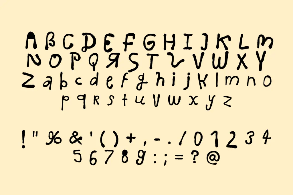
The set covers uppercase and lowercase, numerals, punctuation and symbols — enough to set full words and short phrases without hunting for missing glyphs. There’s no mention of alternates or ligatures here, and the irregular construction of the letters means you don’t necessarily need them: the hand-drawn variation already does some of the work that swash sets usually handle in script fonts.
Because it ships as a single static OTF rather than a variable font or a family with weights, what you see is what you get — there’s no light version for body copy or a bold version for extra punch. Spacing between letters is generous enough that words don’t clot together even with the stroke-width variation, but this is very much a display tool, not a text face, and it should be treated that way from the start.
Use cases
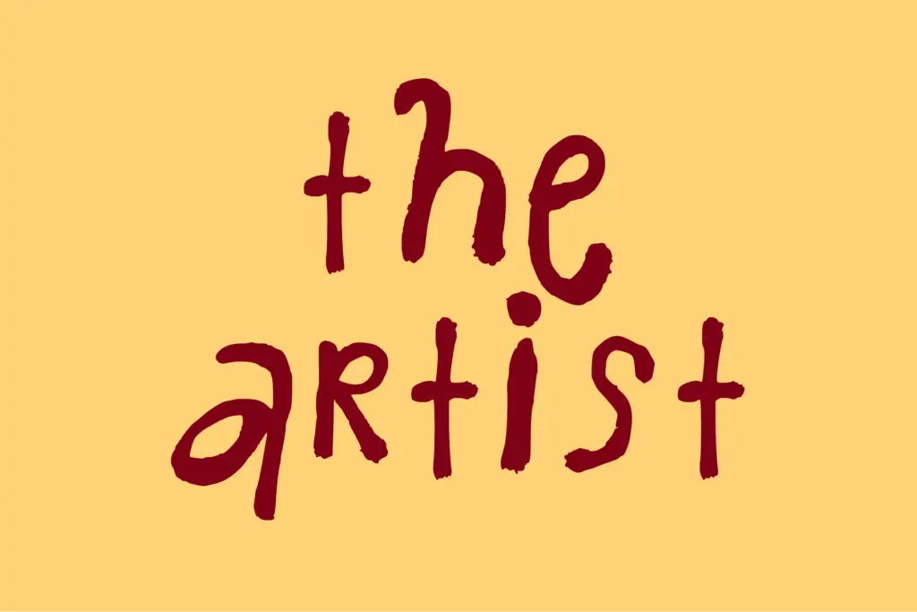
Le Buffet earns its keep on food and drink branding — menu headers, chalkboard-style signage, product labels, packaging call-outs — anywhere a single word or short line needs to feel handmade rather than typeset. It also suits artist branding, logos for small studios or makers, and any project trying to signal craft over corporate polish. A chef’s business card, a bakery sign, a small-batch label: this is squarely that lane.
It’s less suited to anything requiring restraint or multiple lines of setting. Long headlines get visually noisy fast, since every letter is already doing its own thing, and there’s no lowercase-only or all-caps discipline to fall back on for a calmer register. Pair it with a plain sans or serif for supporting text and keep Le Buffet itself to short bursts — a word, a name, a single line — and it does its job well. Ask it to carry a paragraph and the charm turns into fatigue.
What we liked, and what we didn’t
Strengths
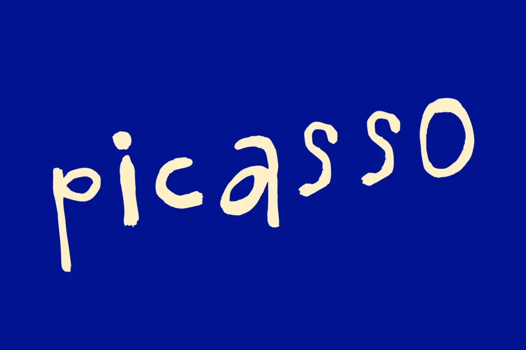
- Loose, varied stroke widths give it genuine hand-drawn character rather than a uniform script look
- Generous letter spacing keeps short words legible despite the irregular strokes
- Upright construction suits signage and labels better than slanted scripts do
Trade-offs
- Ships as a single static weight with no bold or light option for hierarchy
- Gets visually noisy and tiring across longer lines or multiple words
Le Buffet is a confident, scrappy hand-drawn display font that's good at exactly one thing: short, punchy words for food and craft branding. It doesn't pretend to be a text face or a script, and it shouldn't be asked to be one. Keep it to headlines and labels and it earns its keep.

Tmfonts writes independent reviews of typefaces: what each font does well, where it falls short, what it suits, and where it is sold.