
Labelcore Font Free Download
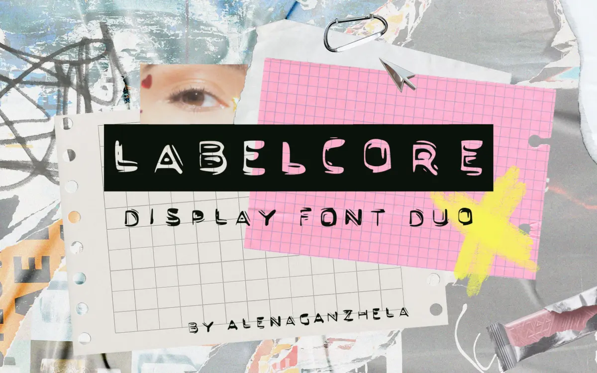
Is Labelcore free to download?
Labelcore is a commercial font sold on Creative Market, so the full version needs a paid license. Get it from the official listing: Labelcore font download.
Need something free? These sans serif fonts from Google Fonts are free for personal and commercial use:
Design style
LABELCORE takes its cue from the embossed plastic tape of handheld label makers — the kind of lettering that shows up on binders, cassette spines, and office supplies before anyone thought of it as a style. The letters are all caps, built on a tight, blocky geometry: square counters, short apertures, and strokes that stay close to uniform width. There’s a deliberate roughness worked into the edges, a bit of texture and unevenness that keeps it from reading as a clean industrial stencil. It’s not trying to be precise — it’s trying to look like it came off a machine that’s been dropped a few times.
The duo gives you Regular and Bold, and the two are close enough in structure that they read as the same family rather than two different ideas glued together. Bold doesn’t just thicken the strokes; it tightens the counters too, which keeps the letterforms from clogging up at small sizes. That’s a small detail but it matters for a display face built around stacking words for emphasis.
Character set and features
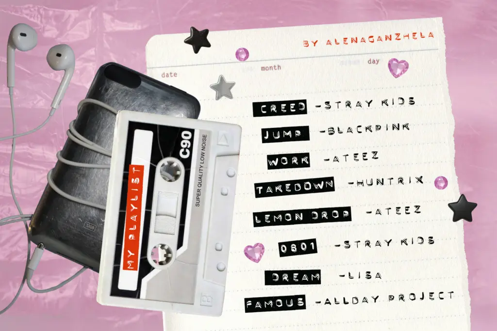
This is an uppercase-only font, which is consistent with its label-maker reference — there’s no lowercase to speak of, and the design doesn’t pretend otherwise. Numerals and basic punctuation are included, enough to cover dates, prices, and playlist track numbers. There’s no mention of extended language support or stylistic alternates, so treat this as a straightforward Latin character set rather than a font with hidden depth.
What you’re buying is really the contrast between the two weights. Used together — Regular for a line, Bold for a word inside it — you get the kind of emphasis that a label maker gives you when someone leans on the embossing dial halfway through a strip of tape. That’s really the whole trick of this duo, and it does it reliably.
Use cases
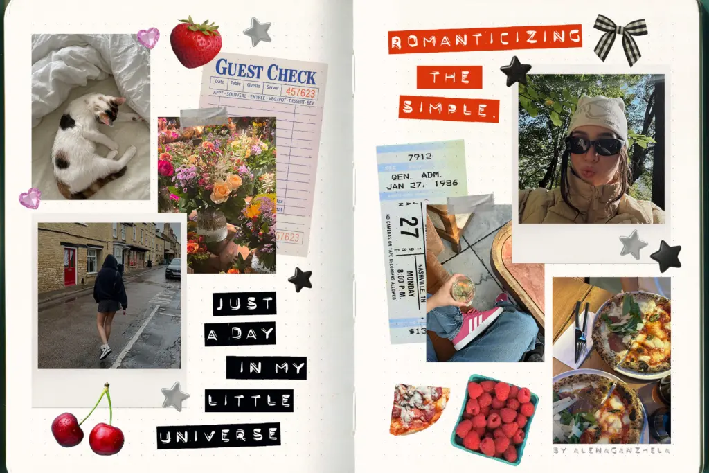
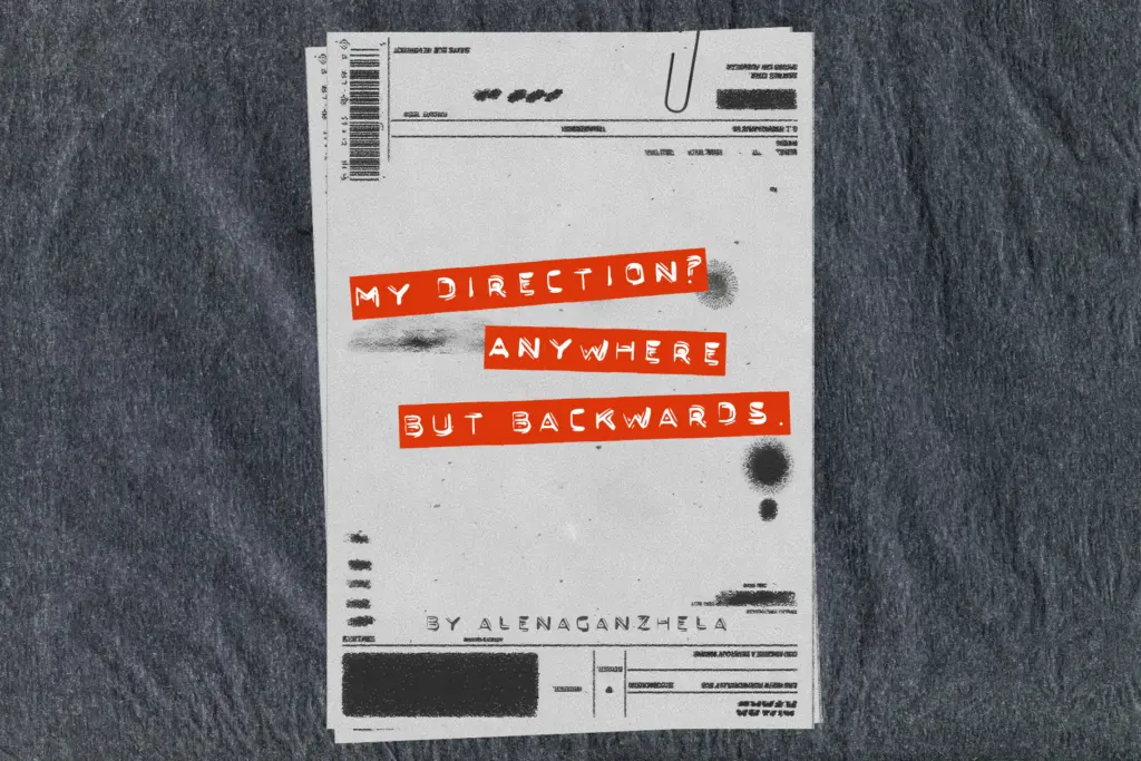
LABELCORE is built for exactly the kind of work it’s marketed toward: collage layouts, scrapbook pages, zine headers, and the sort of busy digital journaling spreads that are popular on Instagram and TikTok right now. It sits comfortably next to torn paper textures, tape graphics, and photo corners — anywhere you want text that looks stuck on rather than typeset. For sticker sheets, mixtape labels, or short punchy headlines, the chunky caps and rough edges do real work.
It’s less useful outside that lane. There’s no lowercase, so anything requiring sentence-case reading — body copy, long captions, formal headers — is off the table entirely. And because the texture and roughness are baked into the letterforms, it won’t scale down gracefully to small print or fine detail; this is a font for shouting a few words, not setting a paragraph. Pair it with the collage and paper-texture assets it was clearly designed alongside, keep the word count short, and it does its job well. Ask it to do anything more structured and the limitations show quickly.
What we liked, and what we didn’t
Strengths
- Regular and Bold weights are drawn consistently enough to combine on the same line without clashing
- Rough, embossed texture reads convincingly as label-maker tape rather than a generic stencil effect
- Tighter counters in the Bold weight keep it legible even when stacked for emphasis
Trade-offs
- Uppercase only, so it can't handle body text or anything needing sentence case
- Textured edges mean it loses clarity at small sizes or in fine print
LABELCORE does one specific thing well: chunky, embossed-looking uppercase lettering for collage and journaling layouts. It's not built to go beyond short headlines and sticker text, and the lack of a lowercase limits where it can travel, but within its lane the two weights pair cleanly.

Tmfonts writes independent reviews of typefaces: what each font does well, where it falls short, what it suits, and where it is sold.