
Cringe Serif Font Free Download
Is Cringe Serif free to download?
Cringe Serif is a commercial font sold on Creative Market, so the full version needs a paid license. Get it from the official listing: Cringe Serif font download.
Need something free? These serif fonts from Google Fonts are free for personal and commercial use:
Design style
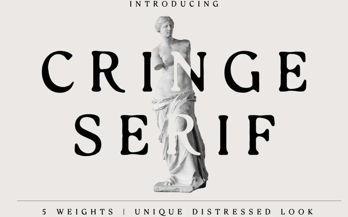
Cringe Serif belongs to the distressed-type family that’s been circulating through packaging and branding work for a few years now: a serif skeleton roughed up with broken strokes, ink traps that look accidental, and edges that refuse to sit flush. It reads as handmade rather than hand-drawn, more like a stamp that’s been through a few print runs than a calligraphic revival. The serifs themselves are modest, slab-leaning rather than bracketed, which keeps the distress from turning into noise.
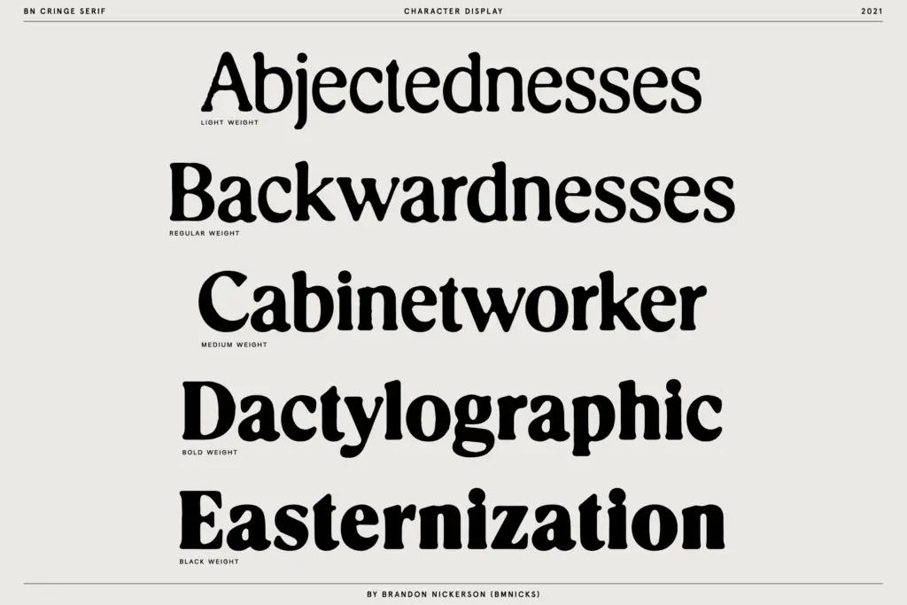
What separates it from the glut of similar “worn letterpress” fonts is the five-weight range. Most distressed serifs ship as a single cut, because the texture is baked in and replicating it consistently across weights takes real work. Here the breakage and roughness scale with the stroke, so the lightest weight reads as fine cracking and the heaviest reads as chunkier gouges rather than just a bolder version of the same texture pasted on top.
Character set and features
The seller’s claim that each character has unique attributes checks out in practice — this isn’t a font where the distress is a single repeating filter applied to a clean base. Letters have individually placed breaks, so repeated characters in a word (a double L, a pair of Es) don’t mirror each other identically, which is the main thing that makes distressed type look genuinely worn rather than stamped from a texture brush. The trade-off is that at small sizes the irregularities start competing with the letterforms for attention, and some counters close up faster than you’d expect from a serif this size on paper.
Five weights gives you more flexibility than this style usually offers — you can build a hierarchy within the one typeface rather than reaching for something else to pair it with for body copy. That said, the lighter weights do the texture more convincingly; the heaviest weight starts to feel like distress for its own sake rather than something structural.
Use cases
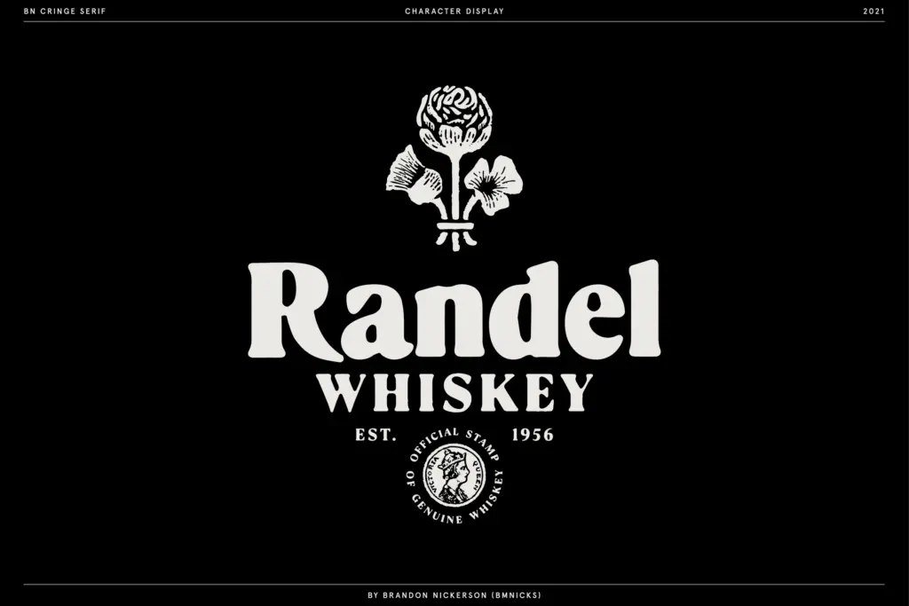
This is a logo and label typeface first. Think craft packaging, apparel prints, badge logos, anything trying to signal a bit of age or handmade production without going full vintage script. It also works for short display lines on posters or record sleeves where texture is doing some of the compositional work.
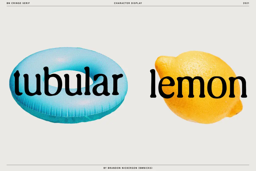
It is not a typeface for body text, and the brief’s claim of being “designed for legibility” needs qualifying — it’s legible at display sizes where the eye has room to parse the breaks, but drop it below about 24px and the distress starts fighting the letter recognition rather than supporting it. Pair the lighter weights with a plain sans or clean serif for any supporting text, and keep the heavier weights to single words or short headlines where the roughness reads as intentional rather than accidental.
What we liked, and what we didn’t
Strengths
- Each character has its own distress pattern rather than a repeated texture overlay
- Five weights let you build hierarchy without switching typefaces
- Lighter weights keep the serif structure readable while still looking worn
Trade-offs
- Legibility drops fast below display sizes, despite the claim of being built for it
- Heaviest weight leans toward noise rather than considered roughness
Cringe Serif is a competent entry in the worn-serif category, distinguished mainly by its five weights and genuinely individualised character breaks rather than a repeated texture. It's built for short display use — logos, labels, badge marks — and shouldn't be asked to do anything smaller or longer than that.

Tmfonts writes independent reviews of typefaces: what each font does well, where it falls short, what it suits, and where it is sold.