
Redlodge Font Free Download
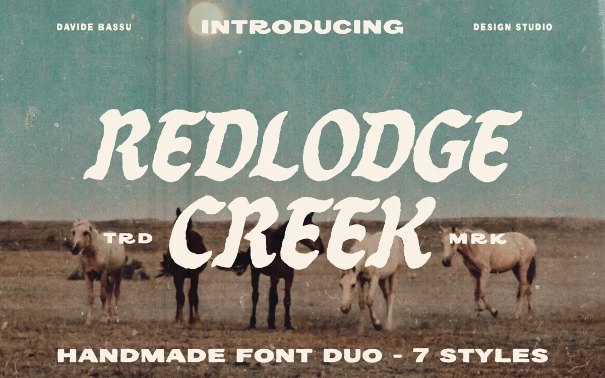
Is Redlodge free to download?
Redlodge is a commercial font sold on Creative Market, so the full version needs a paid license. Get it from the official listing: Redlodge font download.
Need something free? These handwritten fonts from Google Fonts are free for personal and commercial use:
Design style
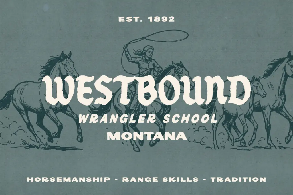
Redlodge pairs a vintage serif with a companion sans, both built around the hand-drawn, slightly uneven line you’d expect from a branding kit aimed at ranch and workwear identities. The serif carries the heavier personality: thick slab-like strokes, a few deliberately rough edges, and proportions that lean toward badge lettering rather than running text. The sans is the quieter half, there to carry supporting lines, addresses, or small print without competing with the serif’s bulk.
The hand-drawn quality is real but restrained — this isn’t a brush script trying to look spontaneous. It reads more like lettering that’s been cleaned up for repeated use: outlines are fairly even, counters are open, and the distressing (where it exists) is light rather than baked into every glyph. That restraint is the right call for a font duo meant to sit inside logo templates rather than stand alone as a display headline.
Across the seven styles — Regular, Tall, Slanted, Outline, Condensed, and a Wide cut — the family covers a reasonable spread of badge-building needs without reinventing the letterforms each time. The Outline style is the most useful variant here; it gives the badge-making workflow a second colour layer without needing a separate font.
Character set and features
This is a workhorse character set rather than an expressive one. Letters are built for stacking inside circles, shields, and ribbon badges, which means x-heights are generous and ascenders/descenders are kept short and controlled — good for fitting type into tight logo lockups, less interesting if you want a serif with real rhythm at paragraph length.
Language support covers the main Western European set — English, Italian, French, Spanish, Portuguese, German, and the Scandinavian languages — so diacritics are accounted for, which matters more than it sounds for anyone doing regional packaging or export-facing branding.
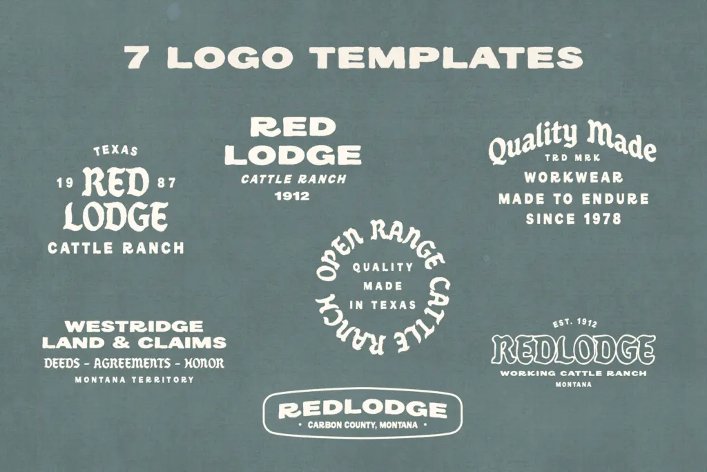
The bundled extras — seven logo templates and fifteen Western-themed illustrations in both PNG and vector formats — are really what separates this from a plain type family. They’re clearly built to be dropped into the templates rather than used as standalone illustration work, and they do the job of getting a badge mark finished quickly rather than offering much room for original illustration direction.
Use cases
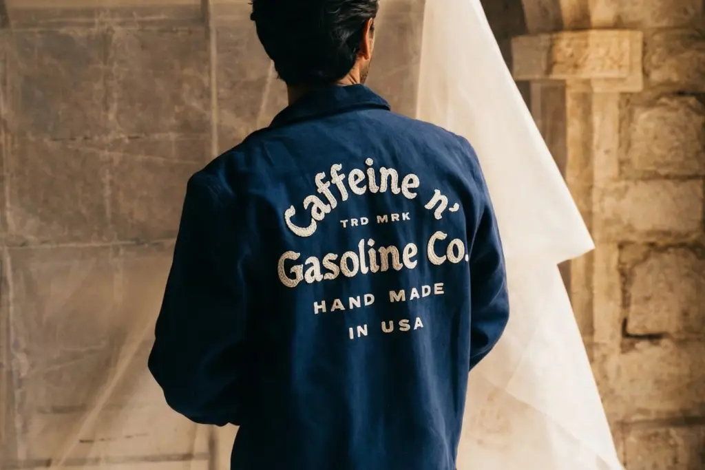
Redlodge is built for a narrow but well-populated lane: ranch and outdoor brands, workwear labels, craft beverage packaging, farmers’-market signage, anything leaning on Americana or frontier nostalgia. The serif works well as the dominant mark in a badge or patch, with the sans handling the smaller supporting copy underneath or around it.
It’s less suited to long-form editorial work or anything needing a neutral, contemporary voice — the Western lean is baked in and won’t read as generic vintage. For apparel graphics, embroidery patches, and packaging labels that want an immediate sense of heritage and rugged craft, it does exactly what it sets out to do, and the template package shortens the path from typeface to finished logo considerably.
What we liked, and what we didn’t
Strengths
- Seven styles give enough range to build full badge lockups without extra fonts
- Bundled logo templates and Western illustrations shortcut the path to a finished mark
- Diacritic support across several Western European languages extends its reach beyond English
Trade-offs
- The Western aesthetic is baked in deeply enough that it won't suit brands wanting a neutral or contemporary feel
- Limited usefulness for long-form text where the serif's badge-oriented proportions lose rhythm
Redlodge does one job well: Western badge and workwear branding, backed by a practical bundle of logo templates and illustrations. It won't stretch into editorial or neutral contemporary work, but for the heritage-brand lane it's aimed at, it's a solid and efficient pick.

Tmfonts writes independent reviews of typefaces: what each font does well, where it falls short, what it suits, and where it is sold.