
Bayfield Font Free Download
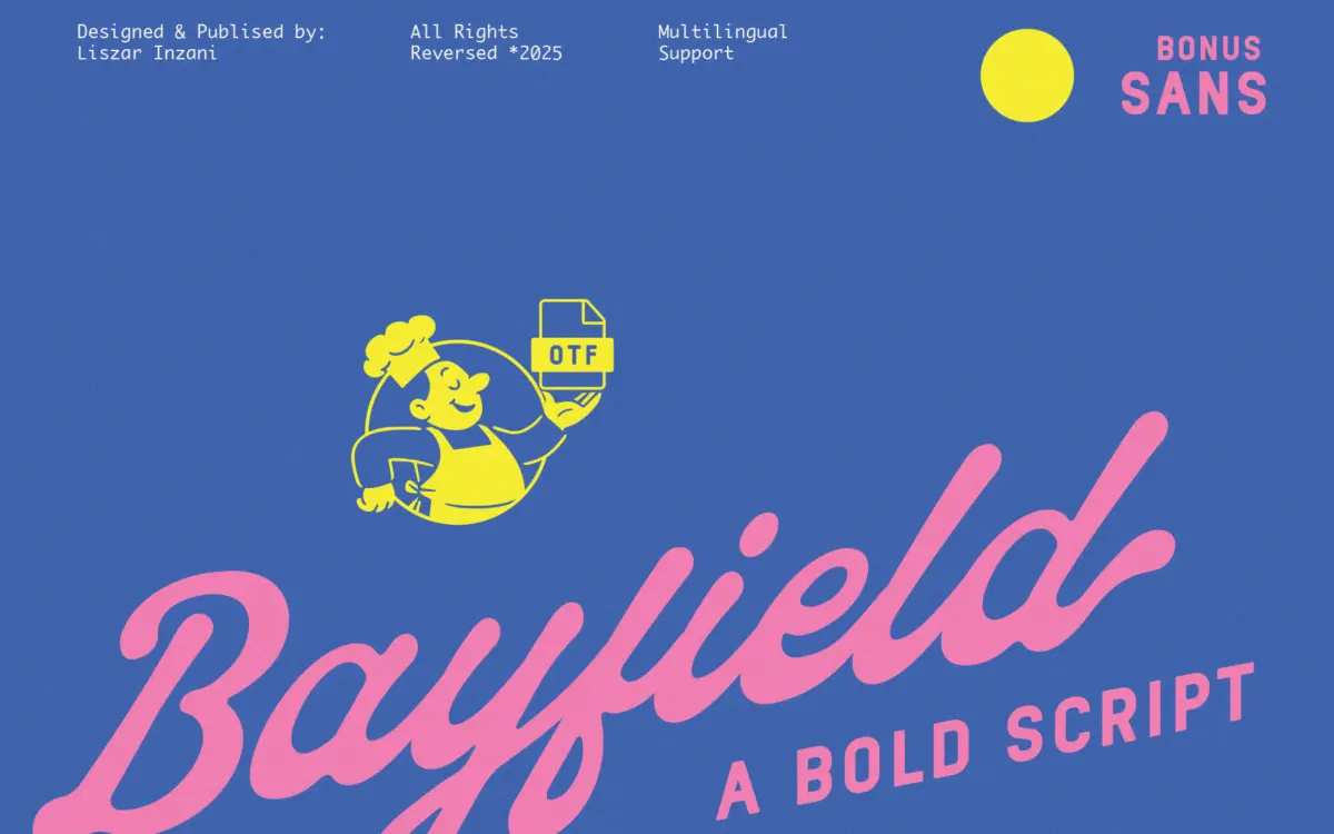
Is Bayfield free to download?
Bayfield is a commercial font sold on Creative Market, so the full version needs a paid license. Get it from the official listing: Bayfield font download.
Need something free? These script fonts from Google Fonts are free for personal and commercial use:
Design style
Bayfield is a two-piece family: a thick, bouncy script and a plain, no-fuss sans serif built to sit underneath it. The script carries most of the personality. Strokes are heavy and rounded, with a consistent thick-thin rhythm that leans more toward a marker or brush feel than a pointed-nib one. Letters tilt forward slightly and connect in a loose, casual way rather than a formal copperplate joinery, which gives it a retro, hand-painted sign quality rather than anything bridal or old-world.
The companion sans is where the pairing earns its keep. It is kept deliberately quiet — even stroke weight, rounded terminals, generous counters — so it reads as a neutral support character rather than a second star. On its own the sans is unremarkable, but that is the point: it is there to carry small print and let the script do the talking.
Where the design shows its age-group is in the rounded bowls and the slightly wobbly baseline on some letters, which is intentional and consistent with the ‘fun, bold’ brief rather than a flaw in execution. It will not suit anyone after restraint or precision; it is built for cheerfulness.
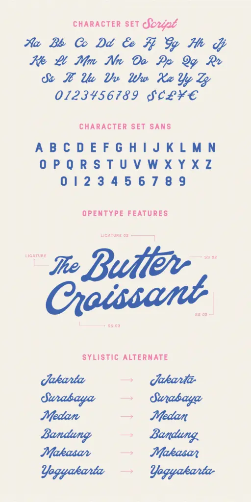
Character set and features
Bayfield includes uppercase and lowercase in both styles, numerals, currency symbols and standard punctuation, plus alternates and ligatures in the script. The alternates matter here more than usual, because a script this heavy can clog up on repeated letters — double Ls, double Os, back-to-back ascenders — and swapping in an alternate is often the only way to stop a word looking like a logjam. Worth testing your actual copy before committing, since not every combination has an obvious fix.
Multilingual support is listed, which extends the font’s reach beyond basic English setting, though exactly which diacritics and language sets are covered isn’t detailed, so it is worth checking against your specific language needs before relying on it for body text in another language.
There is no indication of a true italic or a range of weights beyond the one script and one sans — this is a single-weight duo, not a full family, so there is less room to build a type hierarchy without borrowing from elsewhere.
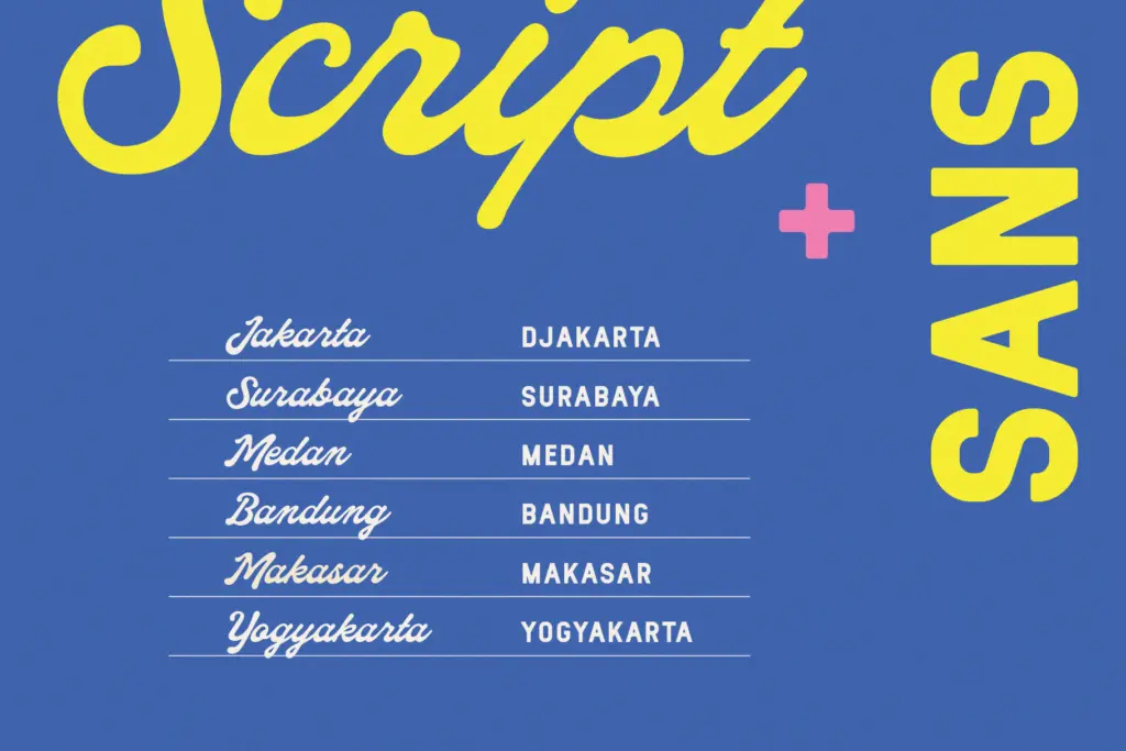
Use cases
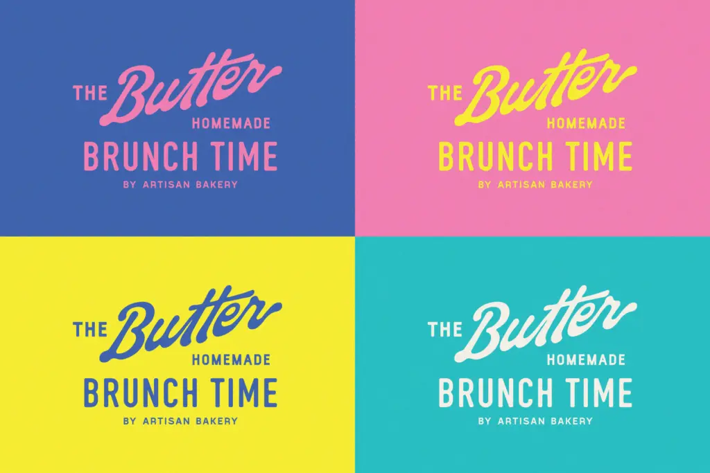
This is a logo and lockup font first. The script works well as a short wordmark — a brand name, a product name, a single phrase on packaging — especially where the goal is cheerful, retro-leaning and a little loud. Posters, badges, stickers, café signage and product labels are all sensible homes for it. Paired with its sans, it covers logotype-plus-tagline situations without needing a second typeface.
It is not a setting font. Long lines of the script will fight themselves at small sizes, and the looseness that reads as charming in a three-word headline becomes fatiguing across a paragraph. Keep the script to short bursts and let the sans handle anything functional — addresses, ingredient lists, captions.
What we liked, and what we didn’t
Strengths
- Alternates and ligatures help manage the heavy script's tendency to clog on repeated letters
- The companion sans is genuinely neutral, making it easy to pair without a fight for attention
- Strong fit for short branding lines — logos, labels, posters — where a cheerful retro tone is wanted
Trade-offs
- Single weight in each style limits how much type hierarchy you can build without another font
- The script's looseness and heaviness make it tiring to read in anything longer than a few words
Bayfield is a solid logo-and-label duo: a cheerful, heavy script with a sensible plain sans to back it up. It is not built for long-form setting and the family is limited to one weight each, but for short wordmarks with a retro, playful tone it does exactly what it says.

Tmfonts writes independent reviews of typefaces: what each font does well, where it falls short, what it suits, and where it is sold.