
Late Cinema Soft Handwritten Script Font Free Download
Is Late Cinema Soft Handwritten Script free to download?
Late Cinema Soft Handwritten Script is a commercial font sold on Creative Market, so the full version needs a paid license. Get it from the official listing: Late Cinema Soft Handwritten Script font download.
Need something free? These script fonts from Google Fonts are free for personal and commercial use:
Design style
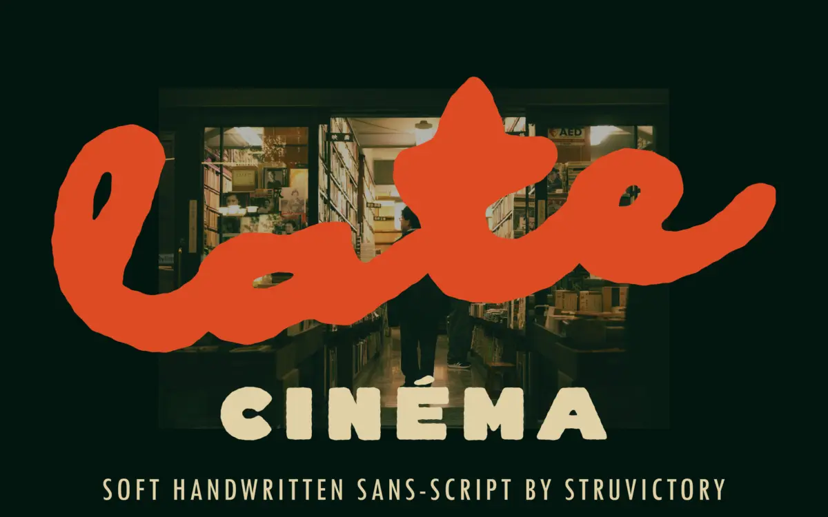
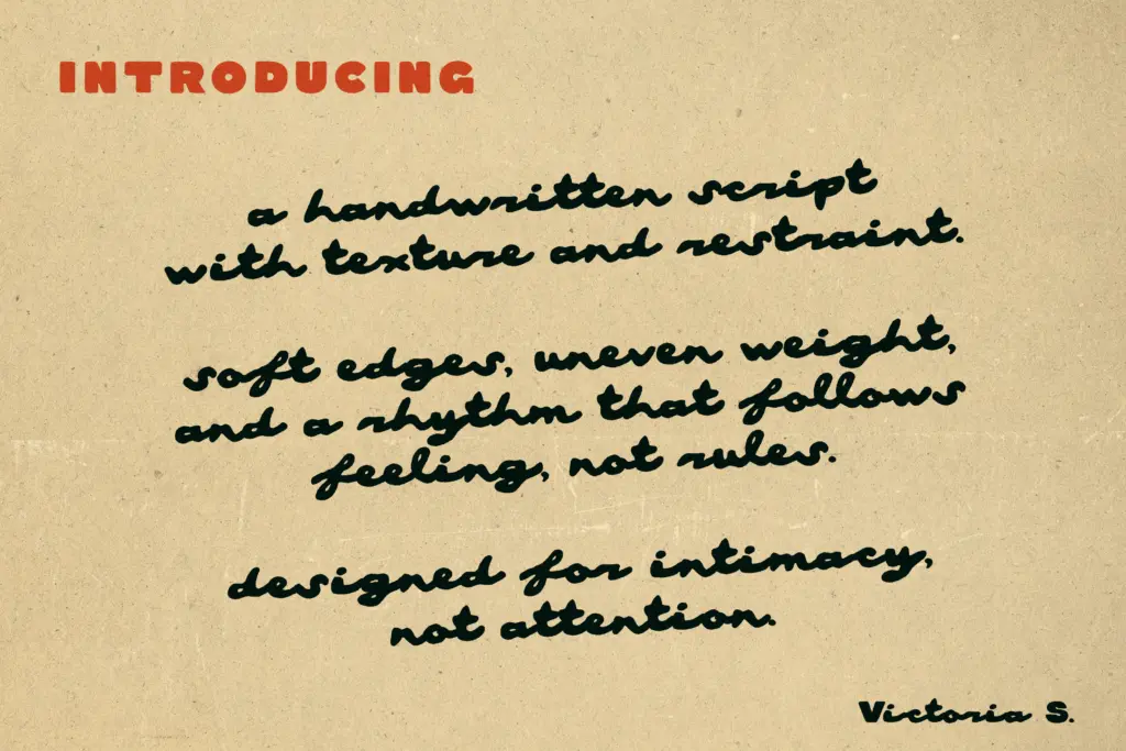
Late Cinema runs on a contrast that gives it most of its personality: solid, almost sans-serif capitals set against a loose, connected lowercase script. The uppercase is where the structure lives — thick, confident strokes with little of the swash or flourish you’d expect from a script companion. The lowercase is the opposite instinct entirely, built from a single inky, slightly textured line that wavers just enough to read as handmade rather than vectorised. The result sits closer to hand-lettering than calligraphy. There’s no formal contrast between thick and thin strokes in the script; it behaves more like a felt-tip or soft brush dragged at a consistent pressure, which is where the “soft” in the name earns its keep.
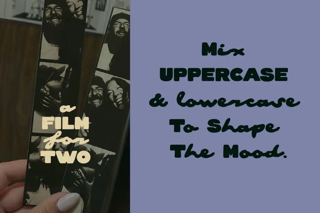
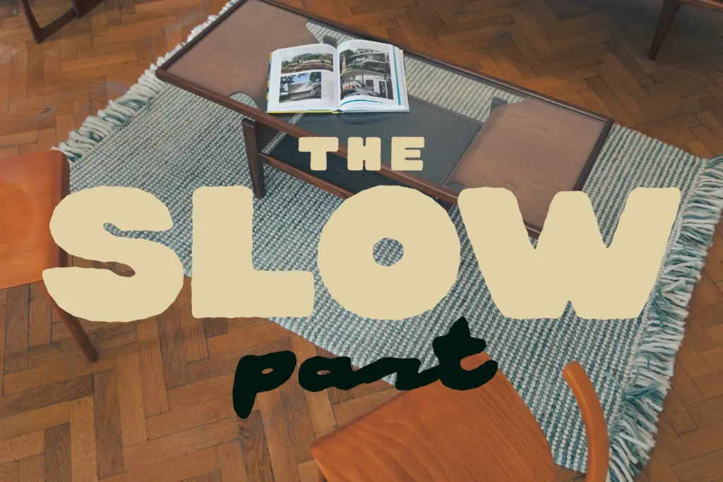
This two-register approach is the whole design argument. Rather than picking a lane — bold display or intimate script — Late Cinema tries to let you use both within a single word or line, capital anchoring the word and lowercase script carrying the mood. It’s an effective trick when it works, though it does mean the typeface reads less like a single cohesive alphabet and more like two related ideas stitched together.
Character set and features
The seller notes support for common Latin-based languages, so coverage should extend past basic English diacritics, though exact scripts and symbol count aren’t specified — worth checking the live preview for anything project-specific before committing. The connected nature of the lowercase script implies some built-in ligature handling, since letters need to join convincingly across common pairs, but no detailed OpenType feature list is given. There’s no stated weight range; this appears to be a single-style release rather than a family with light-to-bold variants, so designers shouldn’t expect multiple weights to lean on for hierarchy within the script itself — that job falls to the paired capitals.
At small sizes, the lowercase script will struggle. The texture and slight unevenness that make it feel handmade at display sizes will start to clot and blur once you drop much below headline scale, which is typical of scripts built this way but still worth flagging plainly. The uppercase, being more sans-serif in construction, holds up considerably better at smaller sizes and could plausibly do some labelling or supporting-text work on its own.
Use cases
This is a headline typeface, not a body-text one, and it knows it. The combination of bold capitals and loose script lowercase suits logotypes, short branding lockups, packaging fronts, poster titles, and signage where a project wants warmth without losing a sense of structure — cafés, small-batch goods, independent film or music branding, anything trading on nostalgia or a handmade feel rather than polish. The cinematic, slightly retro name fits: it reads like something you’d see stamped across a title card or a vintage shopfront sign.
It’s less suited to anything requiring sustained reading or multi-line settings, and because it only comes in what appears to be one weight, it won’t carry an entire brand system by itself — it needs a plain sans or serif alongside it for body copy, captions, and anywhere legibility outranks mood. Used short, large, and sparingly, it does its job well.
What we liked, and what we didn’t
Strengths
- Strong contrast between solid capitals and loose script lowercase gives built-in hierarchy
- The ink-like texture reads as genuinely handmade rather than a filtered script font
- Works well for short branding lockups, packaging fronts and retro-leaning signage
Trade-offs
- Lowercase script loses legibility quickly below headline sizes
- Appears to ship as a single weight, limiting how far it can carry a brand system alone
Late Cinema is a well-judged pairing of structure and texture that works best as a short, large headline piece rather than a full typographic system. The handmade lowercase script carries real warmth but loses clarity fast at small sizes, and with no stated weight range it leans hard on being used alongside something plainer.

Tmfonts writes independent reviews of typefaces: what each font does well, where it falls short, what it suits, and where it is sold.