
Junewood Font Free Download
Is Junewood free to download?
Junewood is a commercial font sold on Creative Market, so the full version needs a paid license. Get it from the official listing: Junewood font download.
Need something free? These serif fonts from Google Fonts are free for personal and commercial use:
Design style
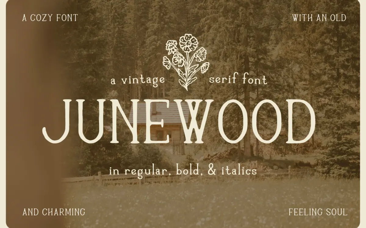
Junewood is a handdrawn serif built on irregularity rather than precision. The strokes wobble slightly at the edges, serifs land unevenly from letter to letter, and the overall impression is of something inked with a worn nib rather than drawn in a vector program and smoothed over. That rough, slightly uneven quality is the whole point: it’s pitched at the cottagecore and folk-art end of branding, where a typeface is meant to read as handmade rather than manufactured.
The letterforms lean warm and soft rather than sharp. Curves are rounded, terminals blunt, and there’s none of the crisp contrast you’d get from a formal transitional serif. It reads as friendly and unhurried, closer to a diary entry or a pressed-flower label than a masthead. The italic leans into this further, loosening up the posture and adding a bit more handwriting energy without losing the serif structure underneath.
Character set and features
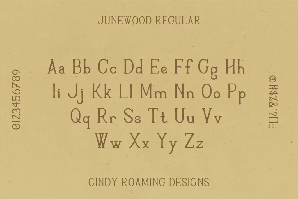
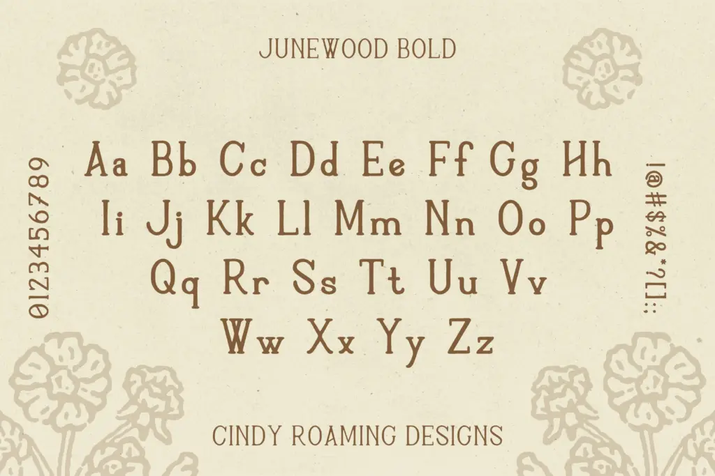
The set covers uppercase and lowercase, numerals, punctuation, an italic, and a bold weight, which is a reasonable spread for a display-leaning serif like this. Having both an italic and a bold gives you some hierarchy to work with inside a single piece — a bold wordmark, an italic subhead, a regular body line — without reaching for a second typeface.
Because the letterforms are intentionally irregular, consistency isn’t really the selling point here, and that’s worth noting rather than glossing over. At small sizes or in long paragraphs, the wobble that reads as charming in a logo or a headline starts to work against comprehension — the eye has to do more adjusting letter to letter than it would with a typeface drawn for continuous reading. This is a typeface for short bursts of text, not body copy.
The spacing holds together reasonably well at display sizes, and the bold weight in particular has enough heft to anchor a short line without losing the handdrawn character. But don’t expect the kind of rhythmic evenness you’d get from a typeface built around a grid — Junewood’s looseness is a feature in headlines and a liability in paragraphs.
Use cases
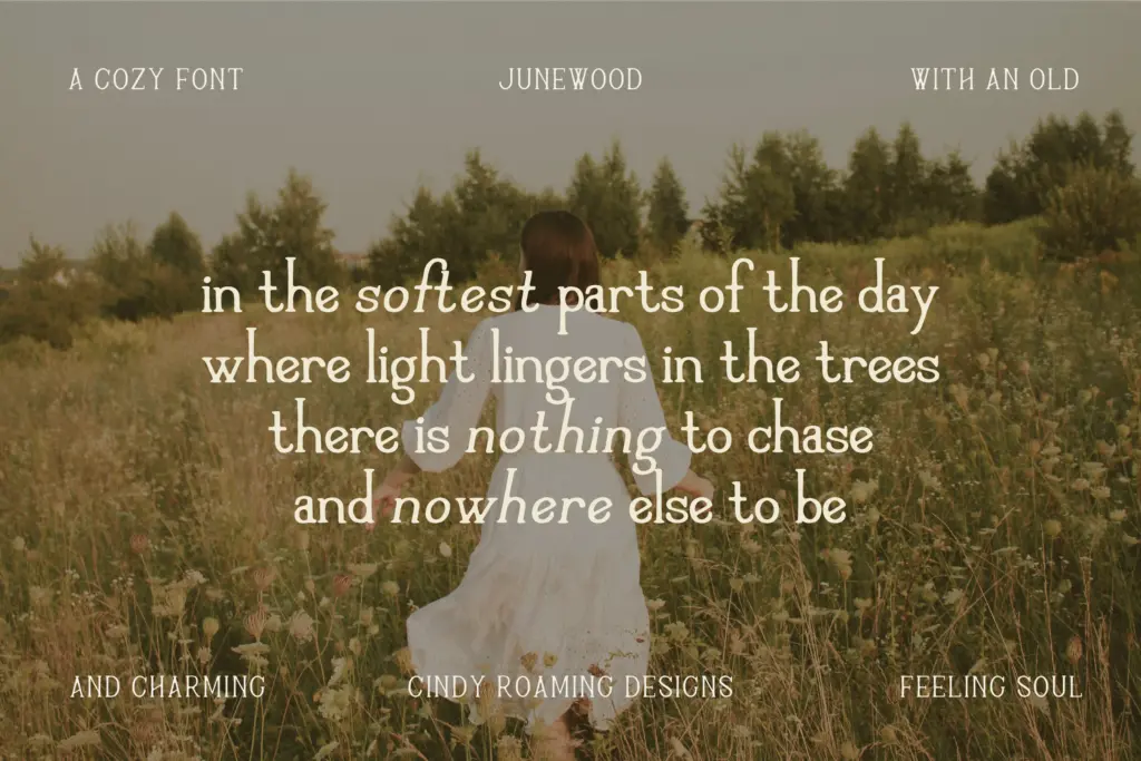
This is a typeface for brand touches rather than editorial systems: a product label on a jam jar, a logotype for a plant shop, packaging copy for something marketed as small-batch or seasonal, a wedding invitation that wants to feel like it was written by hand rather than printed by a press. It suits anyone building a visual identity around warmth, nostalgia, or a sense of things being a little imperfect on purpose.
It’s less suited to anything that needs to scale down to small print or hold a paragraph of instructions — pair it with a plainer sans or serif for supporting text and let Junewood do the work in headlines, logotypes, and short display lines where its handmade quality has room to breathe.
What we liked, and what we didn’t
Strengths
- The deliberate irregularity gives logos and labels a genuinely handmade feel.
- Bold and italic styles add usable hierarchy within a single brand piece.
- Suits cottagecore, folk, and slow-living branding without feeling costume-y.
Trade-offs
- The letterform wobble that charms in headlines becomes a strain in longer text.
- Spacing consistency takes a back seat to character, so tight layouts need care.
Junewood delivers exactly the lived-in, handmade charm it promises, and does it well at display sizes. It's not built for continuous reading, so keep it to logos, labels, and short display lines and let something plainer carry the paragraphs.

Tmfonts writes independent reviews of typefaces: what each font does well, where it falls short, what it suits, and where it is sold.