Serif
3.9
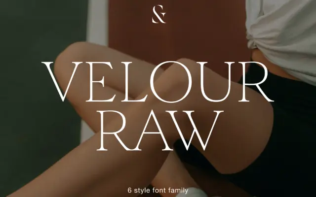
Velour Raw: a low-contrast serif family built for body text, not headlines
Design style Velour Raw is pitched as the calmer sibling of a display serif, and that relationship shows in how…
 Tmfonts

Design style Velour Raw is pitched as the calmer sibling of a display serif, and that relationship shows in how…
Tmfonts
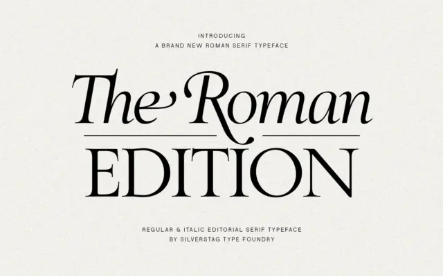
Design style The Roman Edition draws on the proportions of classical Roman inscriptional letterforms, filtered through a more restrained editorial…
Tmfonts
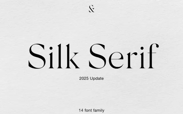
Design style Silk Serif belongs to the high-contrast family that has become shorthand for fashion and beauty branding — thin,…
Tmfonts
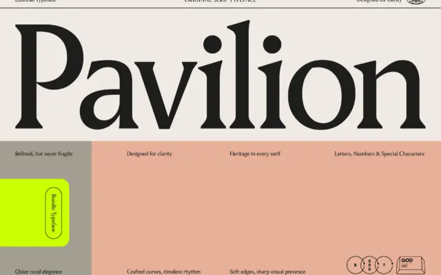
Design style Pavilion sits in the modern-meets-traditional serif camp: bracketed but crisp cuts, moderate stroke contrast, and a structure that…
Tmfonts
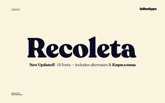
Design style Recoleta belongs to the soft-serif revival that took cues from 1970s display faces like Cooper and Windsor without…
Tmfonts
Design style Belvare sits in that familiar seam between vintage advertising lettering and current editorial serif revival. The condensed proportions…
Tmfonts
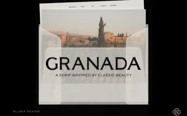
Design style Granada is a high-contrast serif built for the top of a page rather than the body of one.…
Tmfonts
Design style Cravelo sits at the intersection of two things that don’t often meet in one letterform: condensed vintage lettering…
Tmfonts
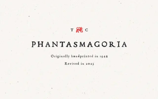
Design style Phantasmagoria is a serif built on the bones of hand-set type, with the roughness of old letterpress printing…
Tmfonts