
Pavilion Serif: a single-weight editorial serif for headlines and short copy
Design style
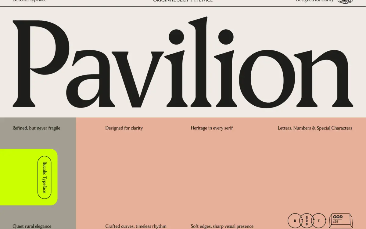
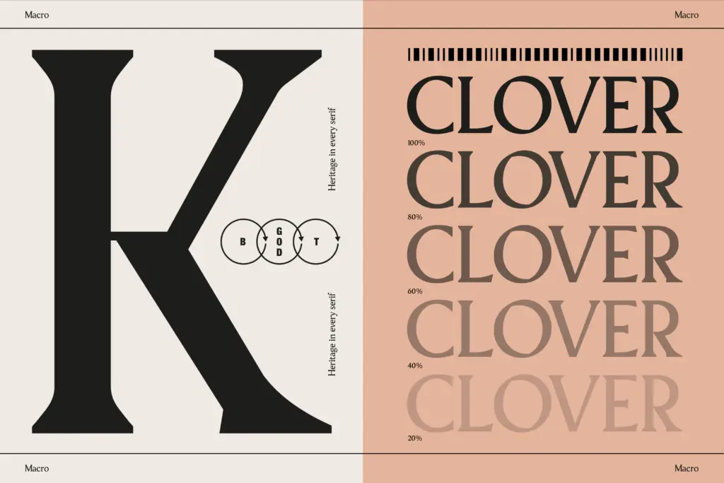
Pavilion sits in the modern-meets-traditional serif camp: bracketed but crisp cuts, moderate stroke contrast, and a structure that leans more geometric than calligraphic. The uppercase carries most of the personality — upright, evenly weighted strokes with terminals that are cut rather than tapered, giving titles a slightly formal, architectural feel without tipping into heaviness. It reads as confident rather than loud.
The lowercase is calmer. Curves are soft, the x-height is generous, and the overall rhythm is even enough that short paragraphs hold together without obvious weak points. There’s nothing eccentric here — no flared serifs, no ink traps, no quirky ductus — which is consistent with its billing as a clean, editorial serif rather than a personality display face.
Character set and features
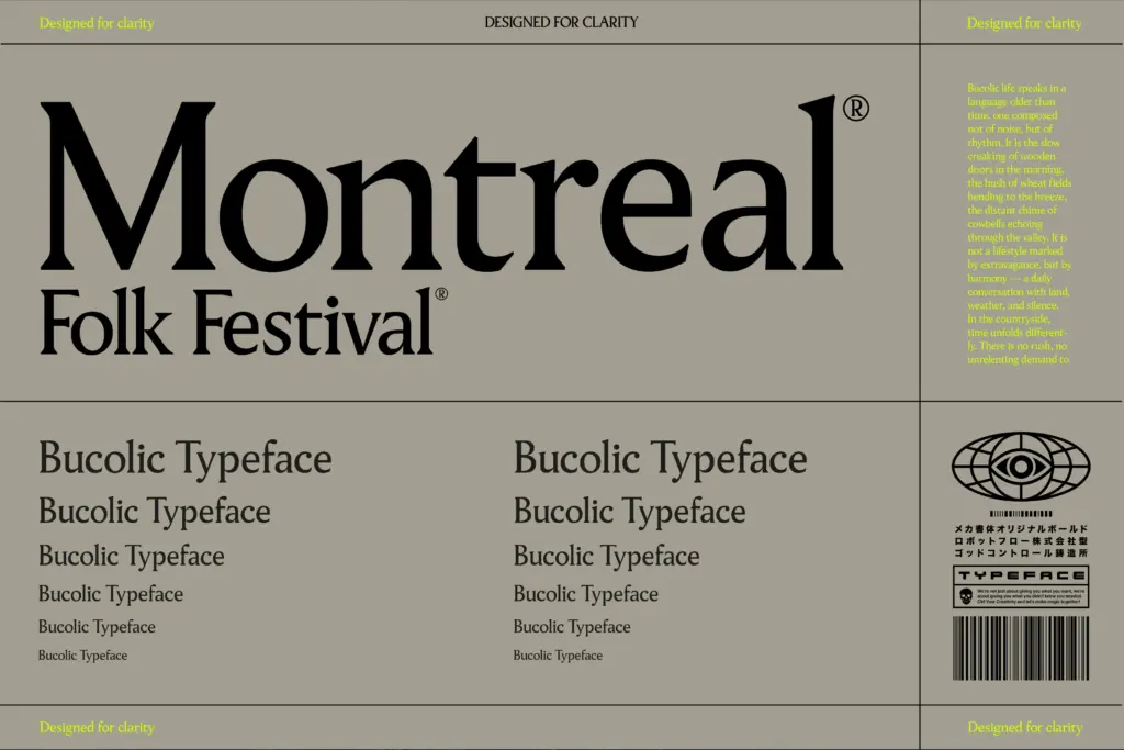
The set is small: 215 characters covering uppercase, lowercase, numerals, and standard punctuation, delivered as a single regular-weight font in OTF, TTF, and both web formats. There’s no italic, no bold, no light — just one weight doing all the work. That’s the main structural limit of the release. If you need a bold headline next to a light caption, Pavilion alone won’t get you there; you’ll need to pair it with something else for contrast in weight or role.
Given the character count, don’t expect ligatures, alternates, small caps, or extended language support — the brief makes no mention of any of that, and the file list confirms it’s a straightforward single-style package. What you get is a clean, dependable letter shape repeated consistently across the basic Latin set, which is exactly what an editorial serif needs to do at the paragraph level.
Use cases
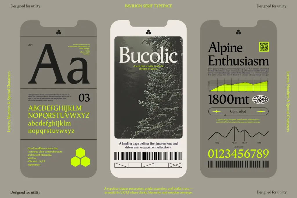
Pavilion earns its keep as a headline and subhead serif for editorial layouts — magazine mastheads, pull quotes, section titles, the kind of short-form text where its even rhythm and restrained curves read as considered rather than decorative. The seller’s claim that it works for long-form body copy holds up reasonably well too: the x-height and spacing keep paragraphs from feeling cramped, though at very small sizes the moderate contrast in the strokes will ask for generous leading to stay comfortable.
It also has legs in branding and packaging work where a single, quiet serif mark is enough — a wordmark, a product name, a short tagline. Because there’s only one weight, it’s better suited to projects with a light typographic hierarchy than to dense systems needing bold, italic, and multiple weights working together. Pair it with a sans or a heavier serif from elsewhere in your library if you need that range; Pavilion alone will do titles and short text blocks well, but it isn’t built to run an entire layout by itself.
What we liked, and what we didn’t
Strengths
- Even rhythm and generous x-height make short paragraphs comfortable to read
- Uppercase has enough structure and cut to carry headlines and wordmarks on its own
- Restrained curves keep it usable across editorial, packaging, and branding contexts
Trade-offs
- Ships as a single regular weight with no bold or italic, limiting hierarchy options
- Small 215-character set means no ligatures, alternates, or extended language support
Pavilion Serif is a competent, quiet editorial serif with even rhythm and a generous x-height that reads well in short blocks and headlines. Its single-weight, 215-character set limits it to lighter typographic systems, so it works best as one voice in a larger pairing rather than a standalone family.
Verdict

Tmfonts reviews typefaces in depth — every font is tested in real branding, editorial and screen layouts before a word gets written. 555+ fonts reviewed and counting.