
Blissful Radiance: a pencil-textured script for warm, personal branding
Design style
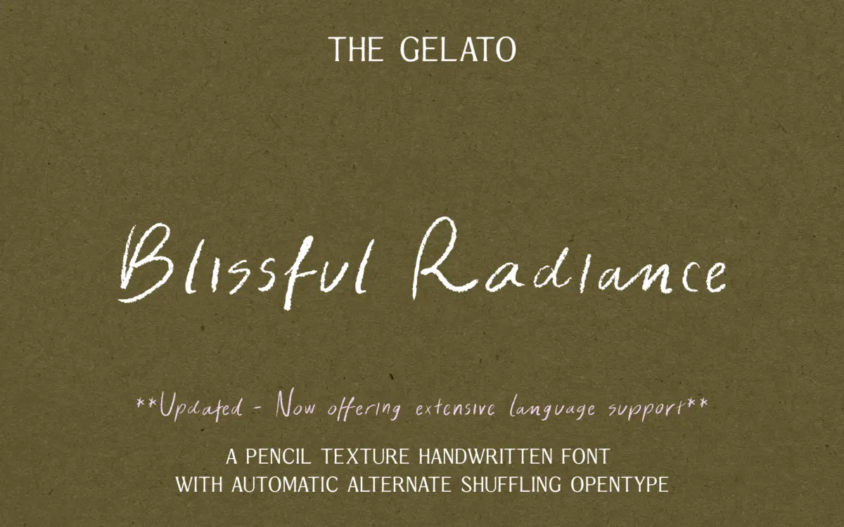
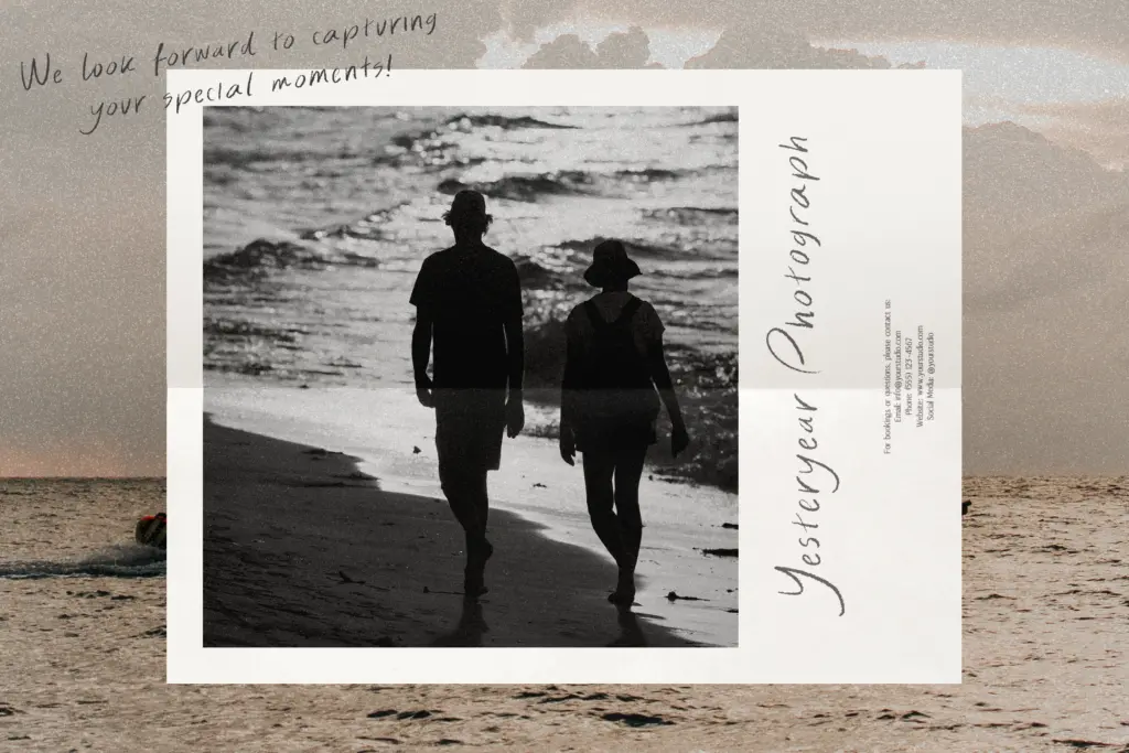
Blissful Radiance belongs to the crowded field of casual handwritten scripts, but it distinguishes itself with a textured stroke that reads like actual pencil rather than a smoothed-out digital approximation. The letters lean slightly forward, joins are loose and informal, and the baseline drifts a little from letter to letter, which is exactly what gives it a handmade rather than templated feel. There’s nothing severe or angular here — the whole thing sits on the softer end of the script spectrum, closer to a note scribbled on the back of an envelope than a formal invitation hand.
The texture is the headline feature and it’s well executed. Strokes have visible grain, and the weight varies subtly within a single letter the way real pencil pressure does. It avoids the trap of looking like a filter applied after the fact — the roughness feels drawn into the letterforms themselves, not layered on top.
Character set and features
The font includes contextual alternates, with two sets that swap automatically as you type repeated letters. This is a genuinely useful feature for a script like this, since handwritten fonts live or die on whether repeated letters within a word look identical and mechanical. Here, a double ‘l’ or a word with two ‘a’s gets some natural variation without the user having to manually select glyphs, which keeps the workflow simple for anyone without deep OpenType experience.
The seller notes multilingual character support, though the brief doesn’t specify which languages or diacritics are covered, so anyone working outside basic Latin script should check the character map before committing to a project. Beyond the alternates, there’s no mention of ligatures, swashes, or additional stylistic sets, so this reads as a font built around one strong texture idea rather than a deep, multi-featured family.
Use cases
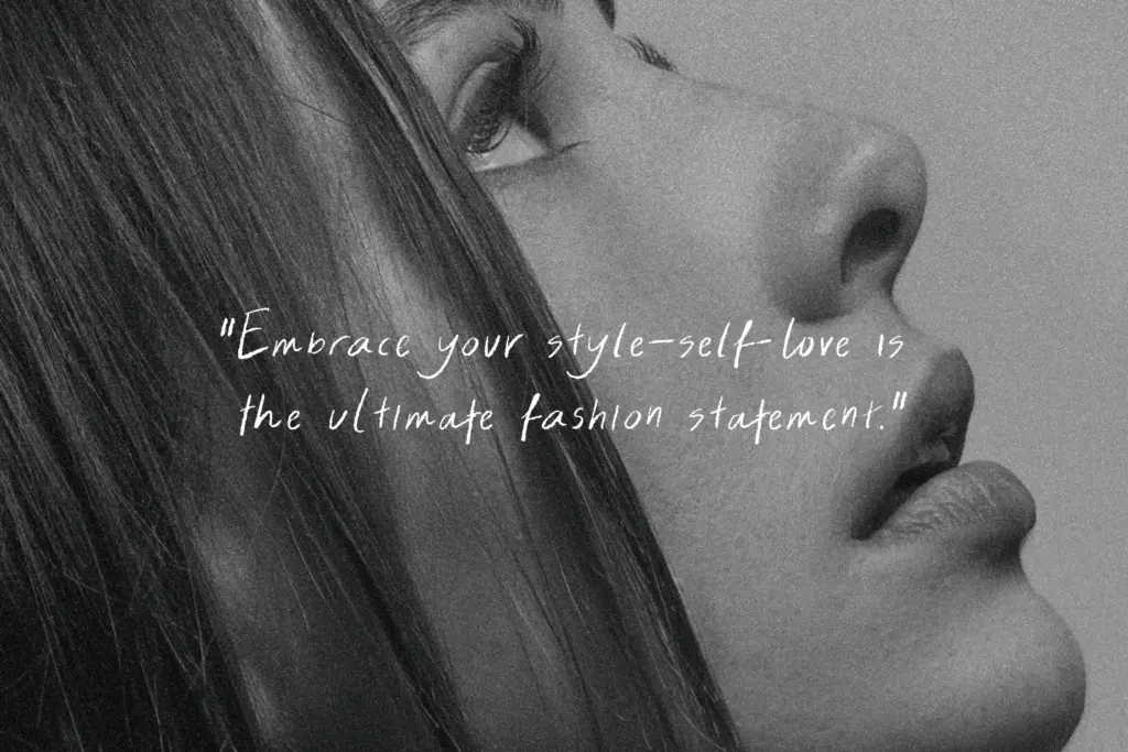
This is a font for warmth over polish. It fits handwritten-style greeting cards, personal notes, packaging that wants to feel small-batch or artisanal, and branding for businesses trying to signal approachability — bakeries, florists, candle makers, that kind of thing. The pencil texture also makes it a natural fit for wedding stationery that’s aiming for rustic or informal rather than black-tie, where a cleaner calligraphic script would feel mismatched.
It is not a workhorse font. The texture and irregular baseline mean it needs generous size and space to read well — at small sizes on a product label or in a paragraph of body copy, the grain can start to muddy legibility rather than add charm. It’s best treated as a display or accent element: a name, a short phrase, a logotype, not a script for setting sentences of running text. Pair it against a plain, quiet sans or serif for supporting copy, since two textured or expressive faces in the same layout tend to compete rather than complement.
Overall, it does one job — casual, hand-drawn warmth — and does it with more texture care than most fonts in this category, but buyers should go in expecting a display-scale, feature-light script rather than a flexible family for varied applications.

What we liked, and what we didn’t
Strengths
- Genuine pencil texture built into the letterforms rather than applied as a surface effect
- Contextual alternates automatically vary repeated letters without manual glyph swapping
- Loose, informal rhythm suits rustic and handmade branding contexts well
Trade-offs
- Legibility drops off at small sizes, limiting it to display and short-text use
- Feature set is thin beyond the alternates, with no mention of ligatures or extra stylistic options
Blissful Radiance nails a specific texture — real pencil grain rather than a filtered effect — and its contextual alternates do useful work keeping repeated letters varied. But it's a display script through and through, needing size and space to hold up, with a fairly limited feature set beyond the alternates. Good for warm, casual branding and stationery; not a font to rely on for anything smaller or more functional.
Verdict

Tmfonts reviews typefaces in depth — every font is tested in real branding, editorial and screen layouts before a word gets written. 555+ fonts reviewed and counting.