
Casually Handwritten: an unpolished script for personal, low-formality projects
Design style
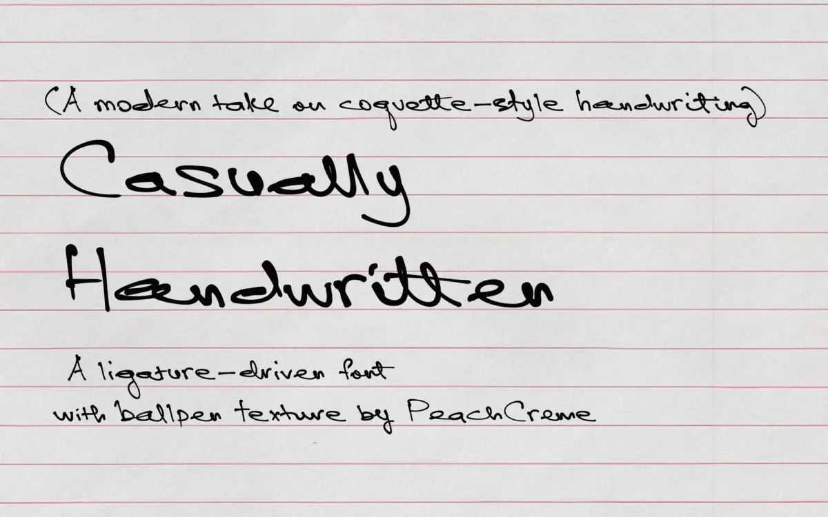
Casually Handwritten reads like a font built from a single pen session rather than a systematic redrawing of a script skeleton. The letters lean slightly, baseline wobbles a little, and stroke weight shifts unevenly from letter to letter in a way that mimics actual pressure changes rather than a programmed contrast curve. That’s the point: this isn’t a script trying to look like calligraphy. It’s trying to look like someone’s handwriting, and mostly it does.
The looseness comes at a cost of consistency. Some letters sit closer to a rounded, bubbly cursive while others feel more angular and rushed, which is true to how real handwriting behaves but means the typeface doesn’t have a single, tight silhouette the way a more engineered script does. Designers who want a script with an obvious signature shape — a distinctive swash or a repeatable flourish — won’t find that anchor here. What they’ll find instead is texture: a page of this font looks handwritten because no two instances of the same letter look quite identical.
Character set and features
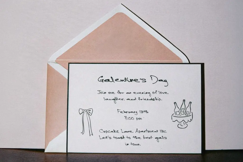
The font ships with 135 ligatures and alternates, all scoped to lowercase letters. That’s a meaningful number for a handwriting font, and it does real work — common letter pairs and word-final letters get swapped out for variant forms so repeated words don’t look stamped from the same mould. Used through OpenType-aware software with alternates and ligatures switched on, this is where the font earns its keep. Set it in a program that ignores OpenType features, though, and you’re left with the base lowercase set, which is noticeably plainer and loses a good portion of what makes the font interesting.
Because the alternates are lowercase-only, uppercase letters carry more of the font’s default character with no variation to break up repetition. Names, titles, or anything leaning heavily on capitals won’t get the same organic movement that lowercase-heavy text does. This is a font that rewards lowercase-set copy and works against you if your layout calls for a lot of caps.
Use cases
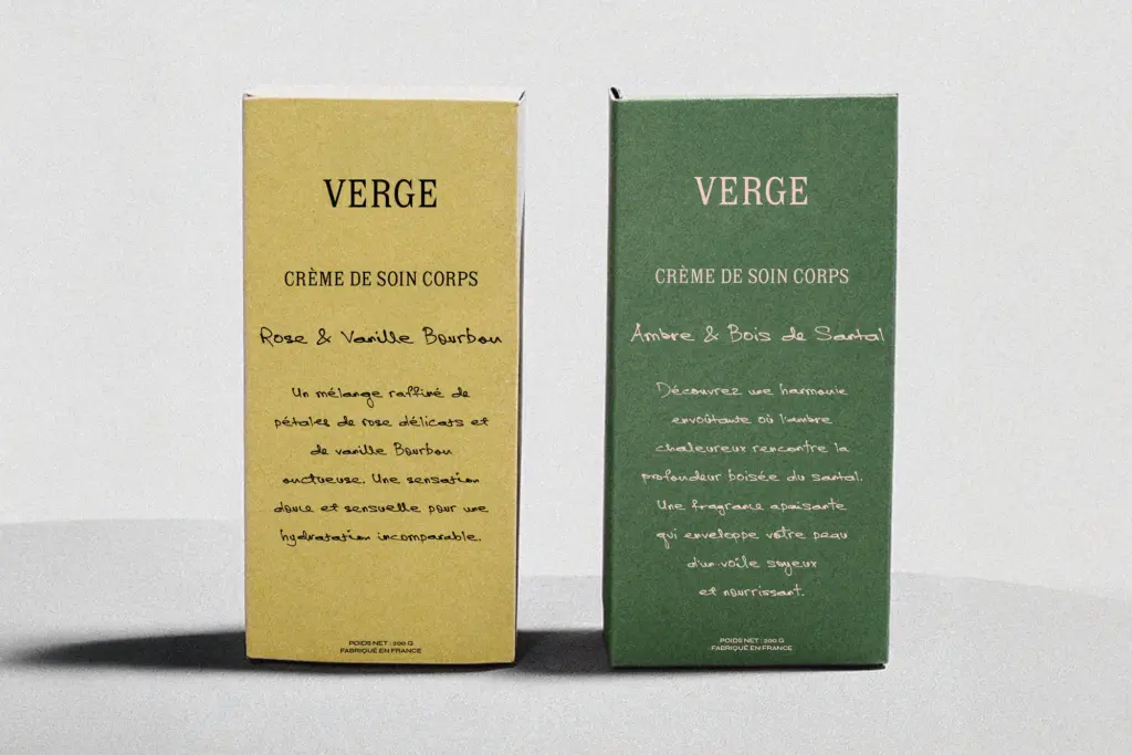
This suits packaging copy, wedding stationery, journaling spreads, and any branding work aiming for a handmade, personal register — the kind of project where
What we liked, and what we didn’t
Strengths
- 135 lowercase ligatures and alternates genuinely vary repeated letters and words
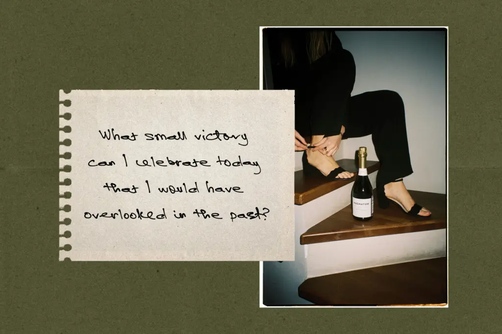
- the uneven baseline and stroke weight read as authentic handwriting rather than a stylised script
- well suited to short-form, informal copy like packaging notes and journaling
Trade-offs
- alternates are lowercase-only, so headlines and copy leaning on capitals lose most of the variation
- without OpenType feature support the font falls back to a much plainer, repetitive base set
Casually Handwritten does one thing convincingly: it looks like a real hand wrote it, wobble and all. The 135 lowercase ligatures give it genuine texture in OpenType-aware layouts, but the effect thins out fast without feature support, and the uppercase set doesn't share the same variation. Best kept to short, lowercase-heavy, informal work rather than asked to carry a whole brand system.
Verdict

Tmfonts reviews typefaces in depth — every font is tested in real branding, editorial and screen layouts before a word gets written. 555+ fonts reviewed and counting.