
Ratio: a geometric sans with inktraps for mid-century minded branding
Design style
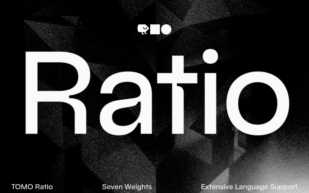
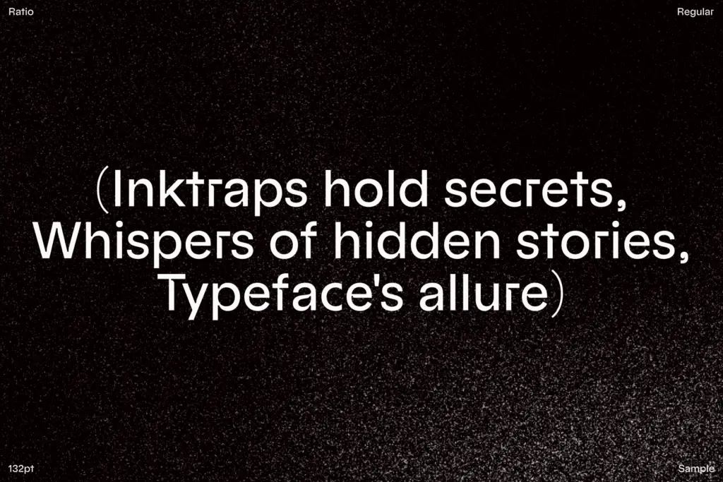
Ratio sits in the geometric sans lineage that runs back through Bauhaus-era type and Futura’s circular lowercase, but it doesn’t just replay that formula. The distinguishing move is the inktrap: notches cut into the joints of letters like the bowl-to-stem junctions of the b, d, p, q and the crossbars of the a and t. Historically inktraps existed to stop ink from clogging at small sizes on newsprint; here they’re kept at a scale that reads as ornament rather than necessity, since digital rendering doesn’t need them. That’s fine — plenty of contemporary sans faces borrow the trait purely for character — but it does mean the inktraps are doing a styling job, not a functional one, and designers should treat them that way.
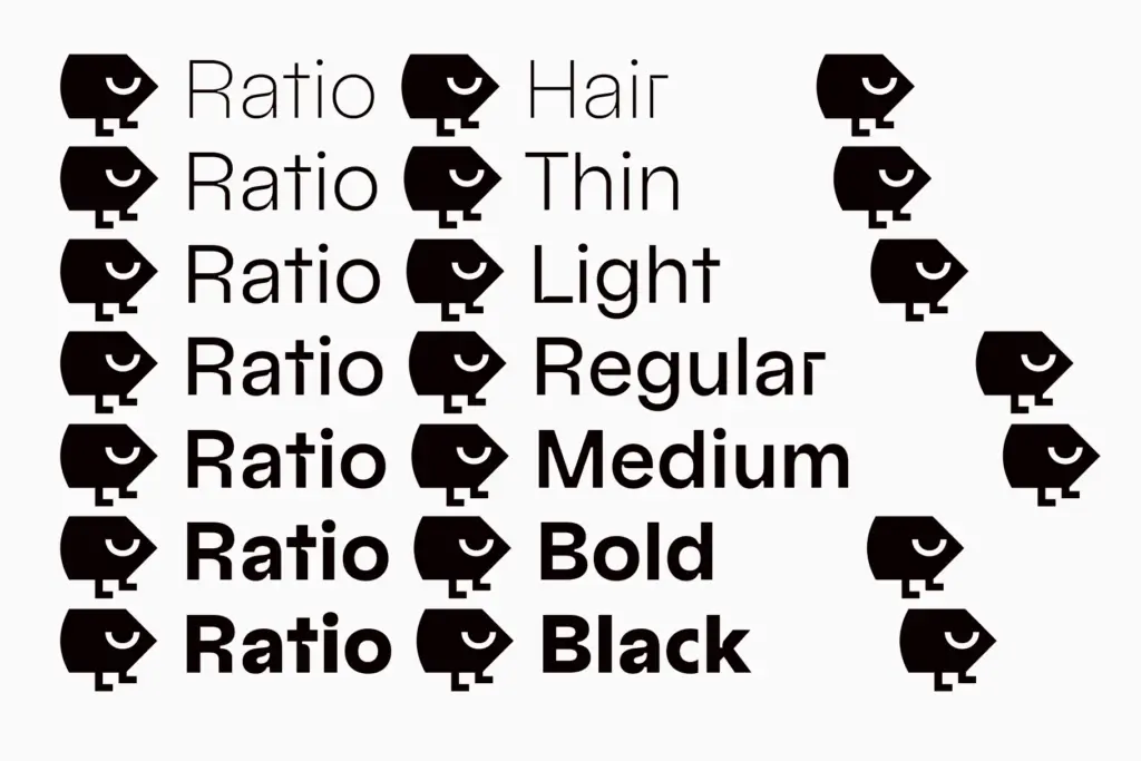
The spurless construction (no small serif-like spurs on characters like G or the terminals of C and S) keeps the geometry clean, which suits the round, compass-drawn feel of the lowercase o, e and c. Across seven weights the skeleton stays consistent, so the inktrap detail scales in visual weight along with the strokes rather than getting lost or over-dominant at either end.
Character set and features
Alternate glyphs are available through OpenType stylistic sets, which is where Ratio earns some of its versatility. Rather than locking you into one treatment of a letter, you can swap in variants for characters that carry the inktrap detail most visibly — useful if a client brief wants the geometric-modernist look dialled up or dialled back within the same family. Seven weights gives a reasonable range for building a hierarchy, from a light suited to body copy or captions up through weights heavy enough for headlines and wordmarks.
Where the inktraps are more of a liability is at very small text sizes: the notches are subtle enough not to distract in headlines and mid-size text, but they add visual noise that a plain geometric sans wouldn’t have once you’re setting dense paragraphs. This isn’t a font that disappears into a page of body text — it has a point of view, and that point of view is more suited to display and mid-size use than to long-form reading.
Use cases
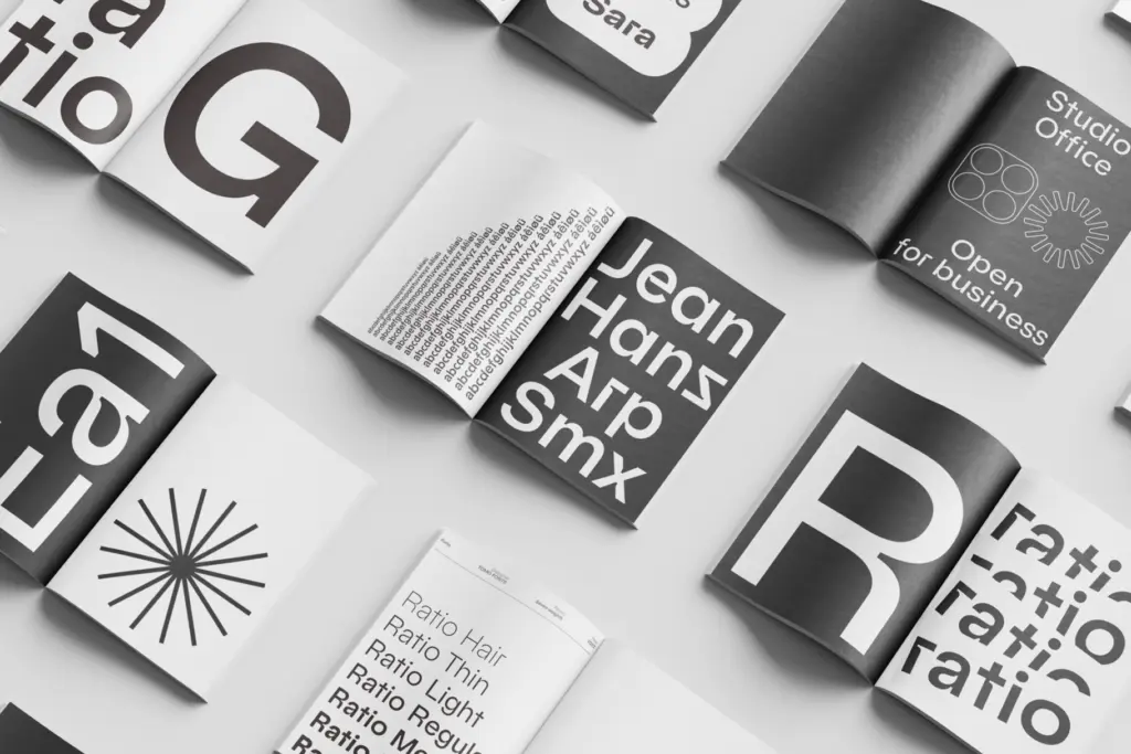
Ratio’s natural home is branding and identity work that wants a modernist geometric base with a bit of manufactured texture — logotypes, wordmarks, packaging typography, editorial headlines, app interfaces that want something slightly more distinctive than a stock system sans. The stylistic-set alternates make it flexible enough to swing from a fairly straight, clean geometric mode to a more overtly detailed one without changing typefaces mid-project.
It’s less suited to dense-text editorial layouts or anything where the reader is expected to spend long stretches at small sizes — the inktrap detail is wasted there and slightly works against comfortable reading. Treat it as a display-and-mid-size workhorse with a decorative signature, not an all-purpose text face, and it does its job well.
What we liked, and what we didn’t
Strengths
- The inktrap detailing gives an otherwise standard geometric sans a distinct, recognisable signature
- Seven weights provide real range for building hierarchy from captions to headlines
- OpenType stylistic sets let you dial the decorative detail up or down without switching typefaces
Trade-offs
- The inktraps add visual noise at small sizes, making it a weaker choice for dense body text
- Its geometric-plus-inktrap look is distinctive enough that it won't fade into the background the way a neutral sans would
Ratio is a well-drawn geometric sans that uses inktrap notches as a styling device rather than a functional one, giving it a distinct mid-century-plus-detail character. It works best in branding, packaging and headline contexts across its seven weights, but the decorative notches add friction at small text sizes. A solid, characterful choice for identity work rather than an all-purpose text family.
Verdict

Tmfonts reviews typefaces in depth — every font is tested in real branding, editorial and screen layouts before a word gets written. 555+ fonts reviewed and counting.