Sans Serif
3.9
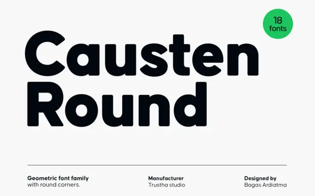
Causten Round: a geometric sans with softened corners for branding work
Design style Causten Round takes a geometric skeleton — circular counters, even stroke widths, a constructed look — and files…
 Tmfonts

Design style Causten Round takes a geometric skeleton — circular counters, even stroke widths, a constructed look — and files…
Tmfonts
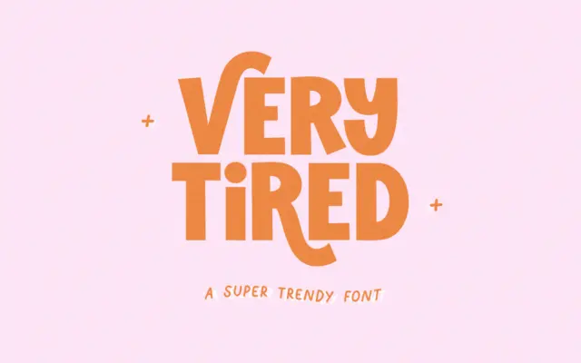
Design style Very Tired is a blocky, all-caps sans with a deliberately worn, retro feel. The core letterforms are thick…
Tmfonts
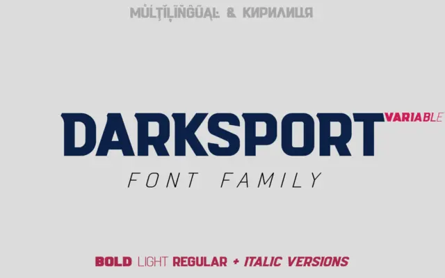
Design style Darksport is a condensed-leaning sans built with athletic branding in mind, and it shows in the details. The…
Tmfonts
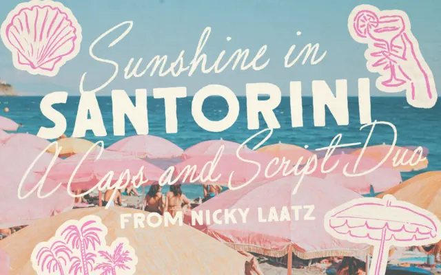
Design style Santorini Sunshine pairs a loose, slightly imperfect script with a rough-edged all-caps sans, both pulling from mid-century signage…
Tmfonts
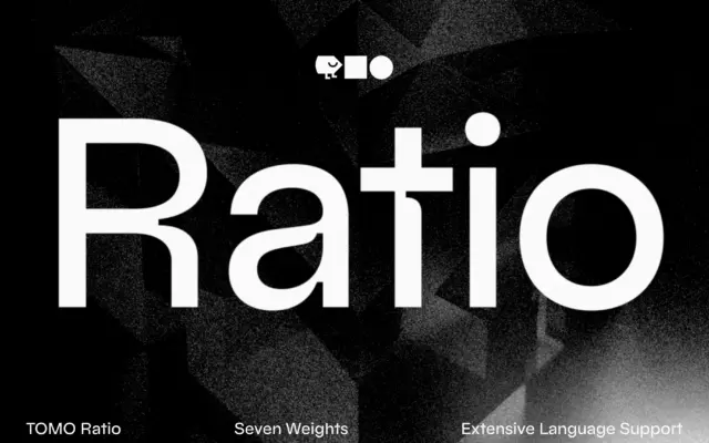
Design style Ratio sits in the geometric sans lineage that runs back through Bauhaus-era type and Futura’s circular lowercase, but…
Tmfonts
Design style This is a family built around a mood rather than a single letterform idea. The brief points to…
Tmfonts
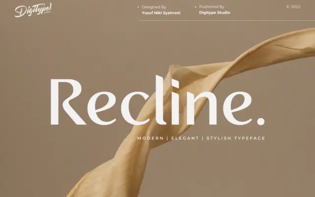
Design style Recline sits in the clean, minimalist end of the sans serif spectrum. It’s the kind of typeface built…
Tmfonts
Design style TT Norms Pro Basic sits in the well-populated territory of geometric-leaning grotesques that try to split the difference…
Tmfonts
Design style Roie belongs to the crowded family of geometric sans faces designed with a single job in mind: sitting…
Tmfonts