
Santorini Sunshine: a retro script-and-sans duo for summery branding
Design style
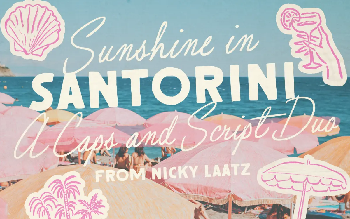
Santorini Sunshine pairs a loose, slightly imperfect script with a rough-edged all-caps sans, both pulling from mid-century signage rather than contemporary lettering trends. The script leans casual and a little wobbly by design — strokes vary in pressure, joins aren’t perfectly matched, and the whole thing reads as if it were brushed quickly rather than plotted. The companion sans is blockier and more graphic, with an inked, hand-painted texture that suggests a shop sign left out in the weather for a decade or two. Neither half is trying to be neutral. This is a mood typeface, and the mood is nostalgic seaside glamour rather than clean modern minimalism.
What holds the duo together is restraint in the rough edges — the imperfections are consistent enough that they read as a style choice rather than noise. It won’t suit anyone after a crisp, corporate hand.
Character set and features
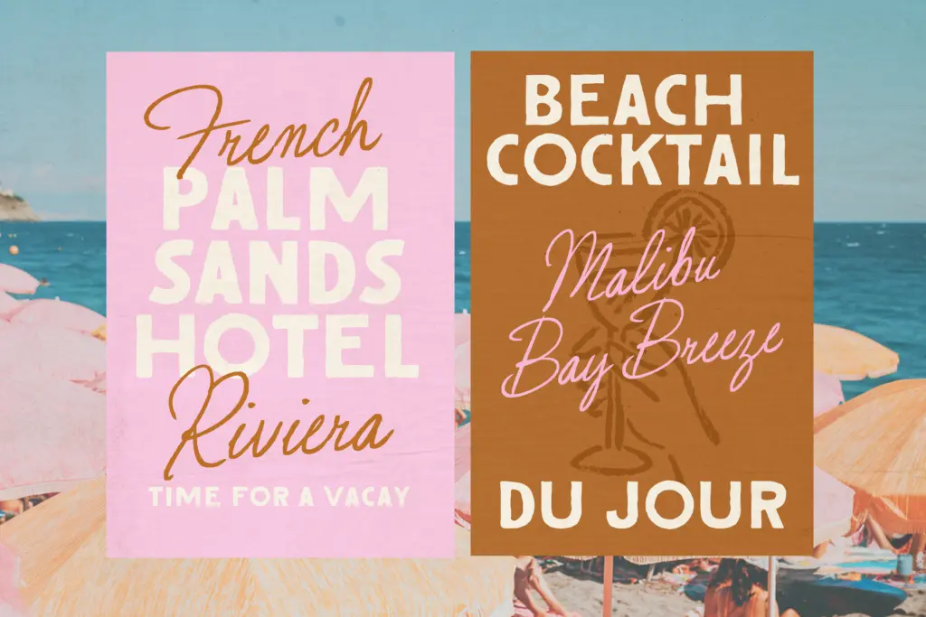
The script comes in a Regular and a Wider spacing variant, each available in two slightly different slants, which gives four ways to set the same words before you even touch the sans. The all-caps sans adds a slightly lighter weight alongside the main one, plus outlined versions of both weights — useful for layering type over photography or building a two-colour lockup without redrawing anything. That’s a reasonable spread of options for a duo pitched at branding and short-copy work rather than long-form text.
Language support covers a solid range of Western European languages, including diacritics for French, Spanish, Portuguese, German and the Nordic languages, so it isn’t limited to English-only projects. There’s no mention of extended OpenType features like swash alternates or ligature sets beyond the basic character variants, so designers expecting a large stylistic-alternate system to vary repeated letters should treat the four script styles as the extent of that flexibility.
Use cases
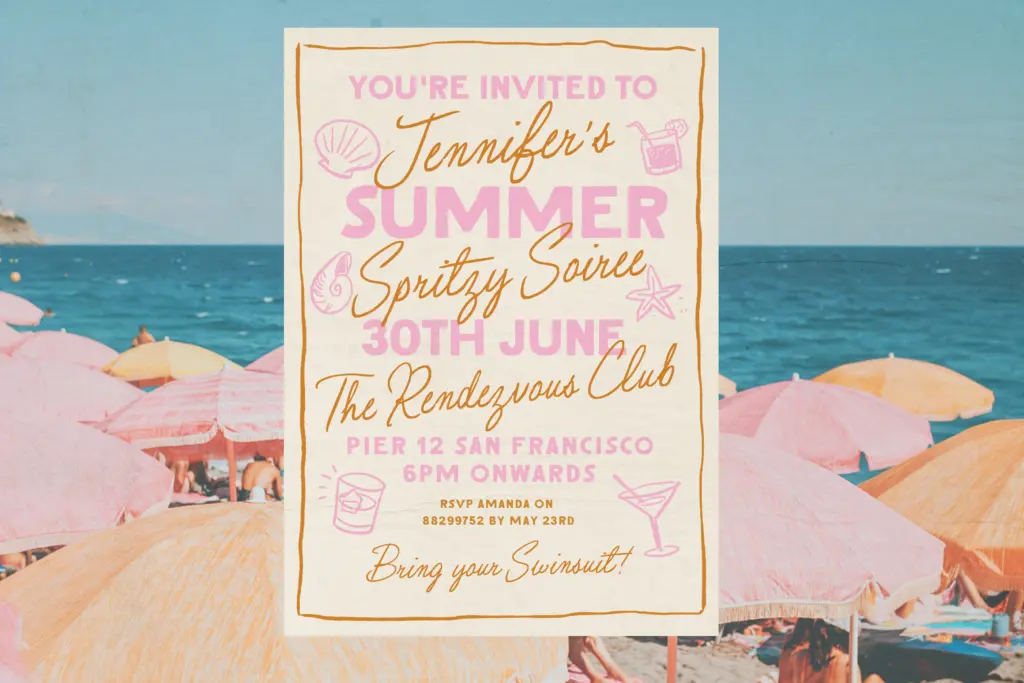
This is a font for short bursts of text: a logotype, a headline on a poster, a product label, an Instagram graphic. The script is legible at large display sizes but its irregular baseline and pressure changes mean it will struggle in a paragraph or anywhere text needs to sit quietly and be read quickly — it’s not built for body copy, and nobody should try to force it there. Pair the sans for supporting details (a date, a location, a tagline) and let the script carry the main word or two.
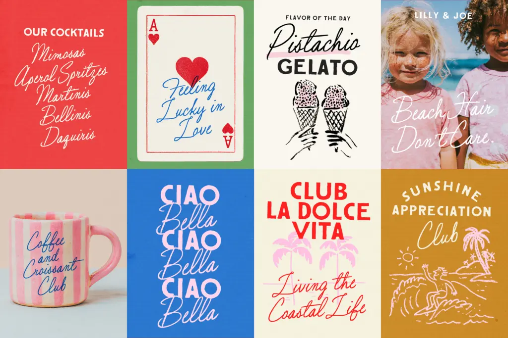
It suits boutique food and drink branding, beach or resort merchandise, event stationery with a retro bent, and packaging that wants to feel handmade rather than manufactured. It’s less convincing for anything needing a sober, trustworthy tone — a law firm or a tech product would find the roughness works against them. Within its lane, though, the duo does a specific job well: it looks like it was drawn by hand for a sign, not generated for a template.
What we liked, and what we didn’t
Strengths
- Four script variants (two spacings, two slants) give real flexibility without leaving the family's visual identity
- The rough-edged sans and outlined versions make layering and two-colour lockups easy
- Solid Western European language coverage extends its use beyond English-only projects
Trade-offs
- The script's irregular baseline makes it unsuitable for anything beyond a word or two of text
- Limited OpenType alternates mean less variation across repeated letters than some script families offer
Santorini Sunshine is a well-matched script-and-sans duo built for short, punchy summer branding rather than everyday text setting. The imperfections in both halves are consistent and deliberate, which keeps the retro-signage feel from tipping into gimmick. It has a narrow but clearly defined lane, and inside that lane it performs reliably.
Verdict

Tmfonts reviews typefaces in depth — every font is tested in real branding, editorial and screen layouts before a word gets written. 555+ fonts reviewed and counting.