
Coastal: a hand-built sans for laid-back branding work
Design style
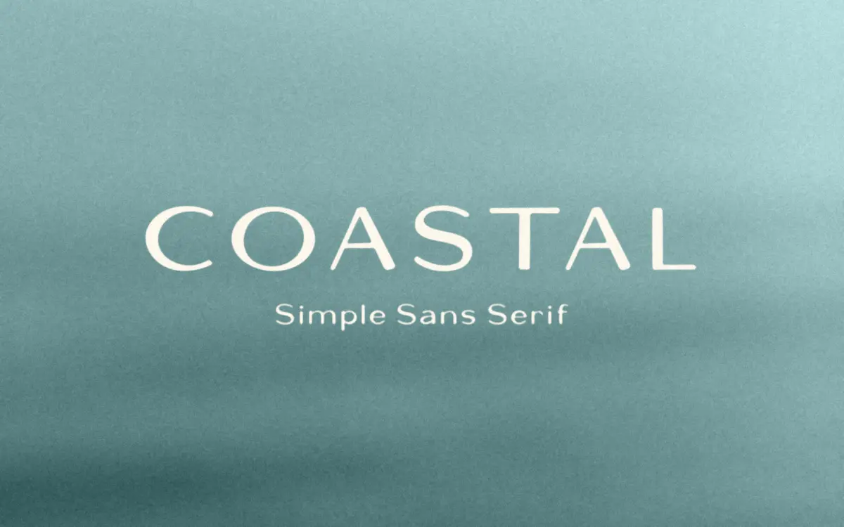
Coastal is a hand-drawn sans serif with the slightly loose, uneven quality that comes from letters built by eye rather than plotted on a grid. Strokes are consistently thin, terminals are blunt rather than rounded, and there’s a light wobble to the baselines that reads as handmade rather than sloppy. It sits closer to a marker-drawn lettering style than to a rigorous grotesque, which gives it warmth but also means it won’t hold a perfectly clean edge under close inspection.
The letterforms are wide and open, with generous counters in the a, e, and o. There’s no attempt at geometric consistency between letters — the g and the s in particular carry idiosyncrasies that give the font personality but also mean it doesn’t behave like a systematic type family. This is a display face with a sans serif skeleton, not a workhorse sans.
Character set and features
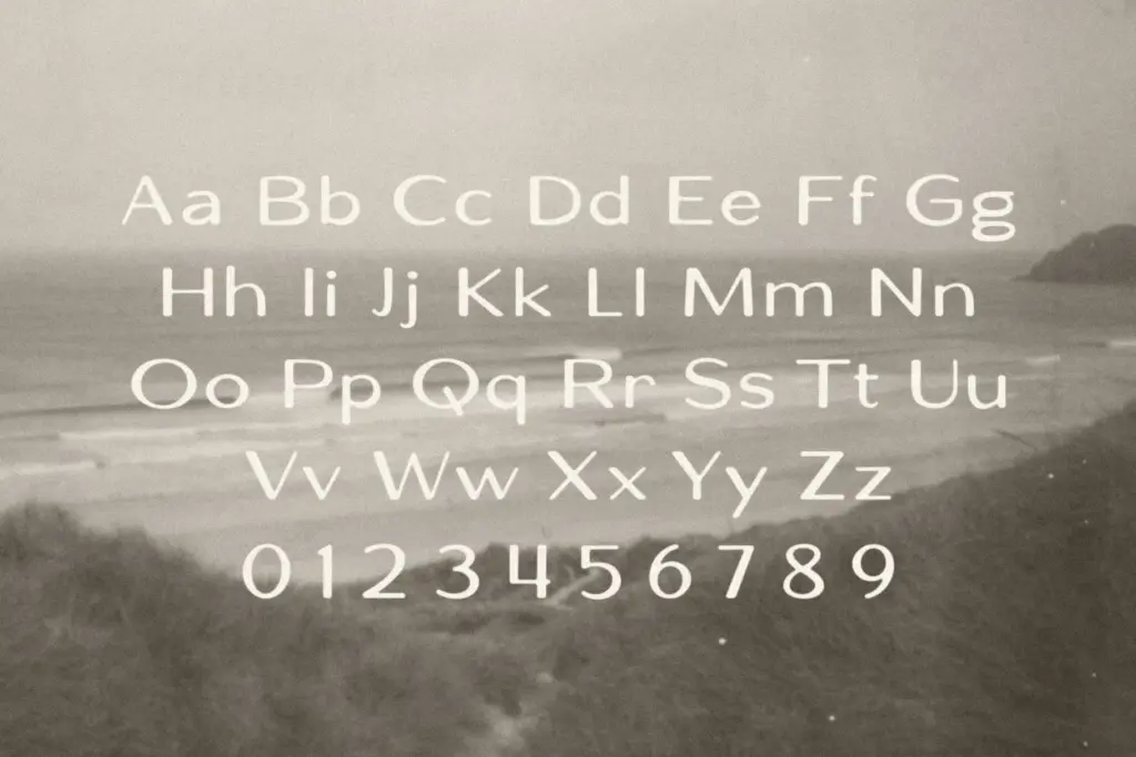
The set is basic: uppercase and lowercase, numerals, currency symbols, and standard punctuation for the English alphabet. There are no ligatures, no alternates, no small caps, and nothing built out for multilingual support. If your project needs diacritics or extended Latin coverage, Coastal won’t get you there.
That narrow scope is fine for what the font is actually for. It’s not trying to be a flexible editorial system with dozens of OTF features — it’s a single, opinionated voice delivered in two cases. The uppercase is the stronger half; the letters are wide enough to breathe and the hand-built irregularity reads as intentional. The lowercase gets a bit busier at small sizes, where the uneven stroke widths and loose spacing start to compete with each other rather than settle into a rhythm.
Use cases
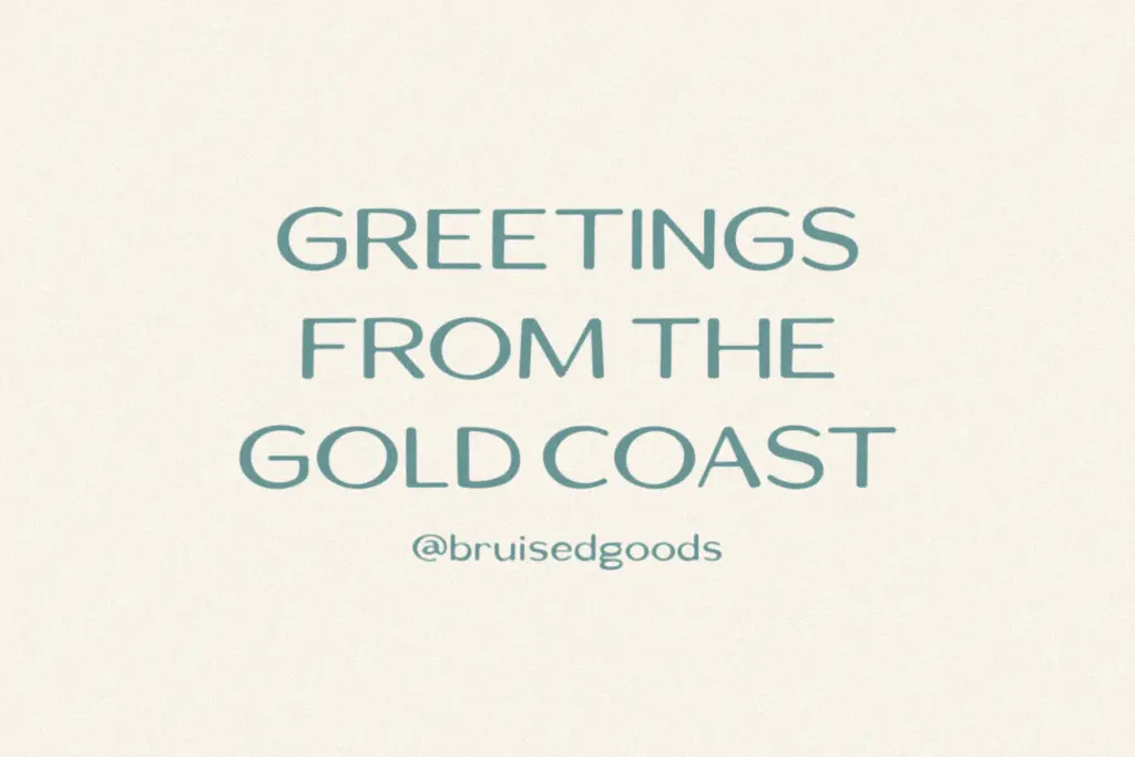
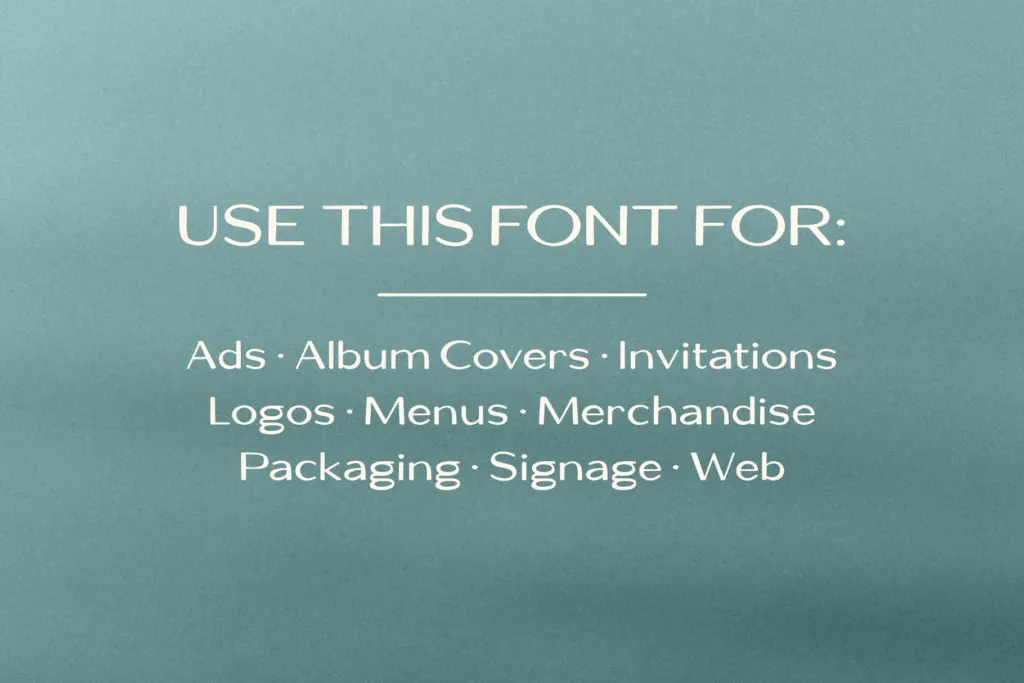
Coastal is built for short bursts of text: logotypes, headlines, packaging labels, signage, merch, and the kind of one- or two-word statement pieces that show up on apparel or beach-town signage. At large display sizes the handmade irregularity is an asset — it looks like it was lettered specifically for the job rather than pulled from a font menu. The name and the character of the letterforms both point toward a relaxed, coastal-lifestyle aesthetic: think surf shop branding, seasonal packaging, or a beachside café’s chalkboard menu redone in vector.
It’s less suited to body copy or anything that needs to run long. The lack of a true text weight, the absence of alternates to break up repeated letters, and the loose baseline mean that a paragraph set in Coastal starts to feel restless rather than readable. Pair it with a plain, quiet sans or serif for supporting text and let Coastal carry the headline or wordmark alone. For web use, it’s realistic as a hero heading rather than as UI or paragraph text — the character isn’t built to disappear at 14px, and it shouldn’t be asked to.
Anyone doing seasonal or lifestyle branding — beachwear labels, tropical-themed menus, blog headers with a relaxed tone — will get quick, usable results from Coastal. Anyone looking for a do-everything sans for a full identity system should look elsewhere; this one has a specific mood and a specific job, and it does that job without pretending to be more than it is.
What we liked, and what we didn’t
Strengths
- The wide, open counters give the uppercase real presence at large sizes.
- The hand-drawn irregularity reads as intentional rather than accidental, which is harder to fake than it looks.
- Works immediately for seasonal, lifestyle, and coastal-themed branding without much tweaking.
Trade-offs
- No ligatures, alternates, or extended language support limits flexibility beyond basic Latin text.
- Lowercase gets visually busy at smaller sizes, so it's unreliable for anything beyond short headlines.
Coastal delivers exactly what a hand-drawn, lifestyle-branding sans should: character, warmth, and a specific mood at display sizes. It's not built for body text or multilingual jobs, and the bare character set limits what you can do with it beyond short headlines and wordmarks.
Verdict

Tmfonts reviews typefaces in depth — every font is tested in real branding, editorial and screen layouts before a word gets written. 555+ fonts reviewed and counting.