
Pink Queen: a soft romantic script for wedding and boutique branding
Design style
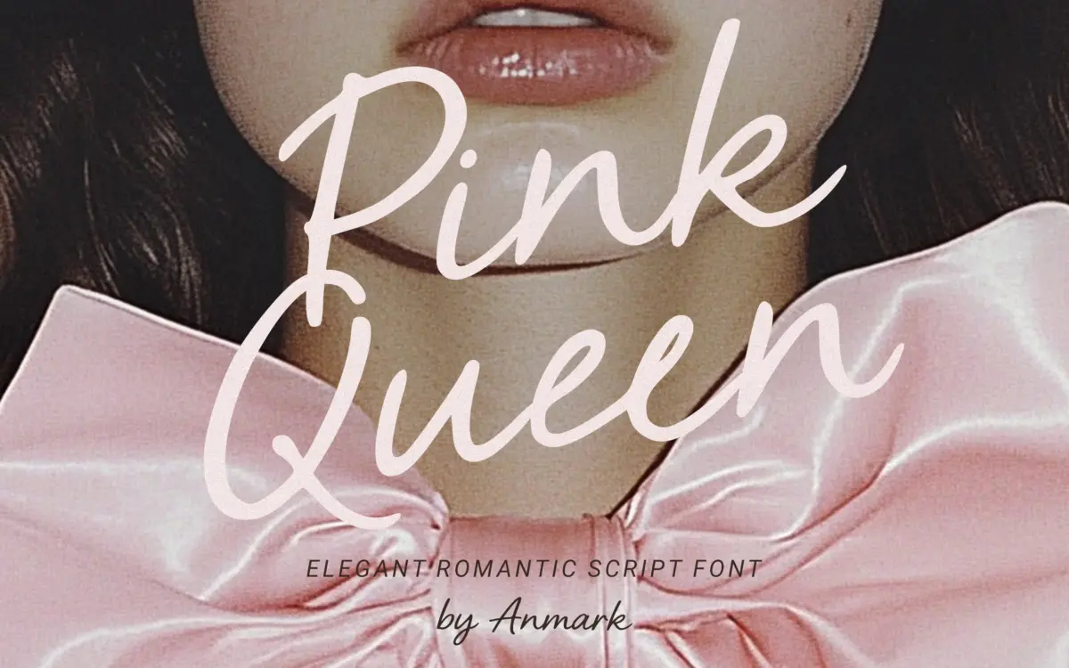
Pink Queen sits squarely in the crowded field of soft, feminine wedding scripts, and it does the job without trying to reinvent it. The strokes are light, the connections between letters are loose and casual rather than tightly joined, and the overall impression is closer to a hand-lettered note than formal calligraphy. There’s a slight forward lean and a gentle bounce to the baseline, which gives it a handwritten feel rather than the rigid geometry of a constructed script.
The contrast between thick and thin strokes is modest — this isn’t a pointed-pen revival with dramatic swells. Instead the weight stays fairly even throughout, which keeps the letters readable but also means the font reads as pleasant rather than distinctive. Nothing about the letterforms is jarring or unusual; it’s a comfortable, familiar style that leans on warmth rather than personality.
Character set and features
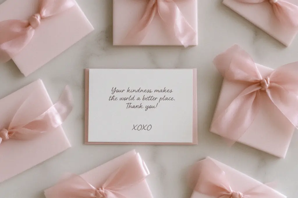
The font includes ligatures, which help smooth over some of the awkward joins that script fonts often run into with certain letter pairs, and the seller notes multilingual support, so accented characters for various European languages should be covered. That’s a genuine practical plus for anyone working with clients outside English-only markets.
Beyond that, the feature set is fairly standard for a script of this type — no wild alternate sets or elaborate swash characters are mentioned, and the design reads as intentionally restrained rather than heavily equipped. Designers who want a script with dozens of contextual alternates and decorative flourishes will find Pink Queen more modest than that. What’s here works cleanly, but the toolkit is not deep.
Use cases
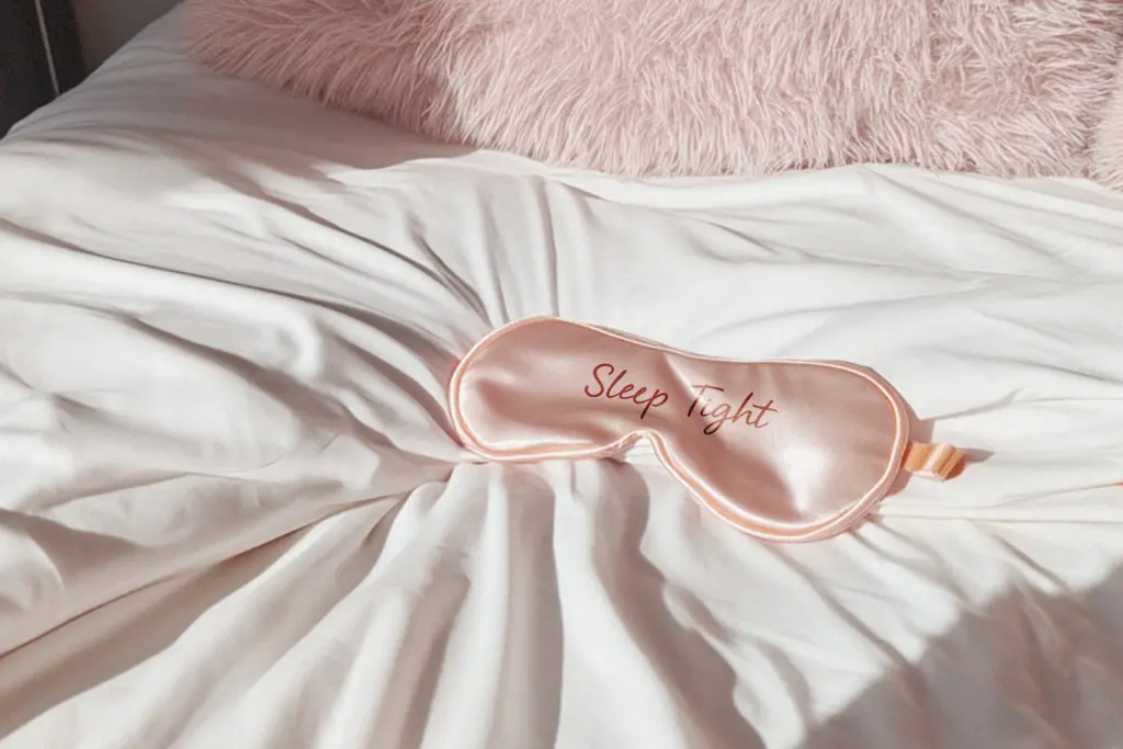
This is a font built for short bursts of text rather than paragraphs — names on invitations, a couple’s initials, a single line on a save-the-date, a boutique logotype. At those sizes, the looseness of the joins and the soft weight read well and give off exactly the romantic, informal warmth the seller is going for. It would also suit product labels for candles, skincare, or stationery lines where a gentle, feminine touch is the goal.
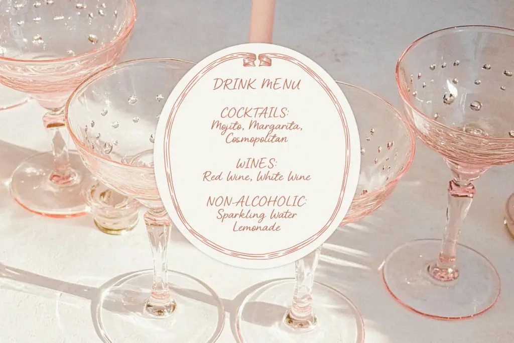
Push it further and the limitations show. Set in a full paragraph or at small sizes, the light weight and casual spacing start to blur, and the lack of dramatic contrast means it doesn’t have much presence when scaled down for body copy or long-form use. It also isn’t a font for brands wanting to look bold or contemporary — it leans traditional and soft, and that’s a narrow lane. Pairing it with a plain sans serif for supporting text is the sensible approach, letting Pink Queen carry just the headline moments while a neutral typeface handles the rest of the layout.
What we liked, and what we didn’t
Strengths
- Loose, casual joins give it a genuine handwritten warmth rather than a stiff constructed look
- Ligatures smooth over awkward letter connections common in script fonts
- Multilingual support makes it usable for international client work
Trade-offs
- Even, modest stroke contrast means it lacks a strong visual signature next to other wedding scripts
- Loses clarity and presence at small sizes or when set in longer passages of text
Pink Queen is a competent, pleasant wedding script that does exactly what it promises without pushing into distinctive territory. It handles short romantic headlines well but loses presence at small sizes or in longer text. A safe pick for bridal and boutique work, not a standout in a crowded category.
Verdict

Tmfonts reviews typefaces in depth — every font is tested in real branding, editorial and screen layouts before a word gets written. 555+ fonts reviewed and counting.