
Gerald and Margaret: a casual handwritten script for warm, informal branding
Design style
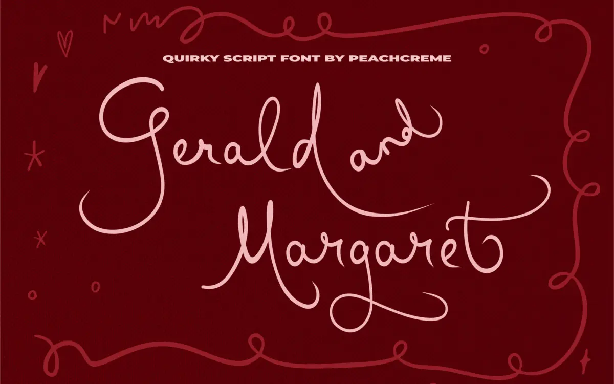
Gerald and Margaret sits in the casual end of the script spectrum, closer to a felt-tip note than formal calligraphy. The strokes have a loose, slightly uneven quality — baselines wobble a touch, joins aren’t perfectly uniform — and that’s clearly deliberate rather than a drawing fault. It reads as handwritten, not engineered to look handwritten, which is a harder trick to pull off than it sounds.
The letters lean forward at a moderate angle with soft, rounded terminals and thick-thin transitions that stay gentle rather than dramatic. There’s no heavy calligraphic contrast here, no sharp flourish work. Instead the personality comes from small irregularities: a slightly oversized loop on a descender, a curl that doesn’t quite match its neighbour. It’s charming in the way a good handwritten card is charming — informal, a little imperfect, warm.
Character set and features
The font ships with alternate letters and ligatures aimed at breaking up repetition, which matters a great deal in a script this loose — repeated letterforms in a word can otherwise look mechanically stamped rather than written. The catch, and it’s worth saying plainly, is that alternate coverage is uneven. Some letters have multiple swapped forms, others have one, and a chunk have none at all. That’s not unusual for scripts in this price bracket, but it does mean you can’t assume every word will get the variation treatment — you’ll need to check the letter-by-letter reference the seller provides rather than guessing.
Ligatures do real work here, smoothing over awkward letter pairs that a straight script often stumbles on. Used well, they’re the difference between a word that looks composed and one that looks like individual letters glued together. Because the alternates are inconsistent across the alphabet, get comfortable in the glyphs panel before committing to a layout — this isn’t a font where you type a word and trust it blind.
Use cases
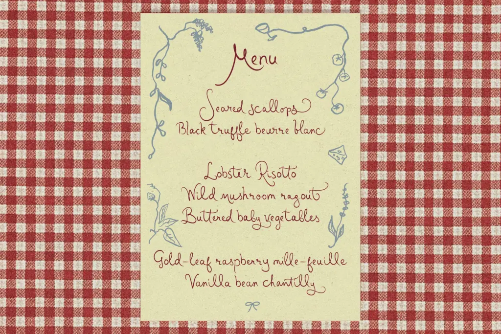
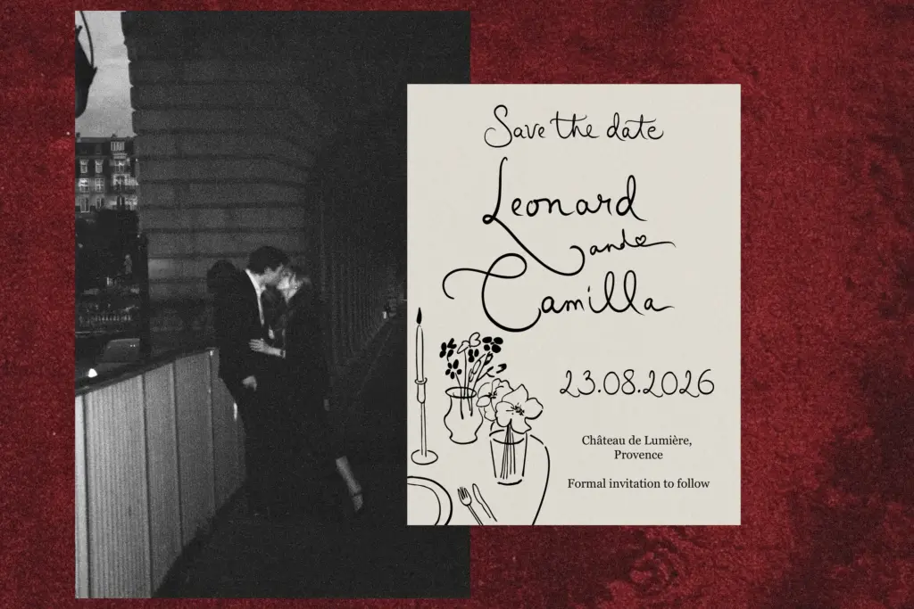
This is a font for short, expressive bursts of text rather than paragraphs. Invitation headlines, a couple’s names on a save-the-date, a logotype for a bakery or florist, a packaging label that wants to feel handmade rather than corporate — that’s the natural territory. The casual slant and soft terminals give it a boutique, slightly nostalgic warmth that suits craft-adjacent branding: candles, stationery, small-batch food packaging, social media graphics for lifestyle brands.
It’s not built for body copy or anything requiring sustained reading — the irregular baseline and joined strokes get tiring past a sentence or two, which is normal for scripts of this type and not a mark against it. Pair it with a plain sans or serif for supporting text and let this carry the headline moment. Given the unevenness of the alternates, budget some extra time for hand-kerning tighter words and swapping in the available variants where they exist, rather than expecting the font to self-correct every repetition on its own.

What we liked, and what we didn’t
Strengths
- Loose, felt-tip character feels genuinely handwritten rather than over-polished
- Ligatures smooth over awkward letter pairs effectively
- Well suited to short branding and invitation-style headlines
Trade-offs
- Alternate letters are inconsistent across the alphabet, requiring manual glyph checking
- Not built for anything beyond short phrases or headline-length text
Gerald and Margaret is a likeable, informal script that suits short branding moments rather than heavy text. The ligatures help, but the alternate coverage is patchy enough that you'll need to check glyphs case by case. It does its intended job well without pushing into anything unexpected.
Verdict

Tmfonts reviews typefaces in depth — every font is tested in real branding, editorial and screen layouts before a word gets written. 555+ fonts reviewed and counting.