
TAN – Mon Cheri: a clean 60s-inflected sans with playful ligatures
Design style
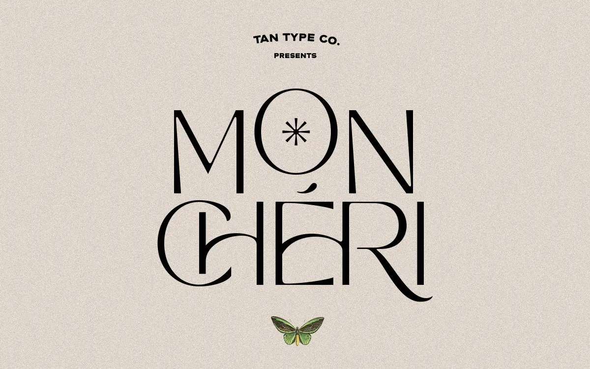
Mon Cheri sits in that familiar TanType territory: geometric-leaning sans letterforms with a retro sensibility, pitched somewhere between a 1960s type specimen and a contemporary logotype. The skeleton is plain and confident — circular counters, even stroke weight, minimal stress — which is what gives it a calm, unfussy presence on the page. Nothing about the base letterforms is showy.
What lifts it out of generic-sans territory are the ligatures. Certain letter pairs connect with a small looping stroke or an extended terminal, giving the face a handwritten flicker inside an otherwise rigid structure. It’s a modest gesture, but it changes the personality of a word without changing its readability. Used sparingly, the ligatures read as a wink rather than a costume.
The overall impression is ‘quiet vintage’ rather than ‘loud vintage’ — there’s none of the exaggerated swash or condensed drama you get in some retro display sans faces. It’s closer to a refined shop sign than a poster typeface, which is worth knowing before you reach for it expecting more personality than it actually has.
Character set and features
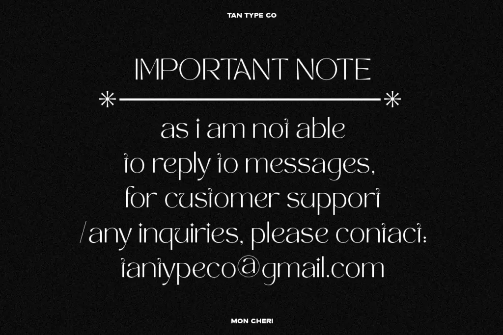
The letterforms are built for OpenType, so the ligature system needs to be triggered through software that supports opentype features — in an app without that support, you’ll just get the base letters and lose the effect entirely. That’s a real consideration if your workflow runs through tools with patchy OpenType handling; the font will still function, just flatter.
Multilingual support is included, which extends its usefulness beyond a single-language market, though the brief doesn’t specify which scripts or diacritics are covered, so it’s worth checking coverage against your specific language needs before committing a project to it. Format-wise it ships as OTF, TTF, WOFF and WOFF2, so it’s ready for both desktop design work and web use without conversion.
There’s no indication of a full weight range — this reads as a single-style release rather than a family with light-to-bold variation, so anyone hoping to build a full type system on Mon Cheri alone will need to look elsewhere for contrast weights.
Use cases
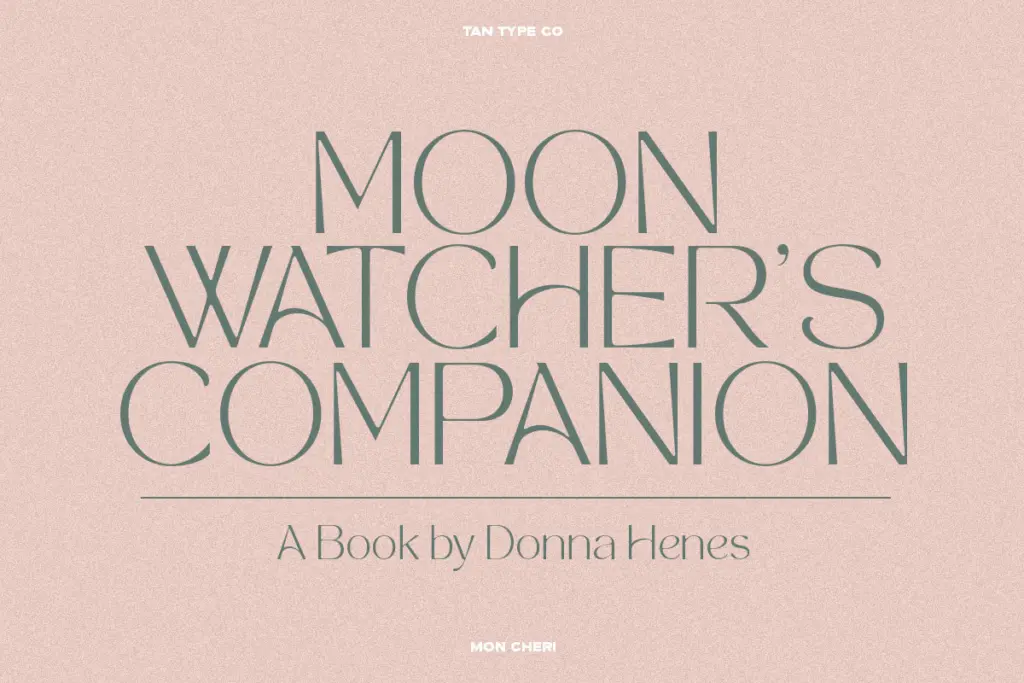
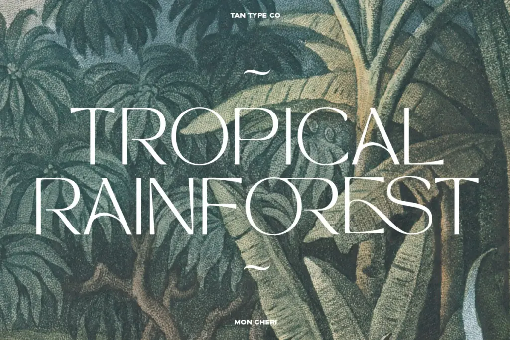
This is a logotype and short-copy font first. The combination of clean geometry and occasional connective ligatures makes it well suited to wordmarks, fashion branding, packaging headlines, and editorial titling where you want something that feels considered without feeling loud. Beauty, lifestyle and boutique retail branding are obvious fits given the classy, minimal tone.
It’s less suited to long-form text — the ligatures are a display device, and at body-copy sizes their charm turns into visual noise rather than voice. Keep it to headlines, logos, packaging copy and short editorial statements, and pair it with a plain, workhorse text face for anything longer than a sentence or two.
What we liked, and what we didn’t
Strengths
- The base letterforms are calm and geometric, avoiding retro cliché.
- Ligatures add a handwritten touch without sacrificing legibility.
- Ships in web-ready formats alongside desktop formats.
Trade-offs
- No stated weight range limits its use as a standalone type system.
- OpenType ligatures require compatible software or the effect is lost entirely.
Mon Cheri is a clean, quietly retro sans that earns its personality through a handful of connective ligatures rather than loud styling. It's built for logotypes and short display copy, not for text-heavy layouts, and its single-weight nature limits how far it can stretch across a full brand system.
Verdict

Tmfonts reviews typefaces in depth — every font is tested in real branding, editorial and screen layouts before a word gets written. 555+ fonts reviewed and counting.