
Lovely Mess: a hand-drawn all-caps sans for scrappy, offbeat branding
Design style
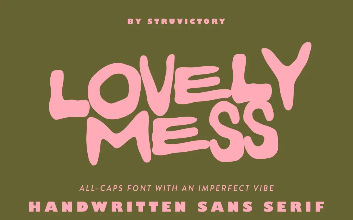
Lovely Mess is exactly what it says on the tin: an all-caps sans-serif built from loose, hand-drawn strokes that refuse to line up neatly. Verticals wobble, corners round off unevenly, and letters sit at slightly different heights and angles within a word. Nothing here is trying to look considered — the whole point is the opposite. It reads like something scrawled quickly with a thick marker, not traced or vectorised into submission afterward.
That rawness is the design’s whole argument. There’s no attempt at optical correction between letters, no smoothing of the awkward moments. Some designers will find that liberating; others will find the inconsistency genuinely hard to work with once a layout needs discipline. This is not a font that will behave the same way twice at different sizes or in different words — the imperfections shift depending on which letters land next to each other.
Character set and features
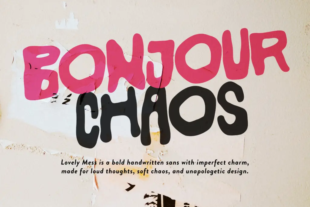
The set is uppercase only, which keeps the chaotic energy contained to a single case rather than doubling the unpredictability across upper and lower. It covers the standard Latin range plus accented characters for the more common Western European languages, so it’ll get through French, German or Spanish copy without falling over, though it’s not built for anything beyond that.
Don’t expect ligatures, alternates, or swash variants — this is a single-style display font, not a system with layered OpenType features. What you see in the preview is what you get in every instance of a letter, which actually helps a little with predictability, since there’s no extra layer of randomness to manage on top of the already irregular forms.
Use cases
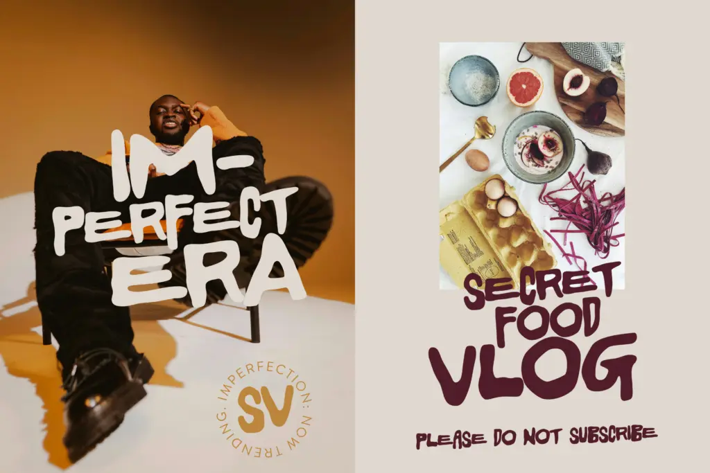
This is a font for moments where
What we liked, and what we didn’t
Strengths
- a
- b
- c
Trade-offs
- a
- b
a
Verdict

Tmfonts reviews typefaces in depth — every font is tested in real branding, editorial and screen layouts before a word gets written. 555+ fonts reviewed and counting.