
Apothecary Serif: a textured vintage serif for labels and packaging
Design style
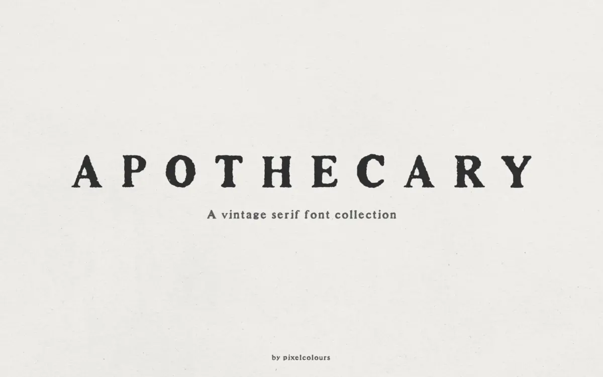
Apothecary Serif leans into the worn-print look that has become a whole subgenre of vintage type: letterforms that read as if they were set on a hand press and inked slightly unevenly, with edges that break up rather than stay crisp. The texture is baked into the outlines rather than applied as a filter, so it holds its character across sizes instead of turning muddy or over-processed. The skeleton underneath is a fairly conventional serif — moderate contrast, bracketed serifs, nothing structurally unusual — which is the right call, because the texture is already doing the work of giving it personality. Push both a distressed skeleton and distressed texture together and you usually end up with something illegible.
It’s clearly built as a companion piece to the designer’s separately sold script, and that shows in the proportions: the caps are tall and a little heavy, built to anchor a script rather than to carry a page of body text on their own.
Character set and features
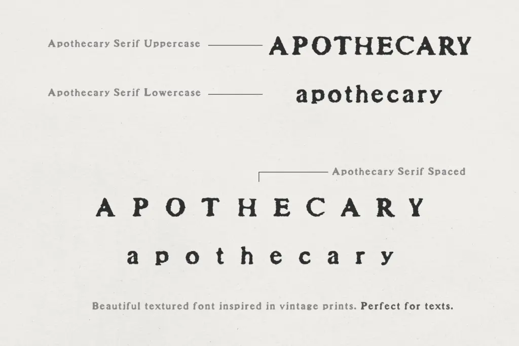
The collection is really four related fonts rather than one. The base Serif and a Spaced variant handle running text and pairing duty, with the spaced version opening up the letter and word gaps enough to read comfortably in a paragraph — worth using deliberately, since the standard cut sits tighter, as vintage serifs often do. Apothecary Serif Caps is the more interesting piece: bold, tall, heavily textured capitals with the lowercase remapped as a secondary, slightly smaller uppercase, which is a genuinely useful trick for building two-tier headline treatments or drop caps without needing a second typeface. Caps Spaced repeats that setup with wider tracking for text-scale use. Language support is included, which extends the set beyond basic Latin, though the brief doesn’t specify which diacritics are covered, so check coverage for anything beyond western European languages before committing.
There’s no mention of alternates, ligatures or contextual swapping here, and nothing in the brief suggests OpenType features beyond the character variants across the four fonts — so don’t expect the kind of built-in randomisation that keeps heavily textured type from repeating itself in long-form use.
Use cases
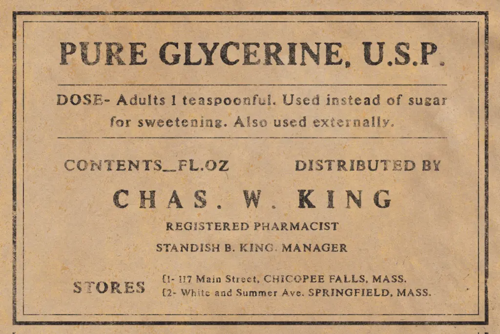
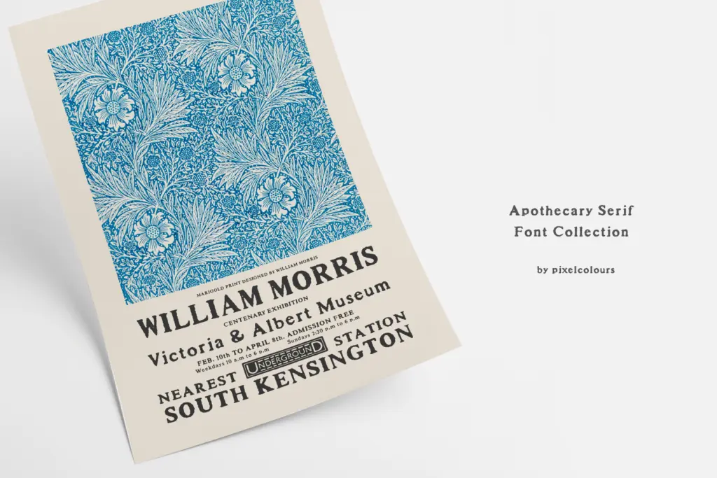
This is a font for small doses of type on a surface that already has some visual noise to it — a label, a packaging panel, a wedding invitation, a quote card. The texture reads well printed, and it’s suited to projects that want an apothecary-bottle, old-pharmacy, antique-shop feel rather than a clean editorial vintage look. Use the Caps for a header or monogram, drop in the Spaced serif for supporting copy, and it does the job it was designed for without extra dressing up.
It’s less suited to body copy at length or to interface use — the texture that makes it interesting at display sizes will start to fight legibility once you’re setting more than a paragraph, and at small sizes on screen the roughened edges can just look like noise. Treat it as a display and short-text tool, not a workhorse text face.
What we liked, and what we didn’t
Strengths
- The distressed texture is drawn into the outlines, so it stays sharp rather than smudging at small sizes
- The Caps style doubles as a secondary smaller uppercase, making two-tier headline layouts easy without a second typeface
- Spaced variants give you a ready-made looser setting for text use without manual tracking adjustments
Trade-offs
- Texture-heavy letterforms lose clarity fast once set at body-text sizes or viewed on screen
- No mention of alternates or ligatures, so long passages risk visible repetition
Apothecary Serif does one thing well: a worn, hand-pressed serif texture that holds up at display sizes without turning to mush. It's built for short bursts of type on packaging, labels and invitations, not for paragraphs or screens, and buyers should know that going in.
Verdict

Tmfonts reviews typefaces in depth — every font is tested in real branding, editorial and screen layouts before a word gets written. 555+ fonts reviewed and counting.